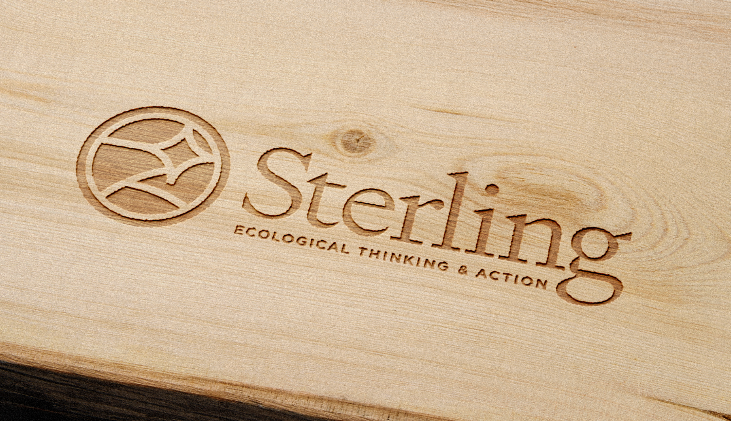
Sterling College has long embraced a hands-on, experiential approach to education—one deeply intertwined with “working hands and working minds.” As the institution embarked on a pivotal chapter of change, both a brand audit and full discovery phase were necessary to align its evolving mission with a refreshed visual identity, ensuring clarity in its positioning within the higher education landscape.
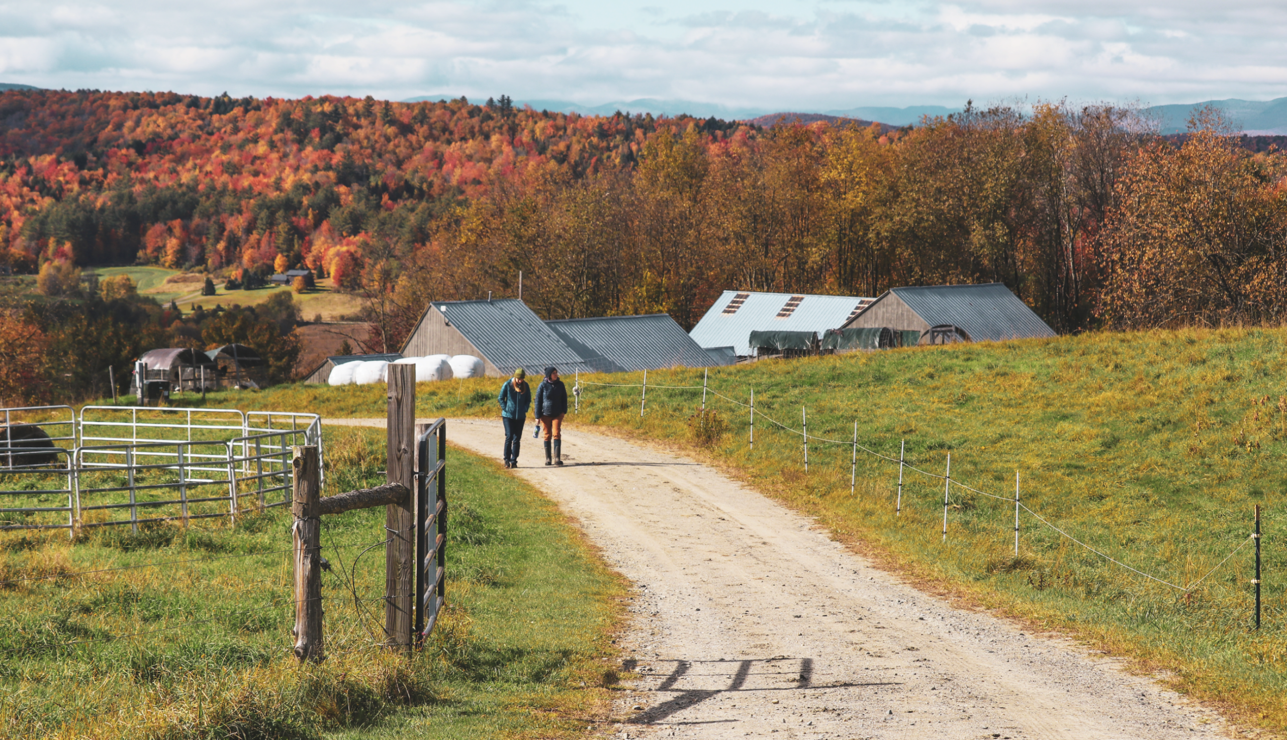
Discovery & Strategy: Aligning Identity with Mission Sterling’s evolution required a deep dive into what makes it unique: a commitment to environmental education, a rural Vermont setting that serves as both classroom and community, and a philosophy that learning should be as hands-on as it is intellectual. Through research, stakeholder interviews, and competitive analysis, we identified key differentiators that set Sterling apart: its intimate student body, commitment to sustainability, and integration of work and learning as part of a broader movement toward responsible, place-based education.
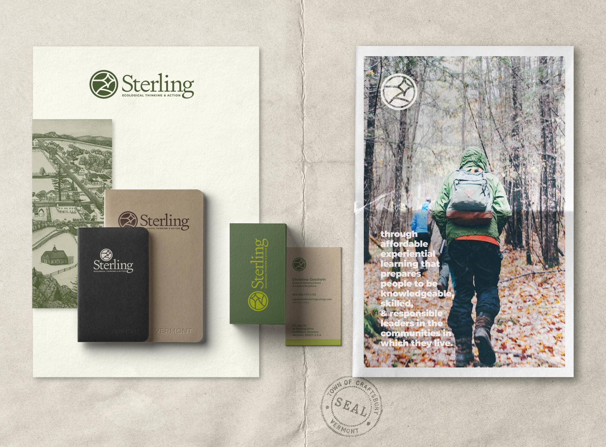
Design Approach: A Dynamic, Story-Driven Identity To visually express Sterling’s bold mission, we refined its brand colors to feel more dynamic and engaging, evoking the vibrancy of the natural world it champions. The introduction of Sterling’s first storied logo was a defining moment—an emblem designed to be both symbolic and adaptable, much like the college itself. Inspired by celestial navigation and organic forms, the new mark reflects interconnectedness, movement, and the guiding principles that define Sterling.
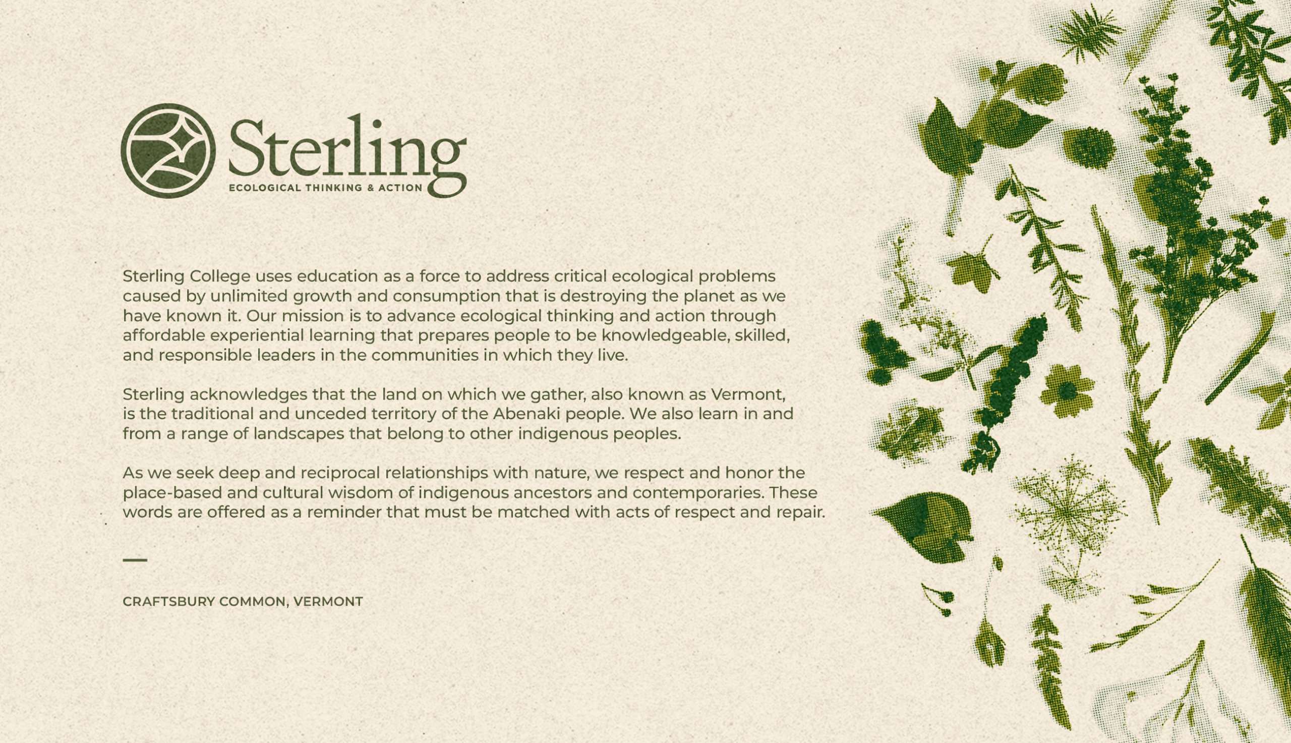
Outcome: A Future-Forward Brand for an Ever-Changing Landscape The result is a brand identity that honors Sterling College’s deep-rooted ethos while propelling it forward with renewed clarity and visual strength. By embracing both heritage and progress, the mission-focused tagline evolved to “ecological thinking and action” as part of the identity to be more inclusive and representative of all functions of the college. Sterling now stands with a brand that is as intentional and impactful as the work its students and faculty pursue every day.
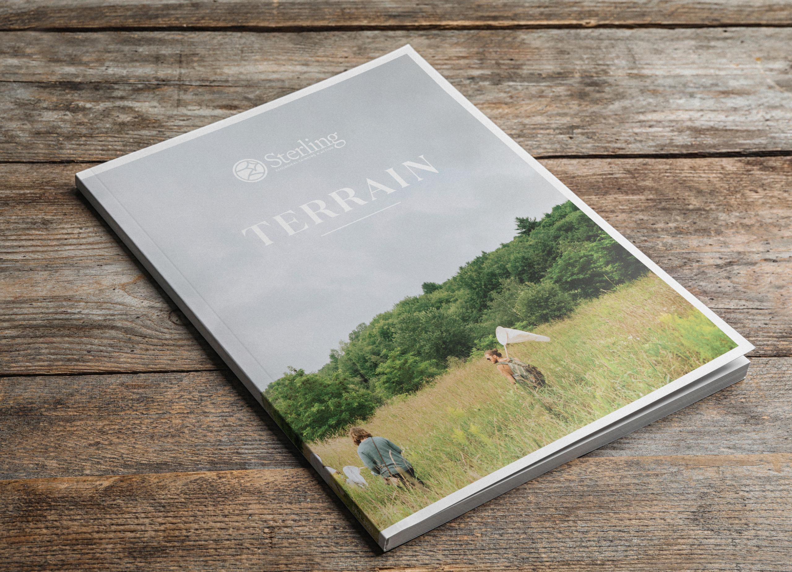
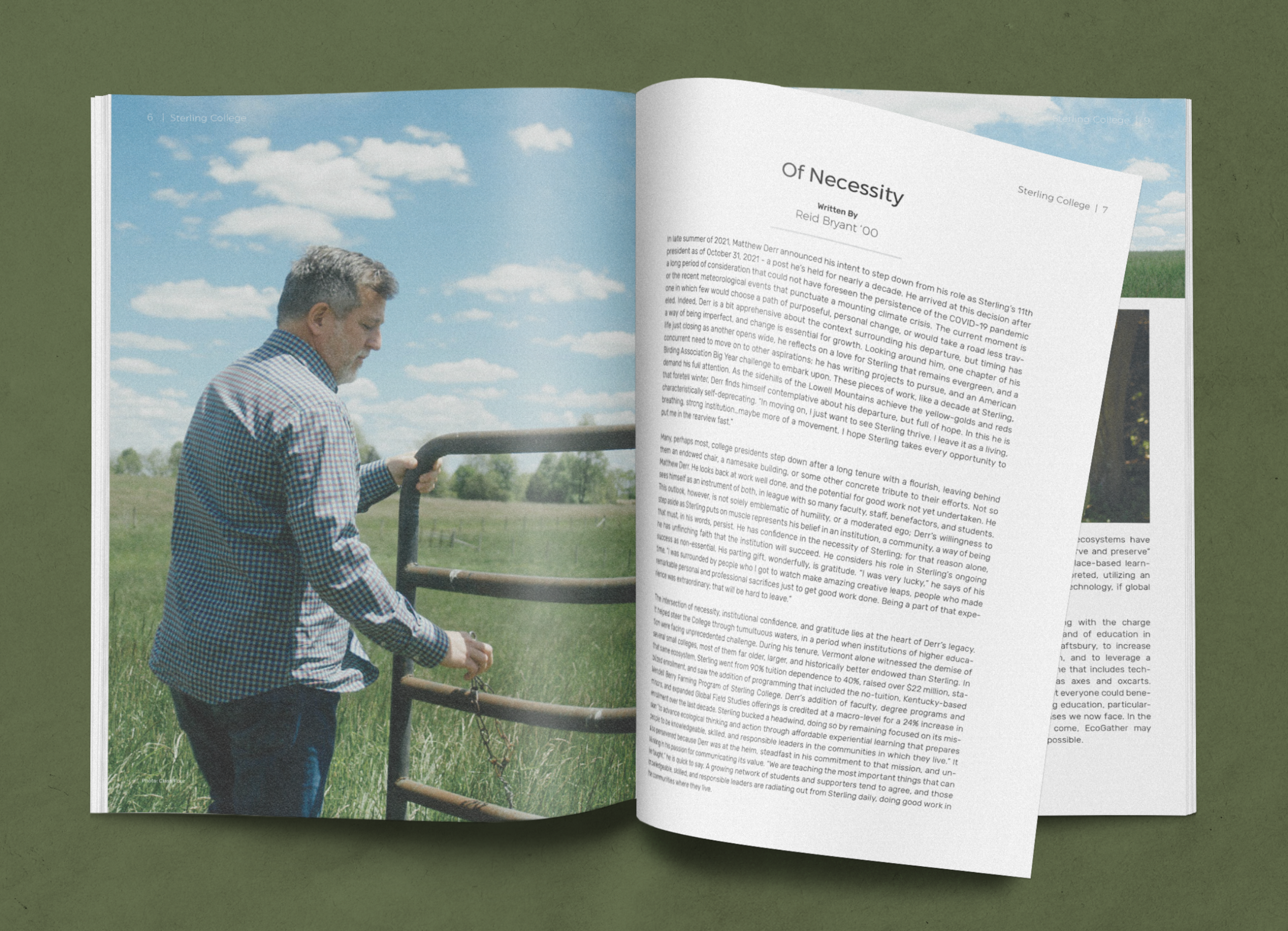
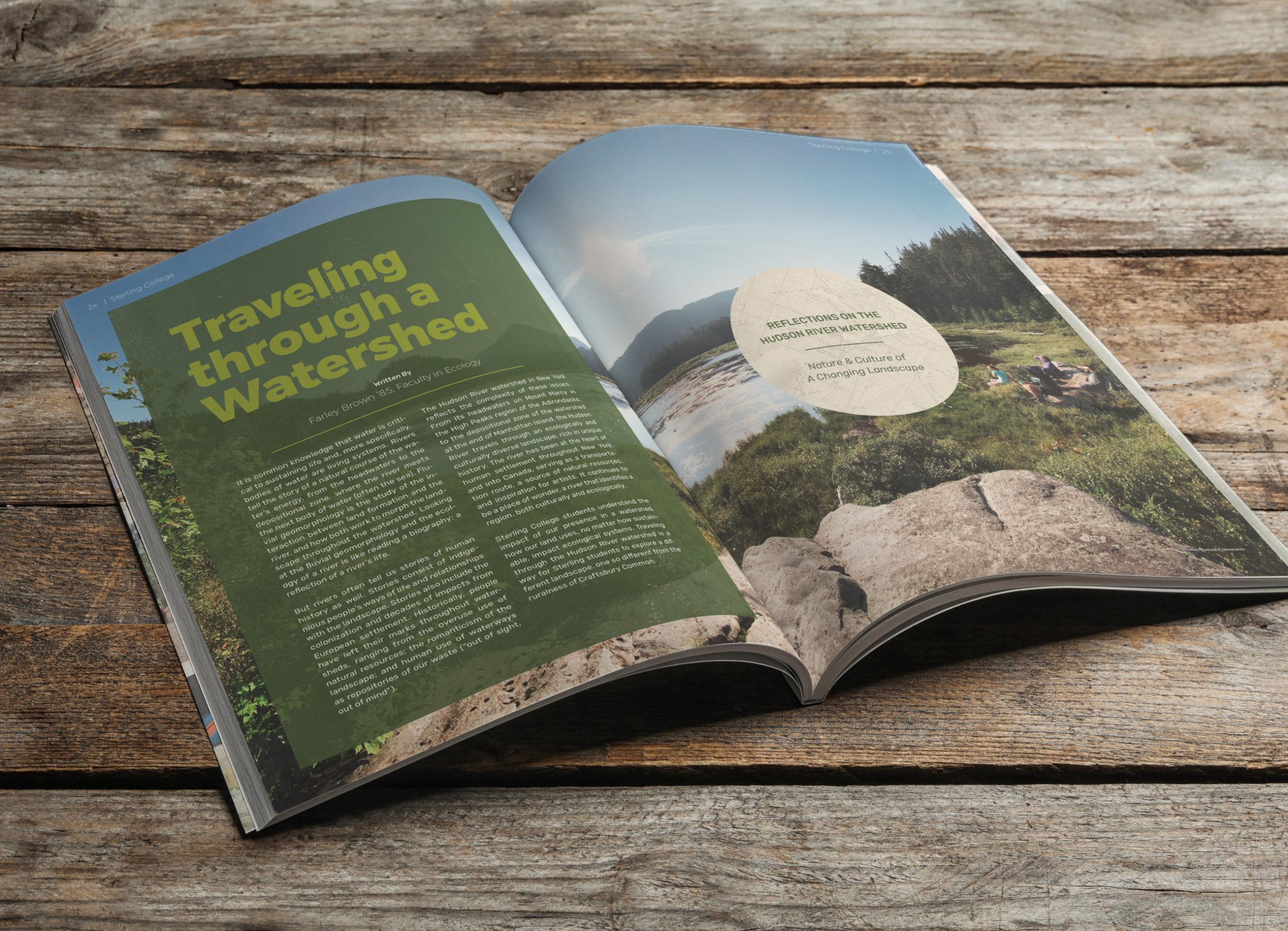
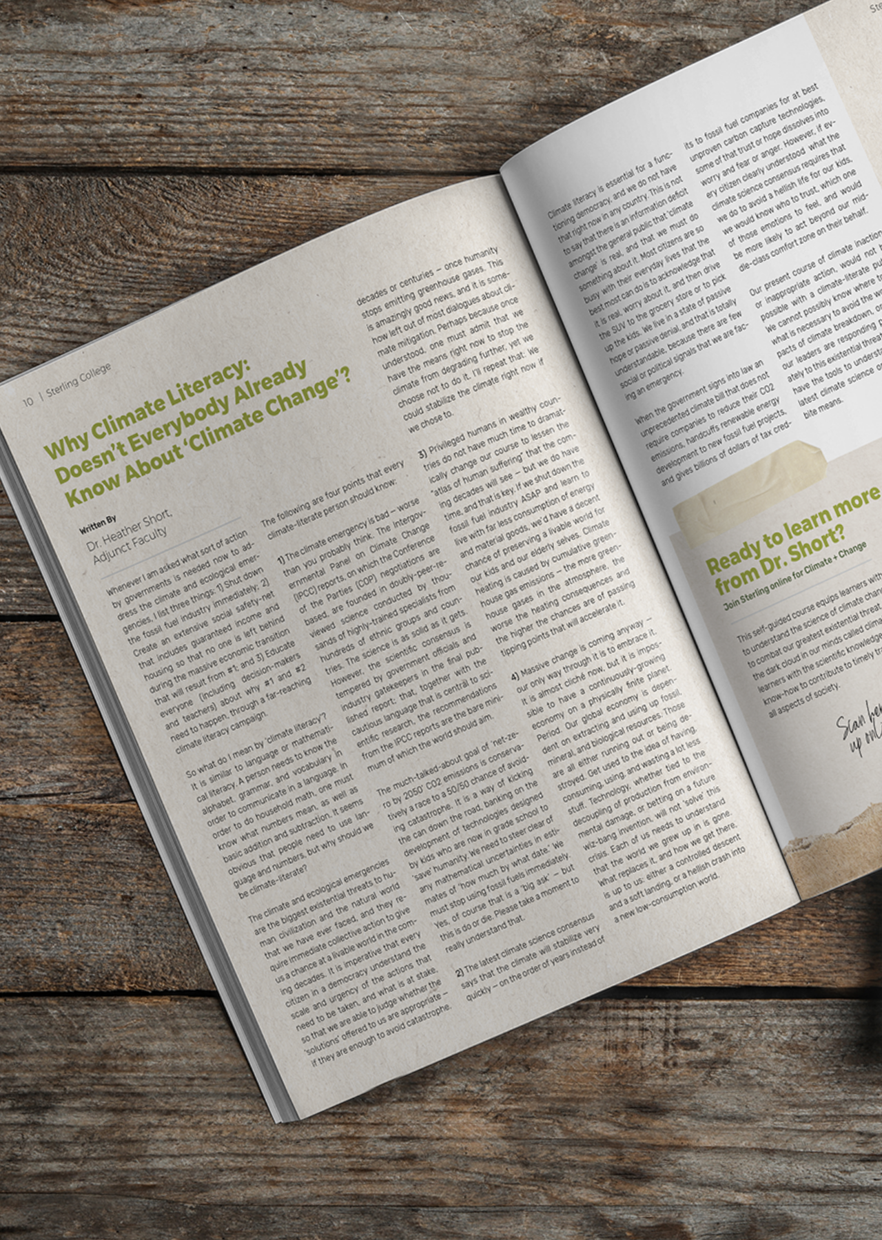
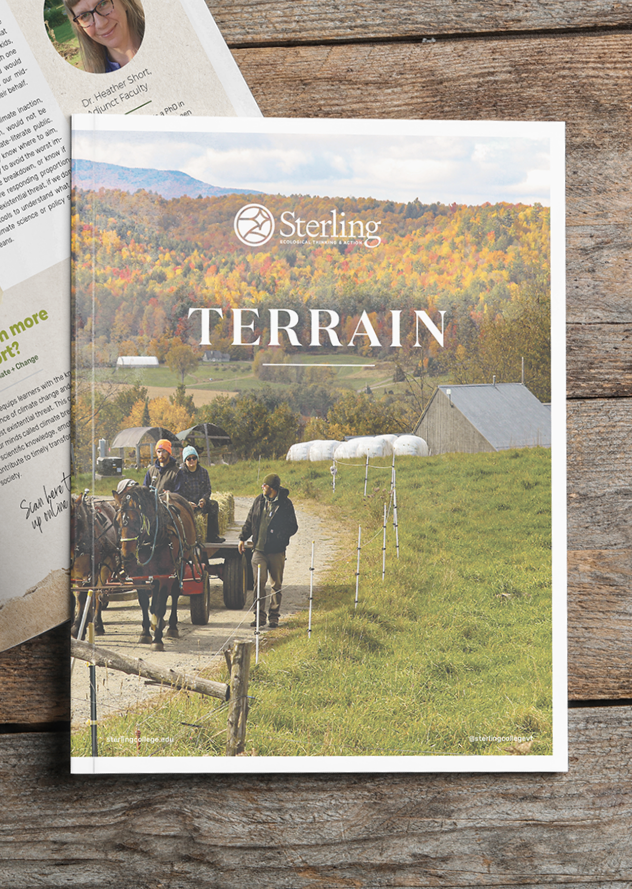
Terrain Annual Review
The terrain is both constant and ever-changing: the place where we actively and urgently engage in as our classroom.
Terrain is physical—the lay of the land—which impacts how water flows and soil forms and vegetation grows. Terrain can also be political, social, economical, and emotional.
Terrain is where we experience, reflect, learn, and act; the container for ecological thinking and action.
Student Mailer
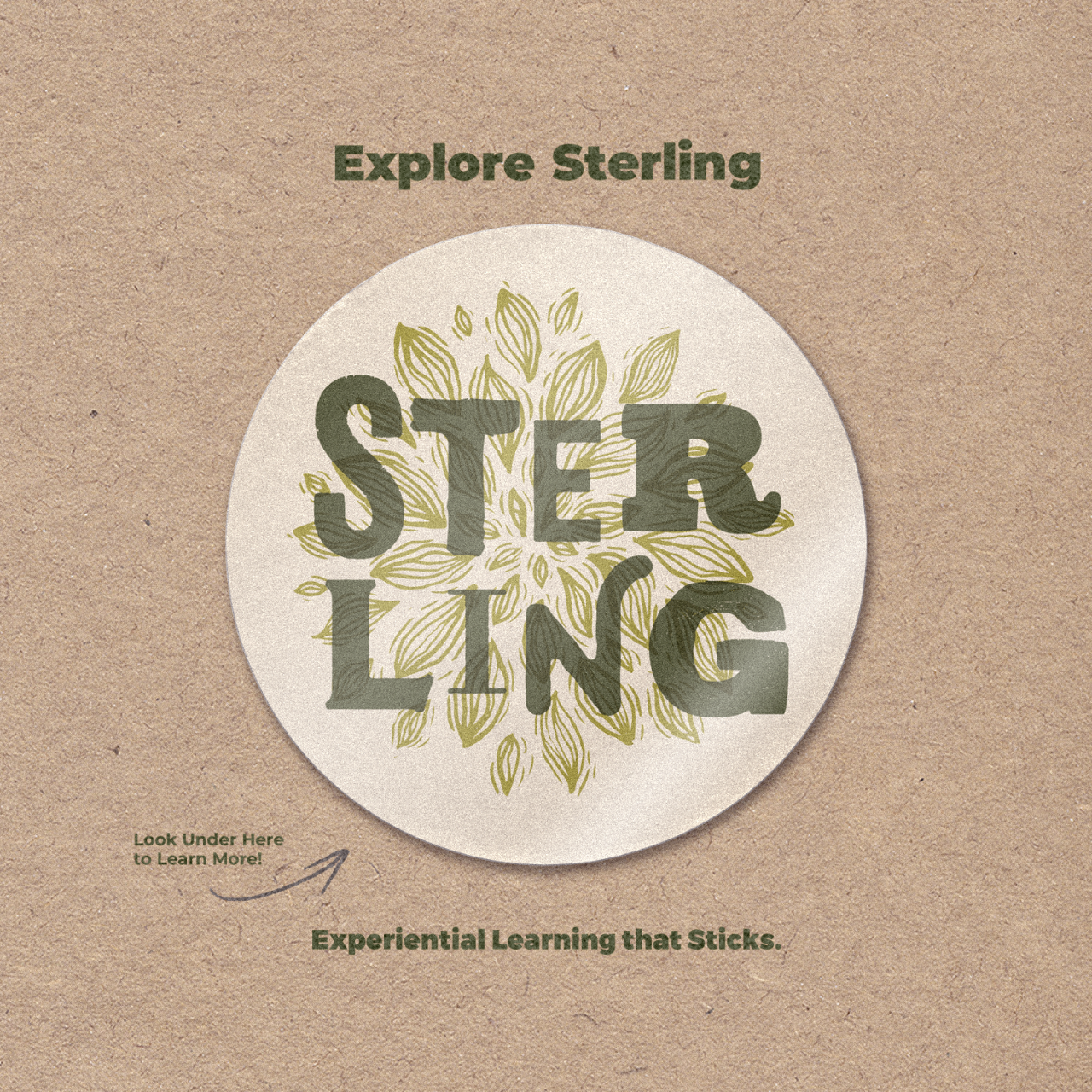
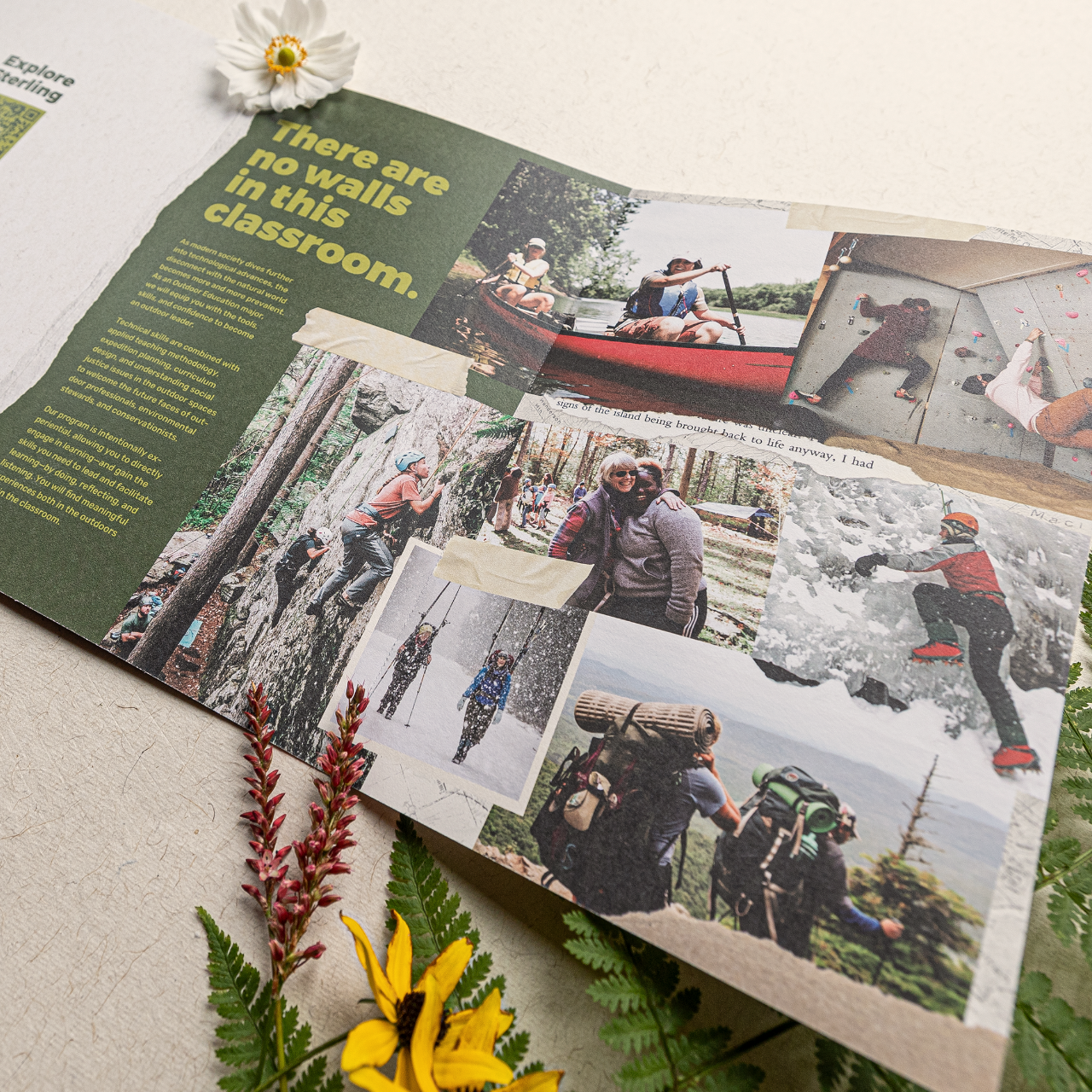
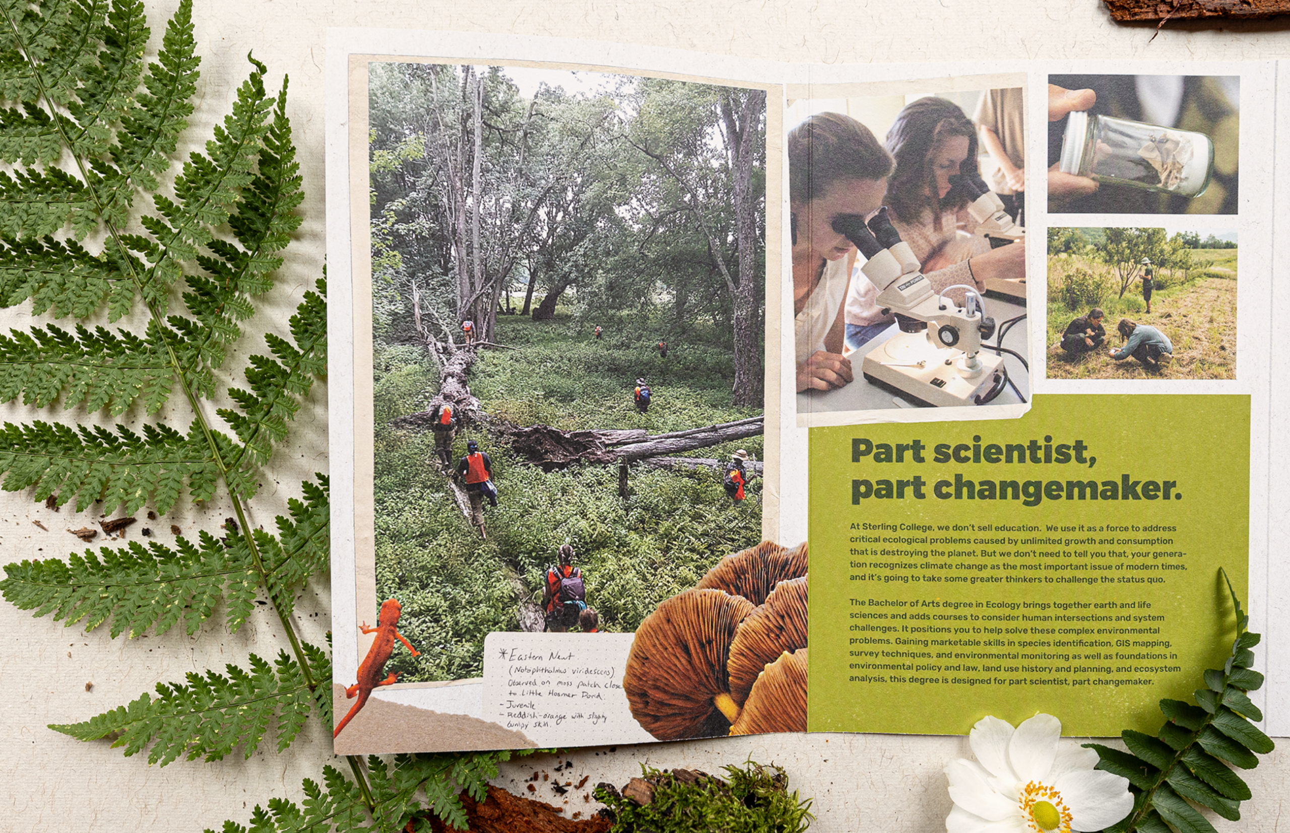
Concept, design, and development of an interactive print mailer designed to engage prospective students.
This 10-panel, self-folding piece features a built-in promotional sticker, a dynamic QR code linking to a personalized Sterling welcome landing page, and a perforated tear-away return postcard for students to request additional information about Sterling.
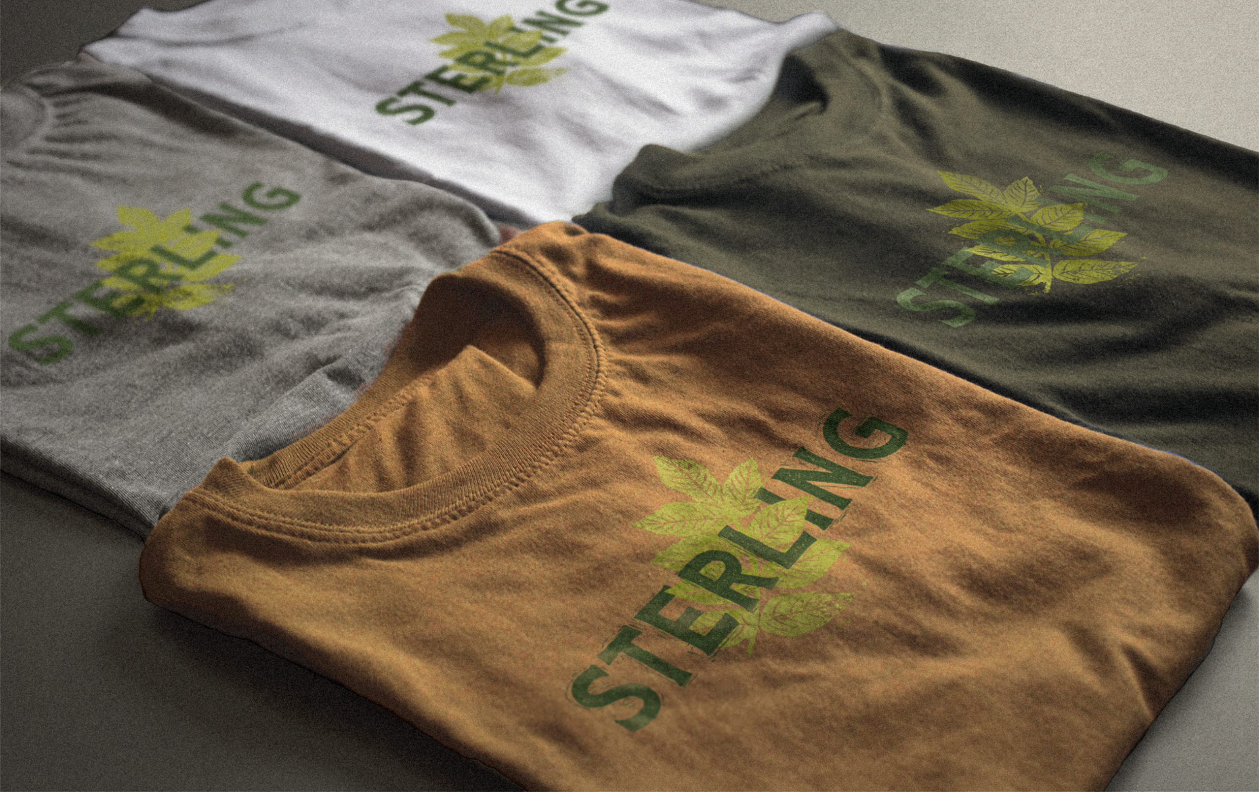
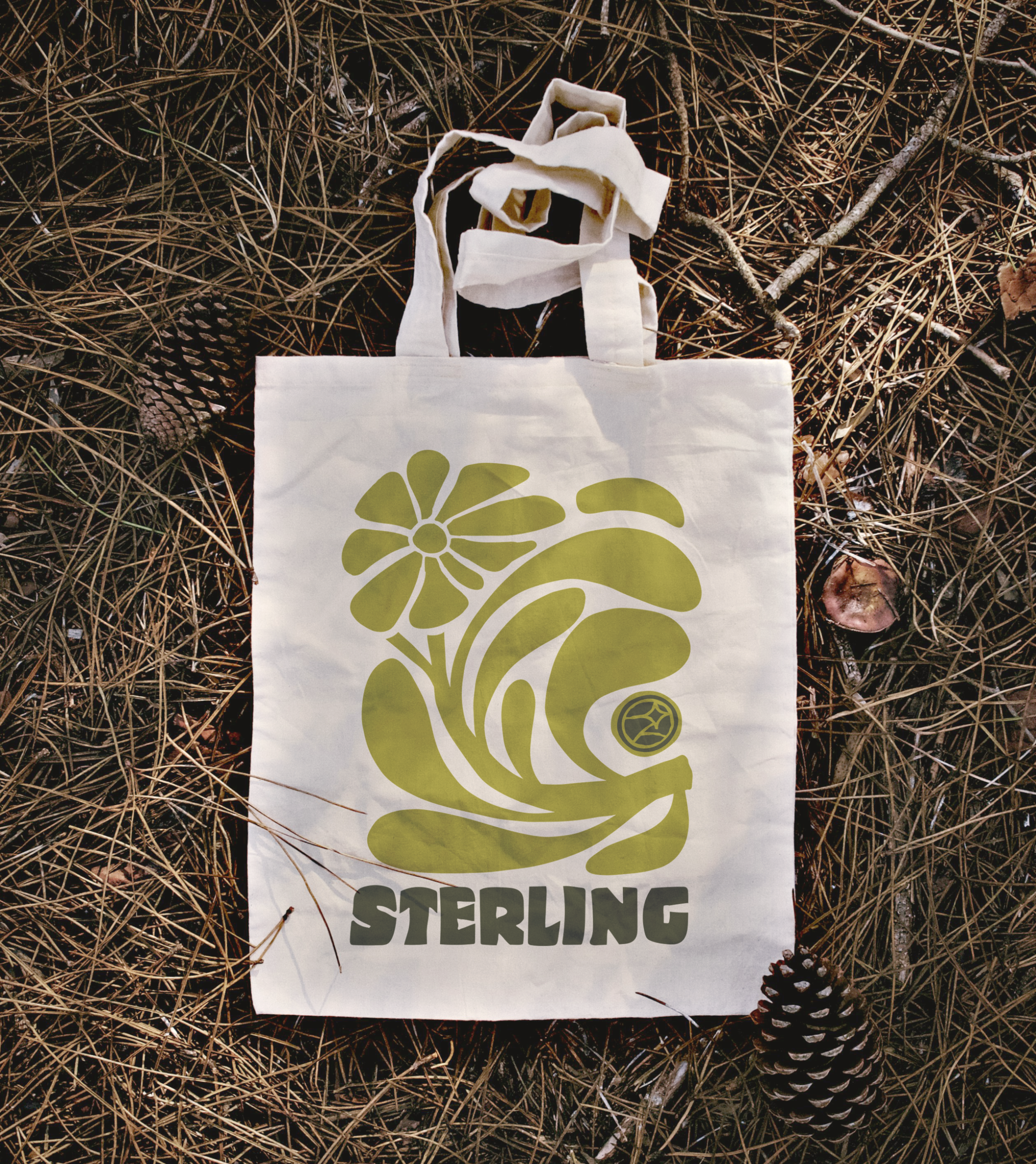
Sterling Swag
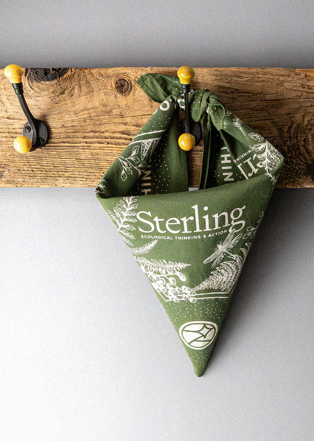
Sterling’s swag design reflects its deep-rooted commitment to environmental stewardship, hands-on learning, and community spirit.
Crafted to resonate with a diverse audience—from prospective students eager to embrace Sterling’s mission to alumnx proud of their alma mater—each piece of swag blends sustainability with style.
Apparel, accessories, and gear feature eco-friendly materials, organic fabrics, and ethically sourced production methods, reinforcing the dedication to responsible design.
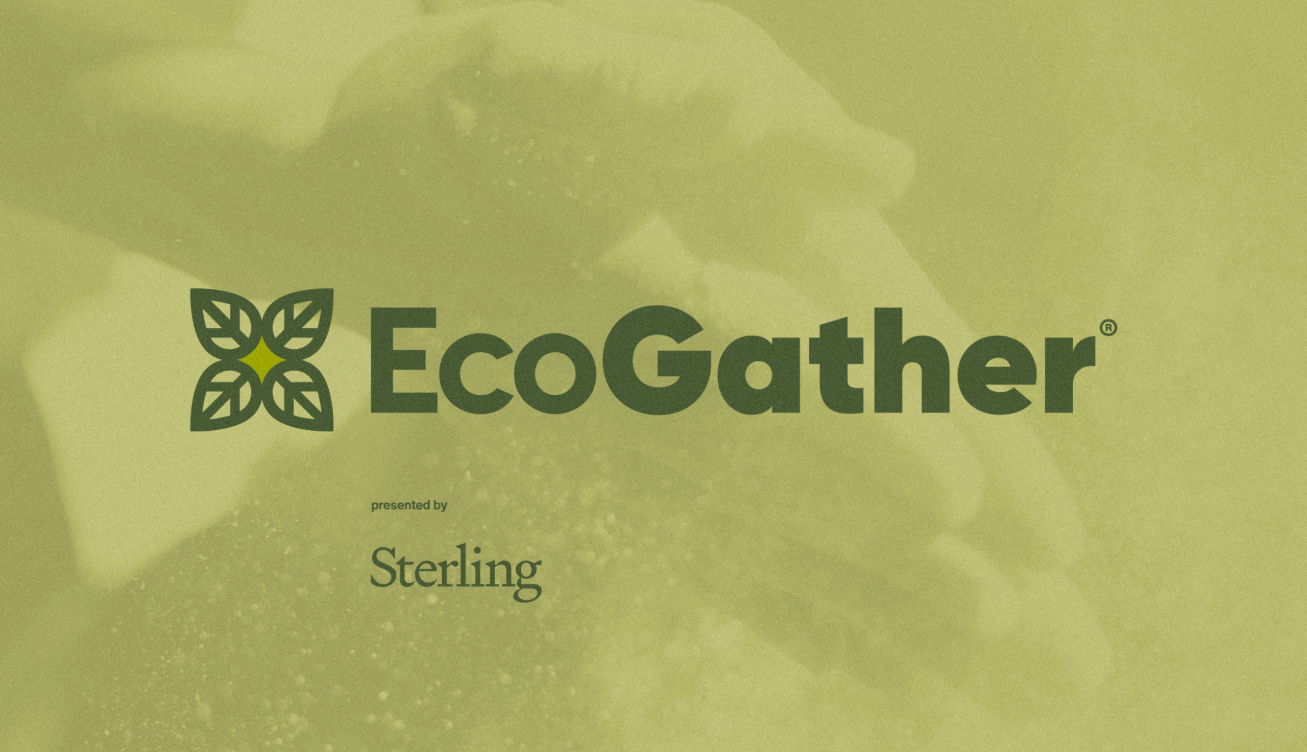
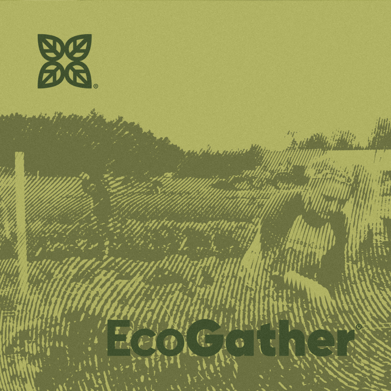
EcoGather
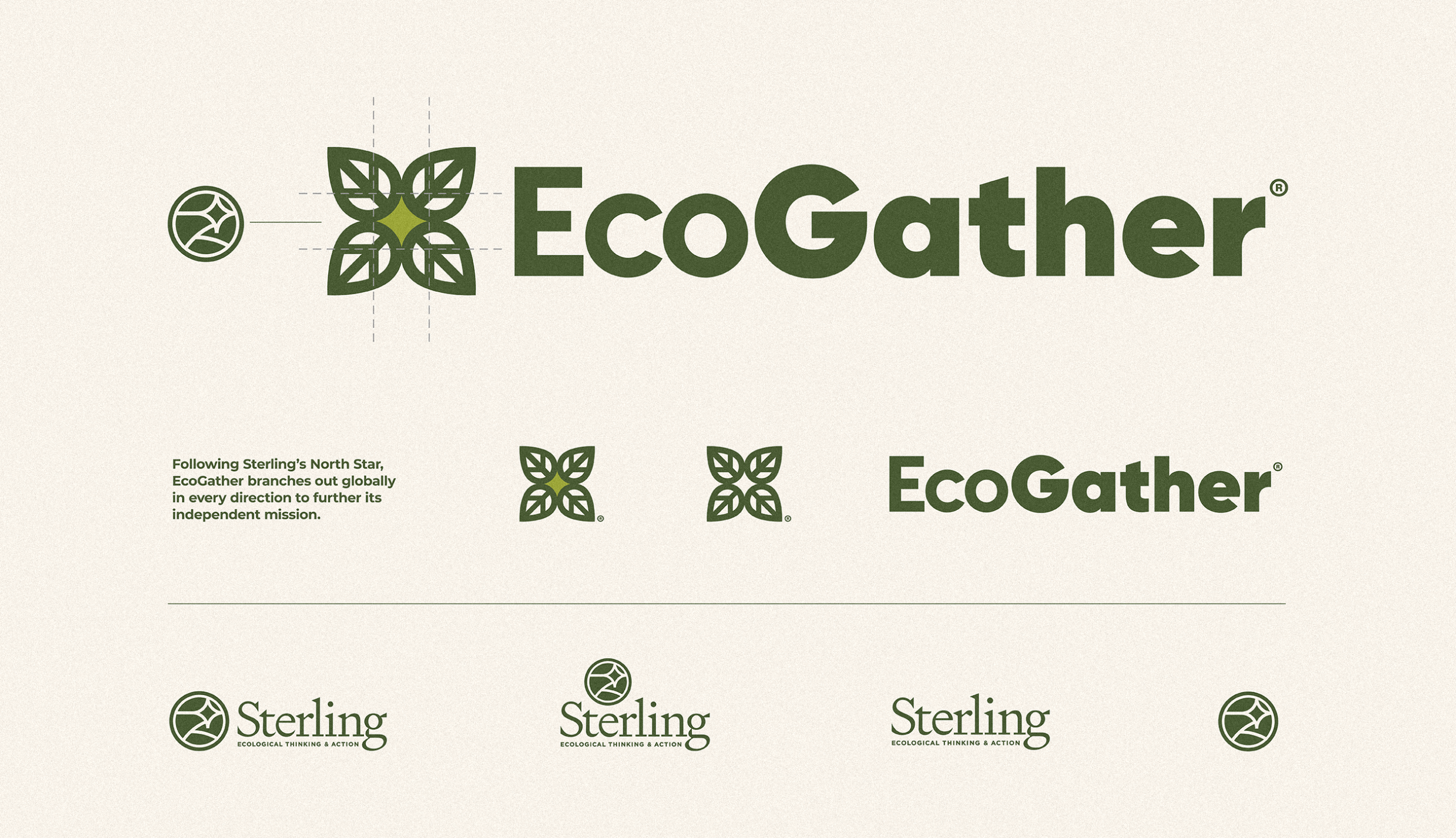
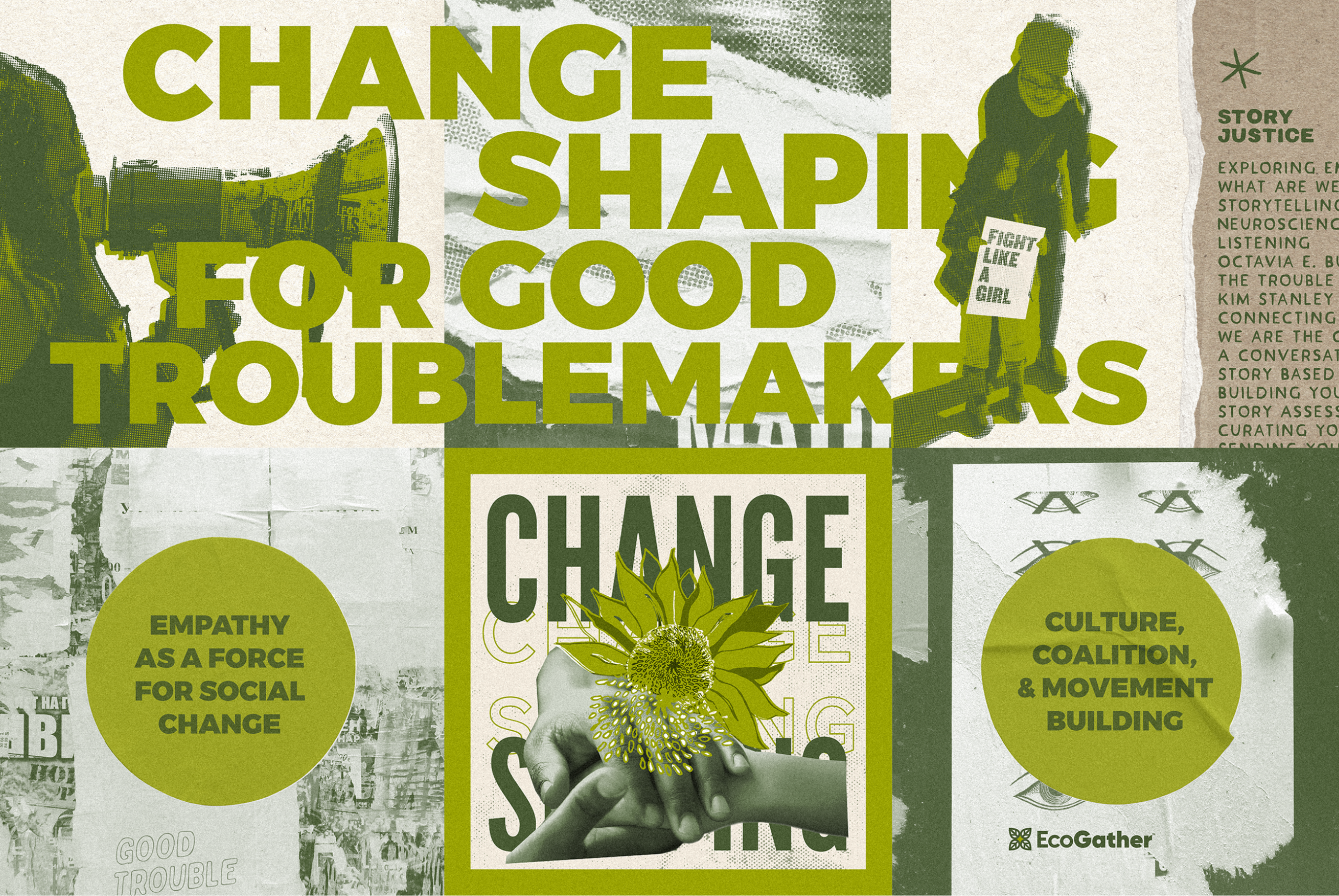
EcoGather, a groundbreaking program from Sterling College, needed a visual identity that reflected its deep commitment to ecological learning, community resilience, and systemic change. As a co-sensing and learning community, EcoGather fosters meaningful connections among individuals seeking to heal the earth and reclaim the human story.
Working closely with the EcoGather team to develop a brand that embodies its mission—one rooted in place-based traditions, agro-ecosystem vitality, and the pursuit of collective liberation. The result? A logo and visual system that not only communicates hope and transformation but also inspires engagement within a global network of changemakers.
By weaving together natural elements, organic forms, and a warm yet modern aesthetic, the EcoGather identity reflects the program’s role as a catalyst for change. Through courses, gatherings, and shared resources, EcoGather provides a space where individuals can explore, learn, and take action within their communities.
The final design serves as more than just a logo—it’s a symbol of possibility, collaboration, and the transition toward well-being economies.
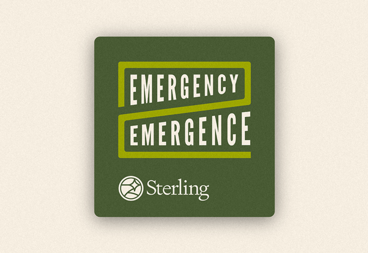
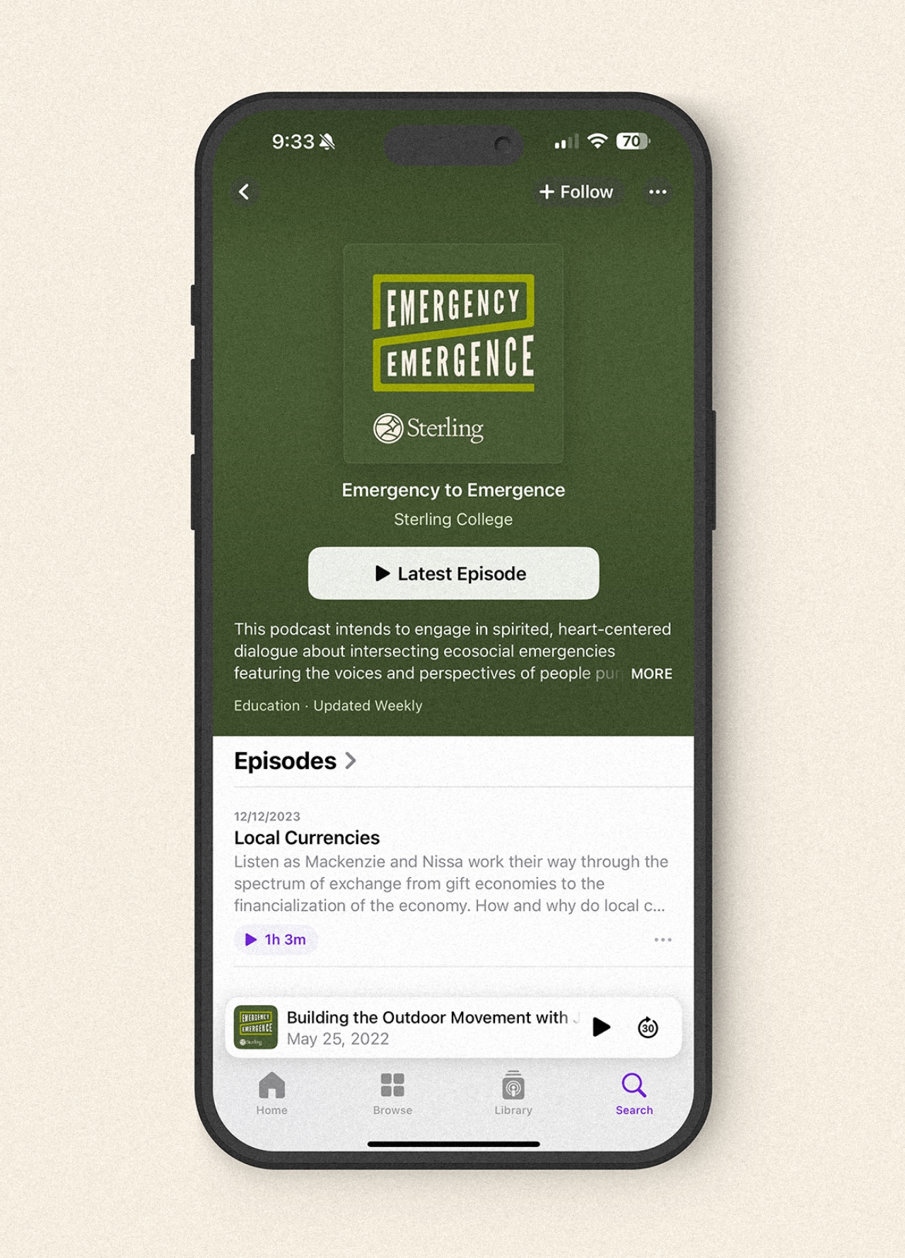
Emergency to Emergence
Designing a Visual Identity for Ecological Dialogue The Emergency to Emergence podcast needed branding that captured its mission—fostering heart-centered conversations on ecosocial crises and community-driven solutions.
Our design balances urgency and optimism, using dynamic visuals and organic elements to reflect both awareness and action. From the logo to supporting assets, we created a cohesive identity that amplifies the podcast’s reach and reinforces its role as a catalyst for hope, resilience, and change.