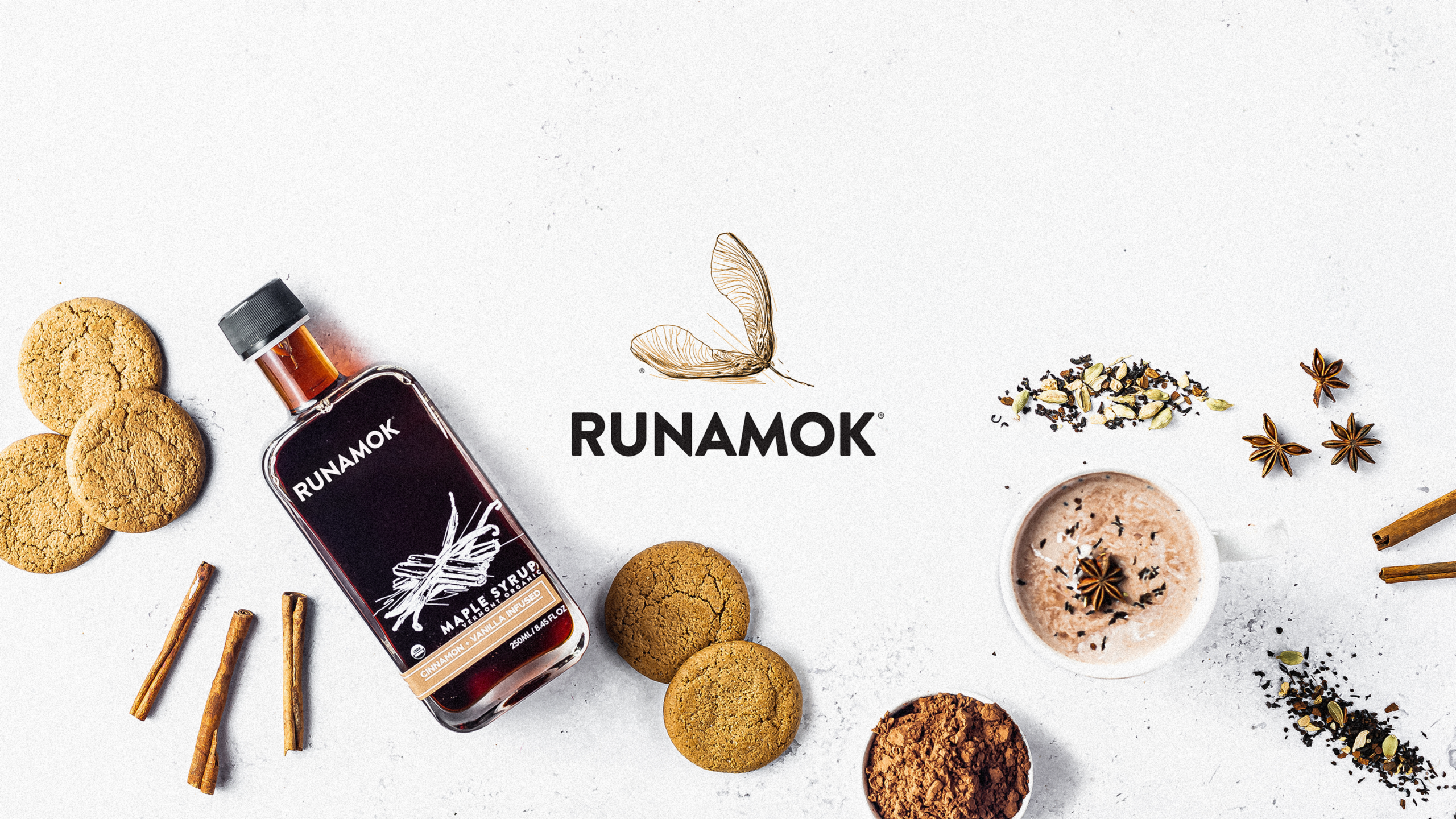
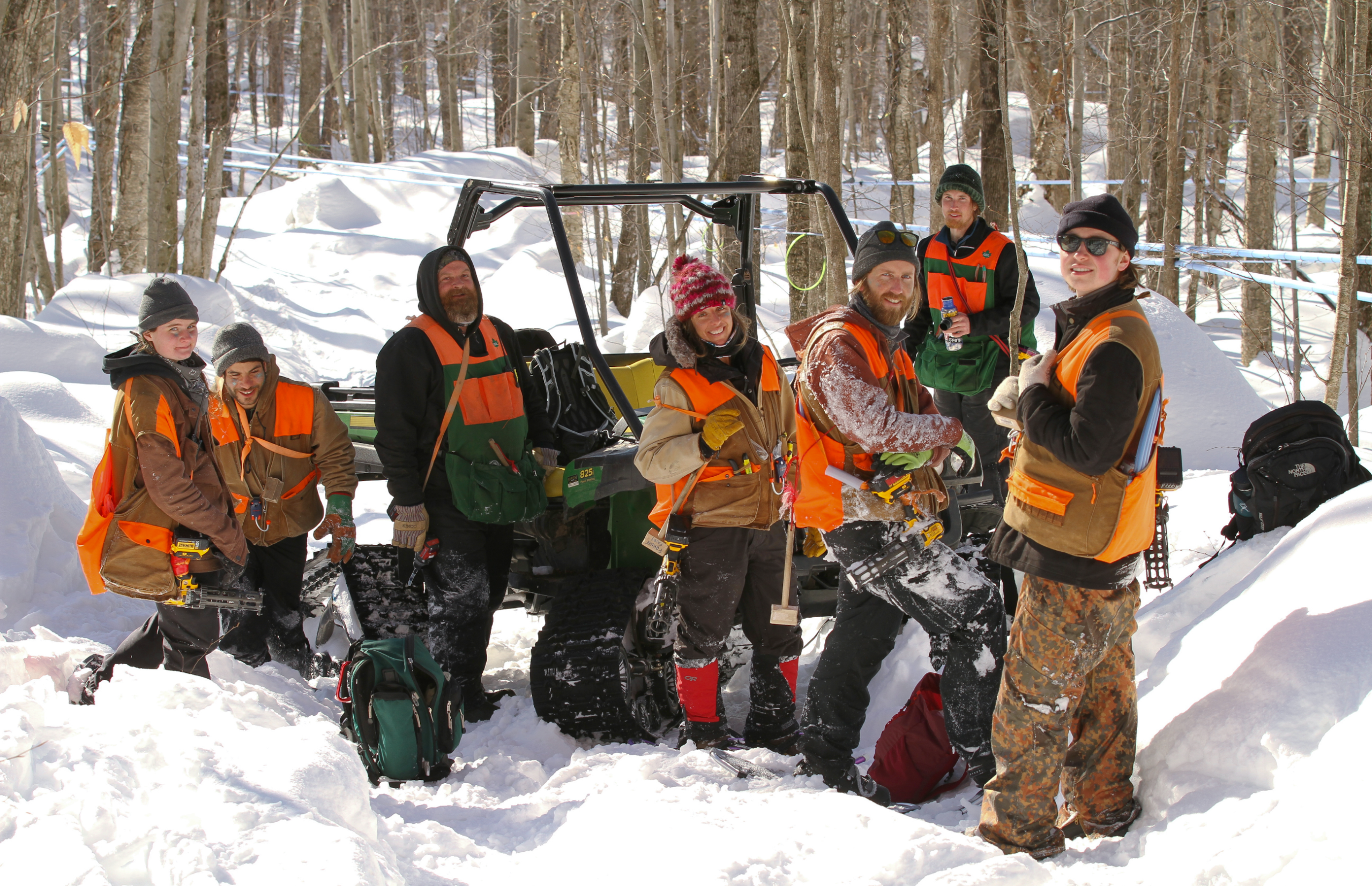
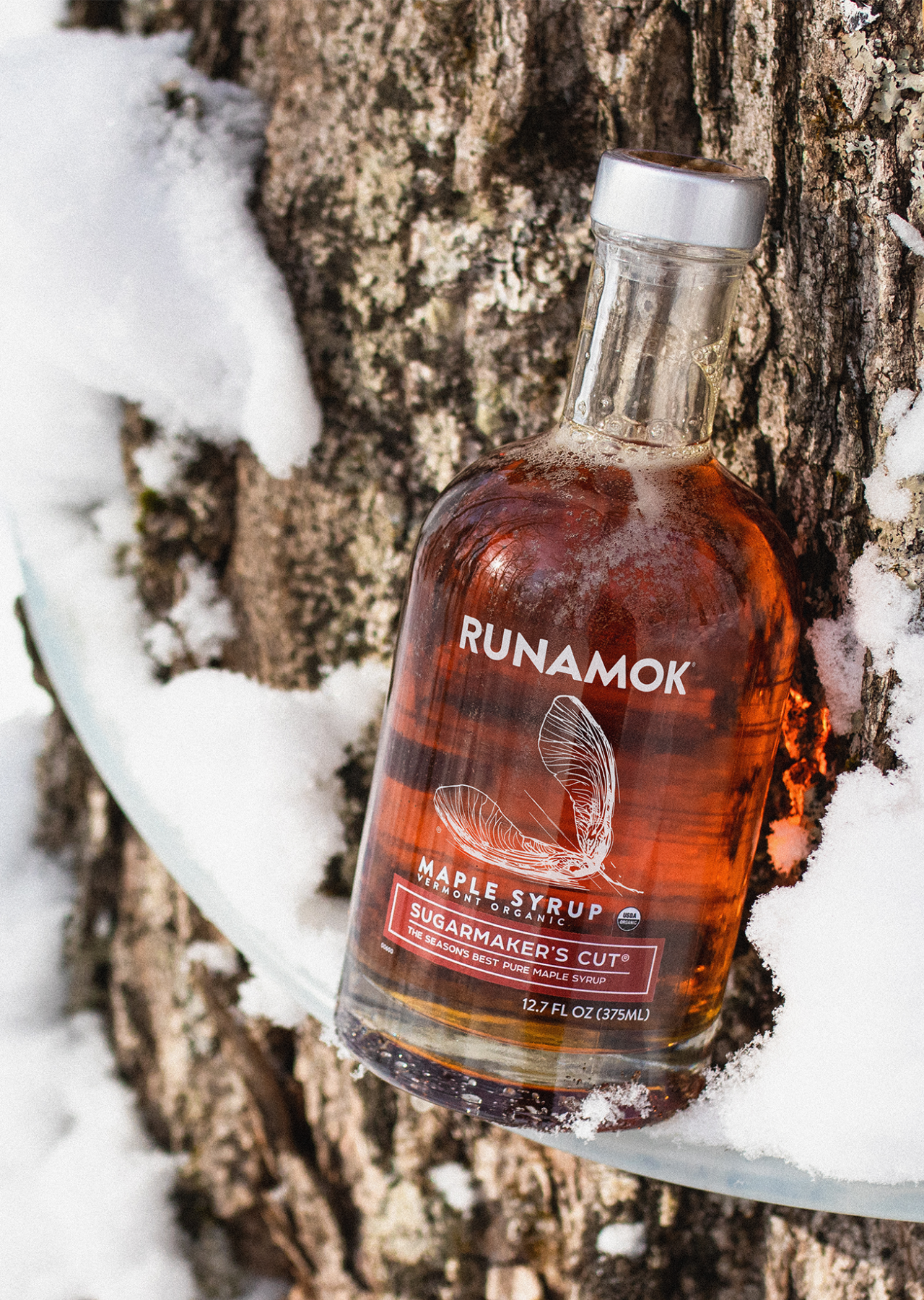
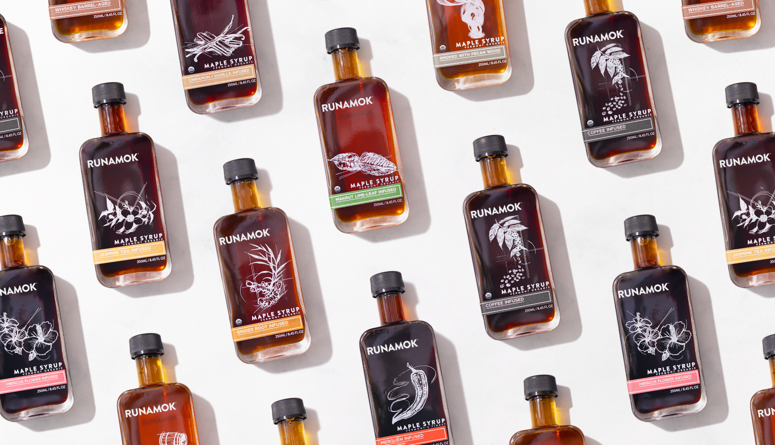
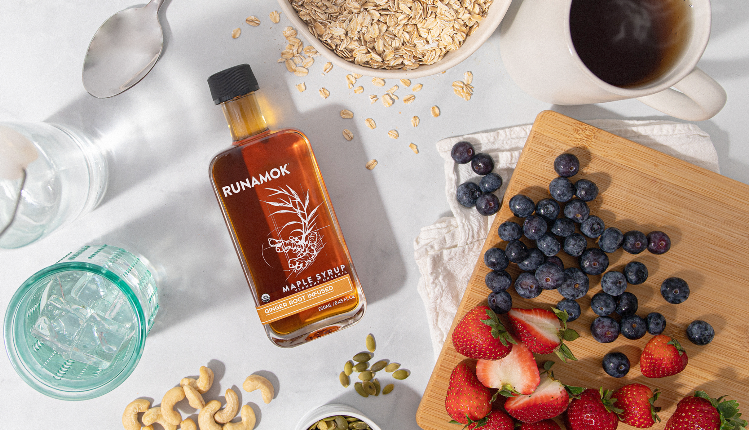
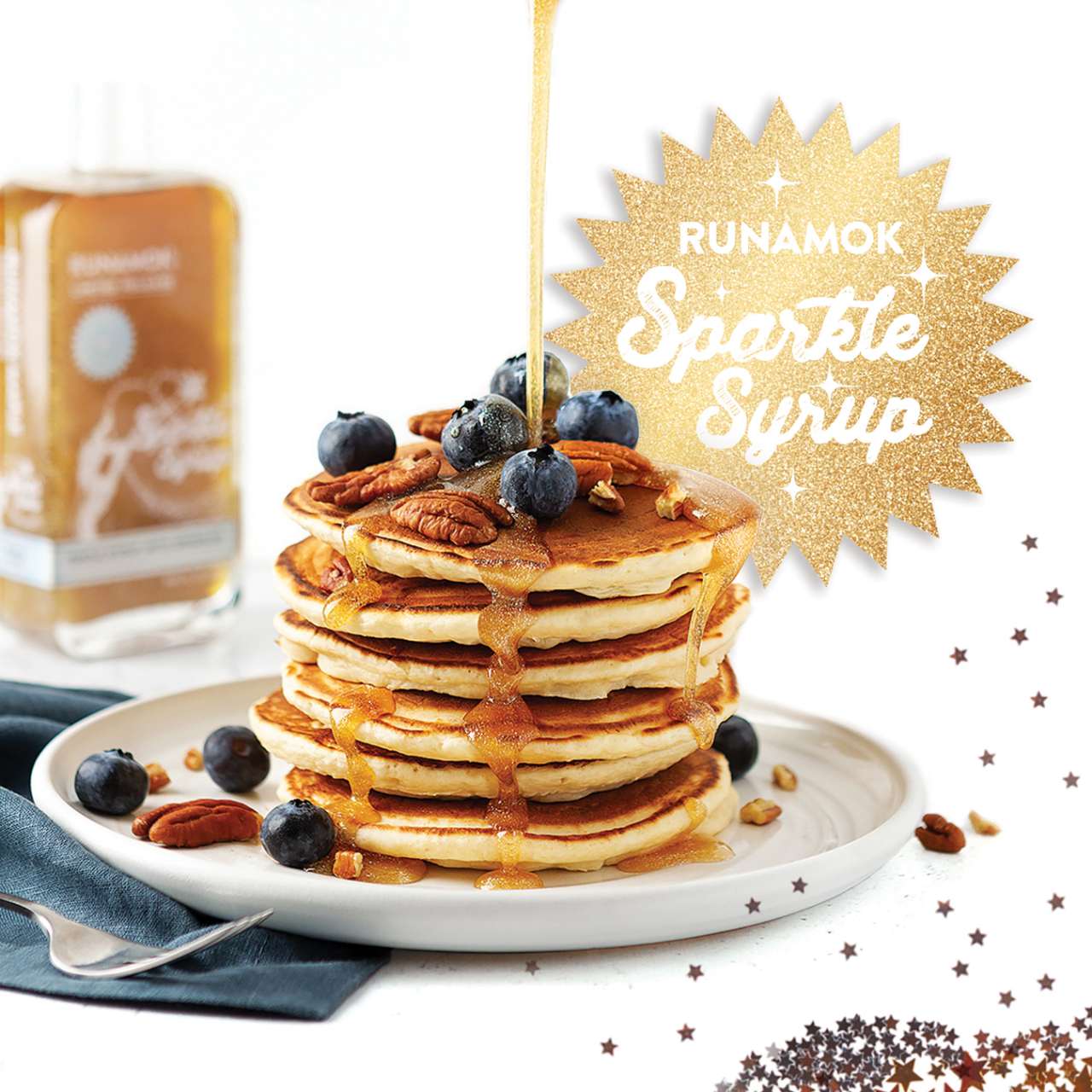
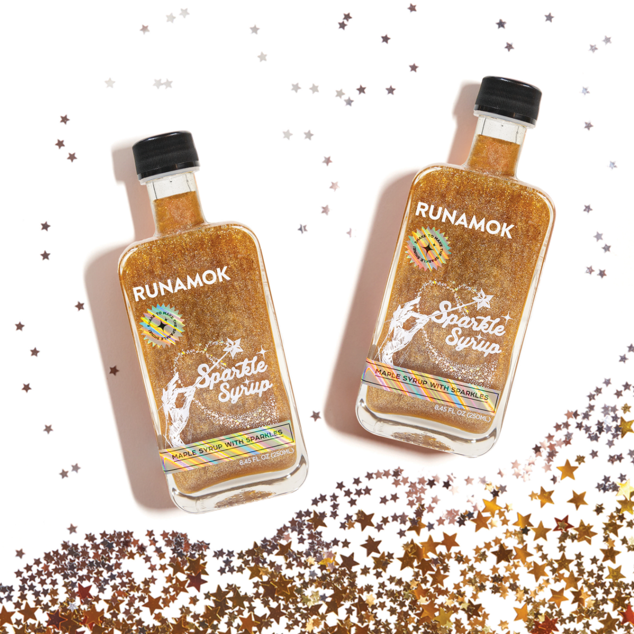
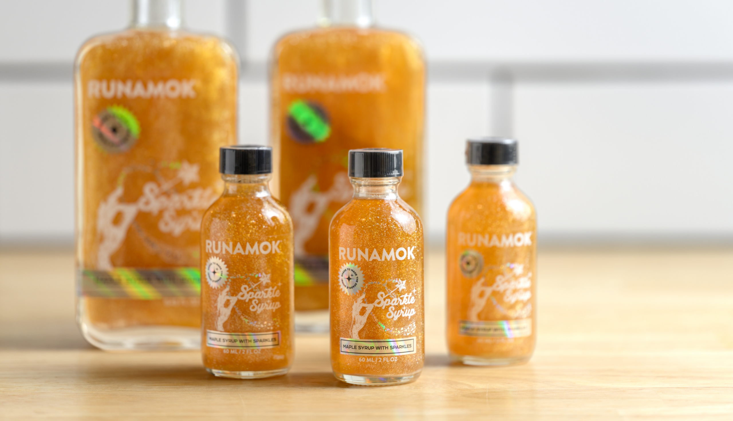
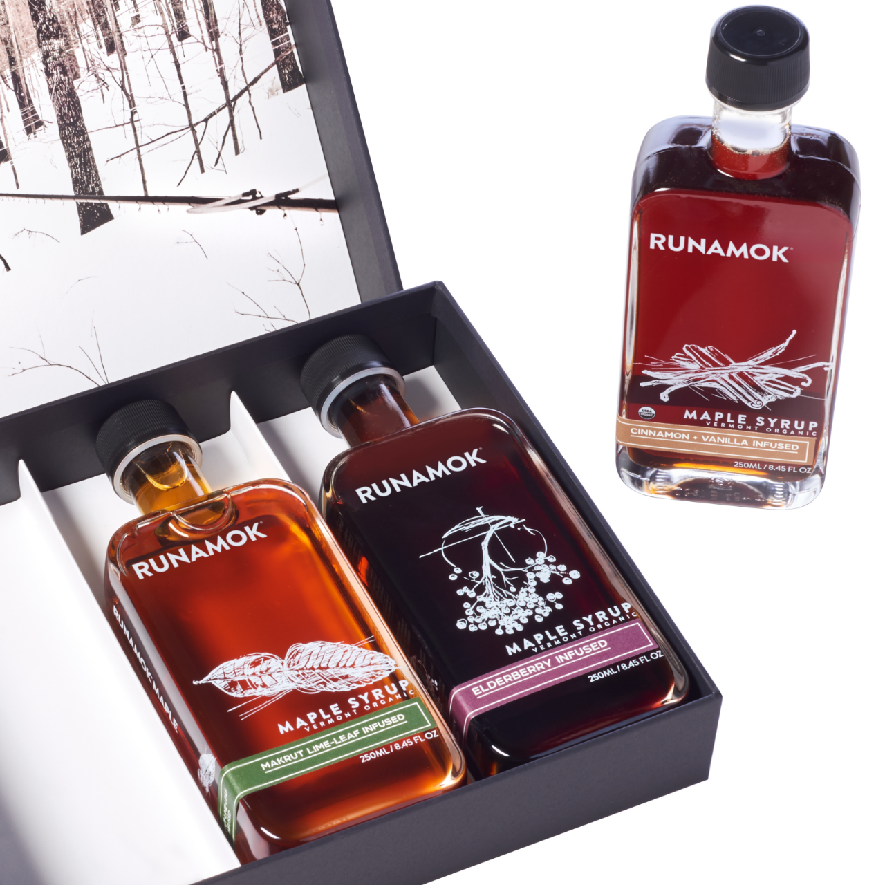
Nestled in the heart of Vermont, Runamok Maple began tapping their primary Cambridge sugarbush in 2009. Runamok’s premium organic traditional, barrel-aged, and infused maple syrup offerings garnered rapid success at the breakfast table and beyond.
From the beginning, Runamok has focused on creating a unique maple syrup product and brand with elegant packaging, innovative flavor profiles, and the highest-quality ingredients. As Runamok aimed to elevate the brand beyond the breakfast table, they expanded the core maple product line to include maple-based cocktail mixers, bitters, and unique raw, infused varietal, hot, and smoky honey.
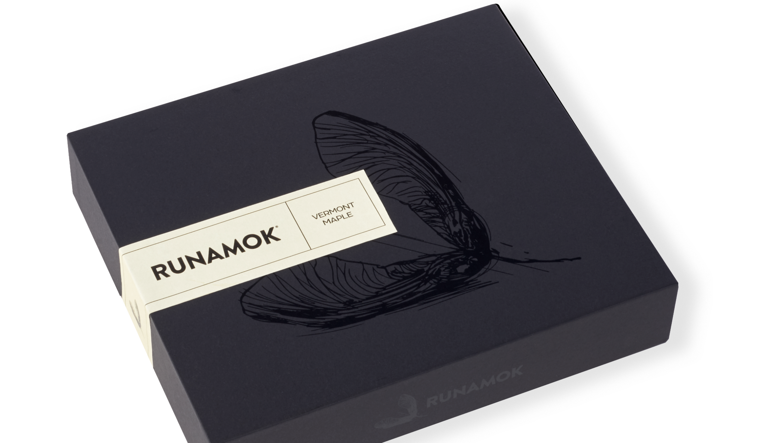
Central to this evolution was the strategic redesign of their logo, transitioning from “Runamok Maple” to simply “Runamok,” signaling the brand’s growth and versatility. Ten Acre designed and developed a packaging and label design suite that blends elegance with functionality, ensuring each product—whether maple syrup or cocktail bitters—feels distinctly part of the Runamok family. The reimagined brand system reinforces Runamok’s legacy and positions them to thrive in a broader marketplace with a robust and recognizable presence.
Maple Mixologist
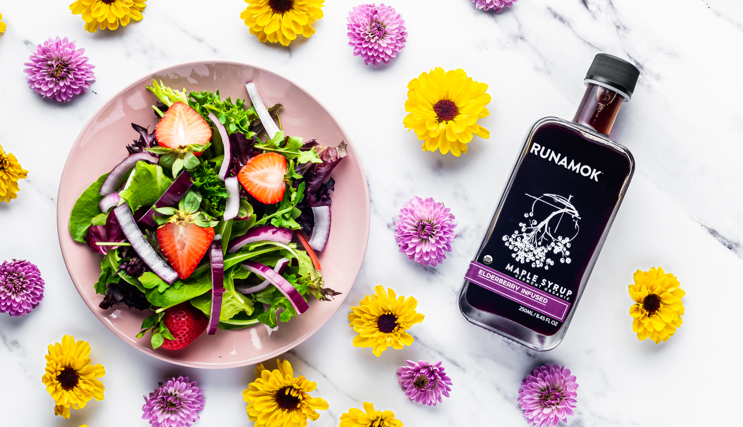
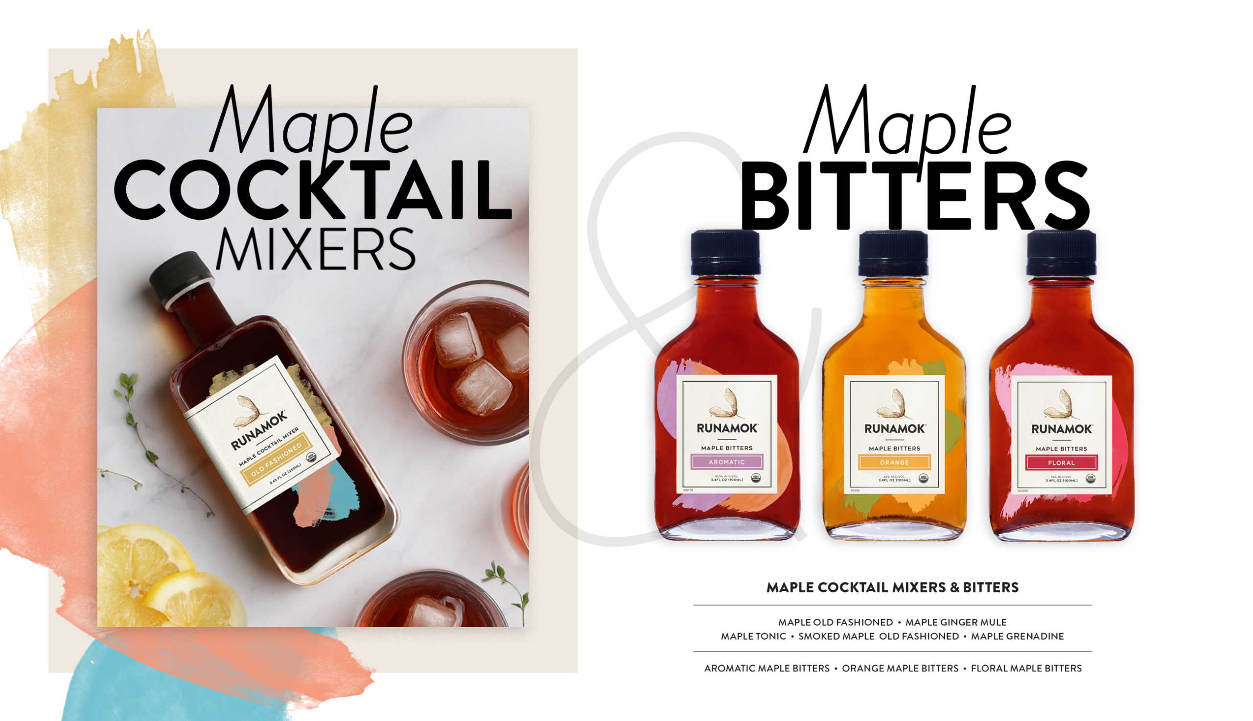
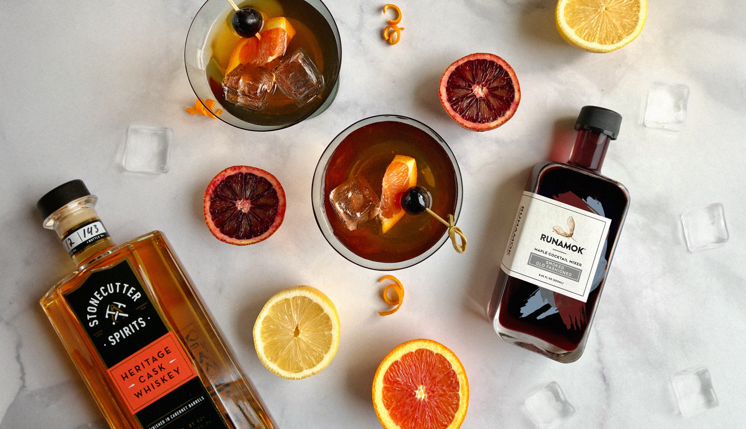
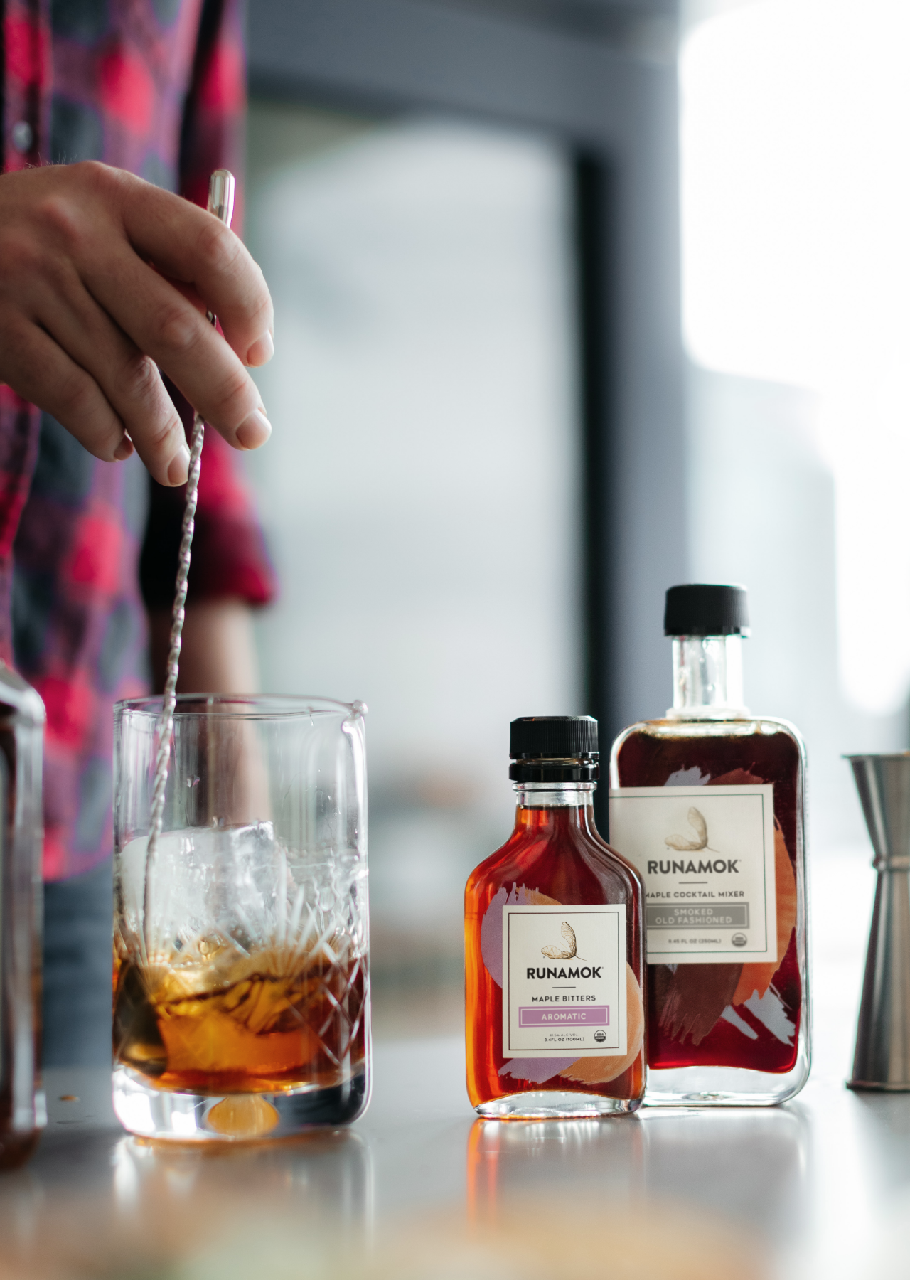
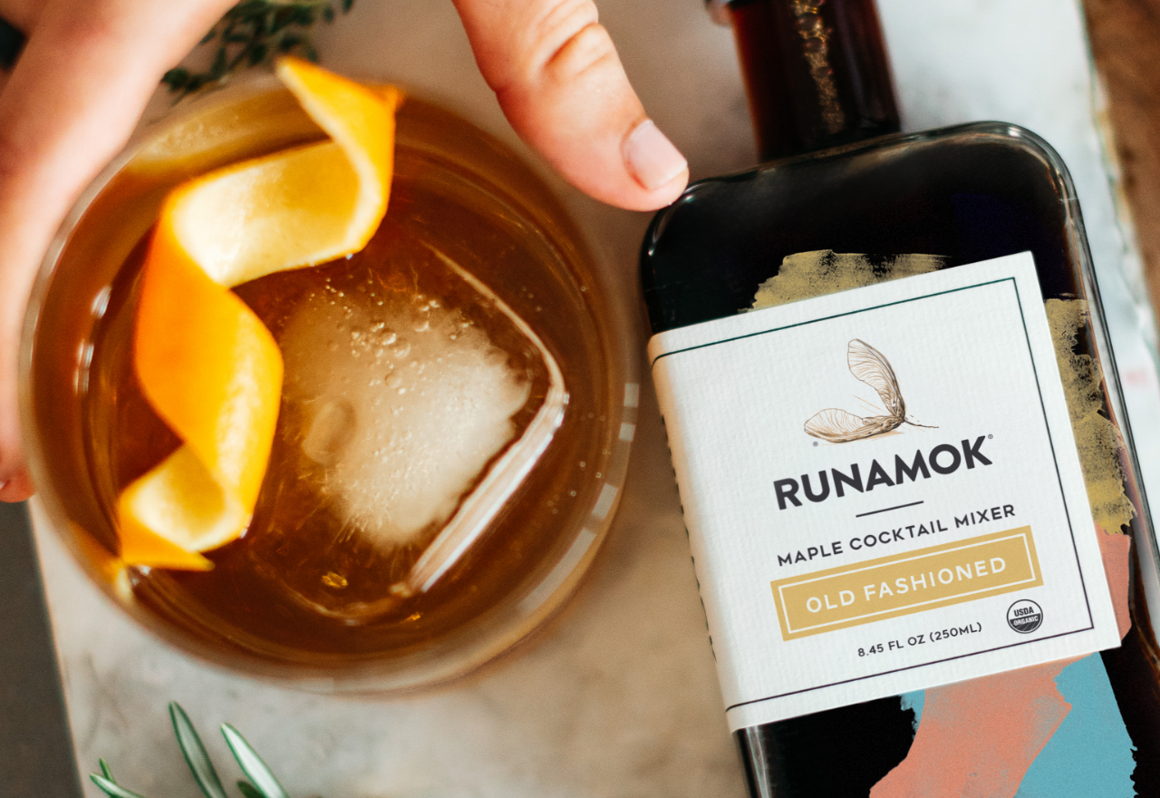
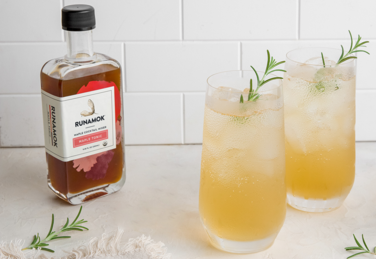
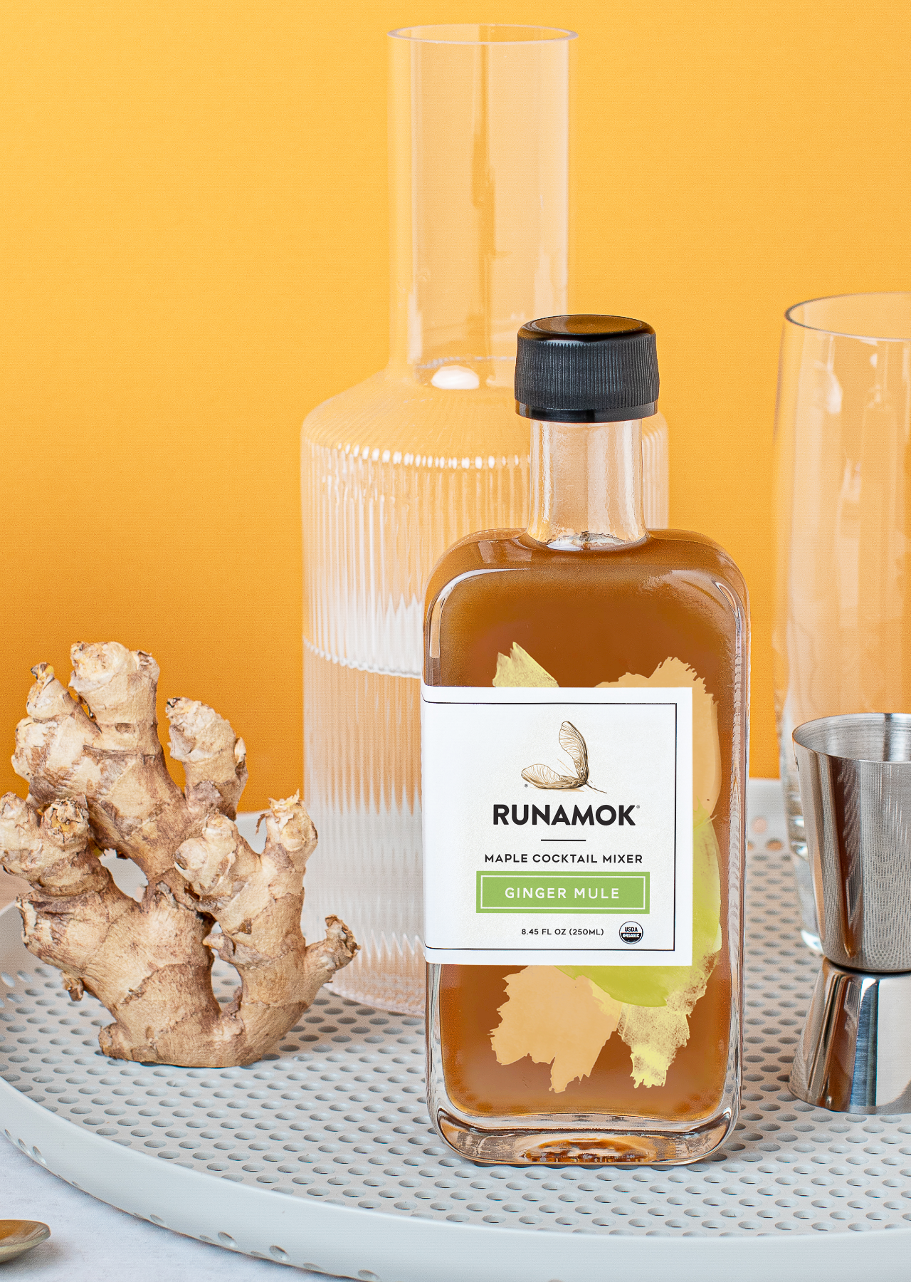
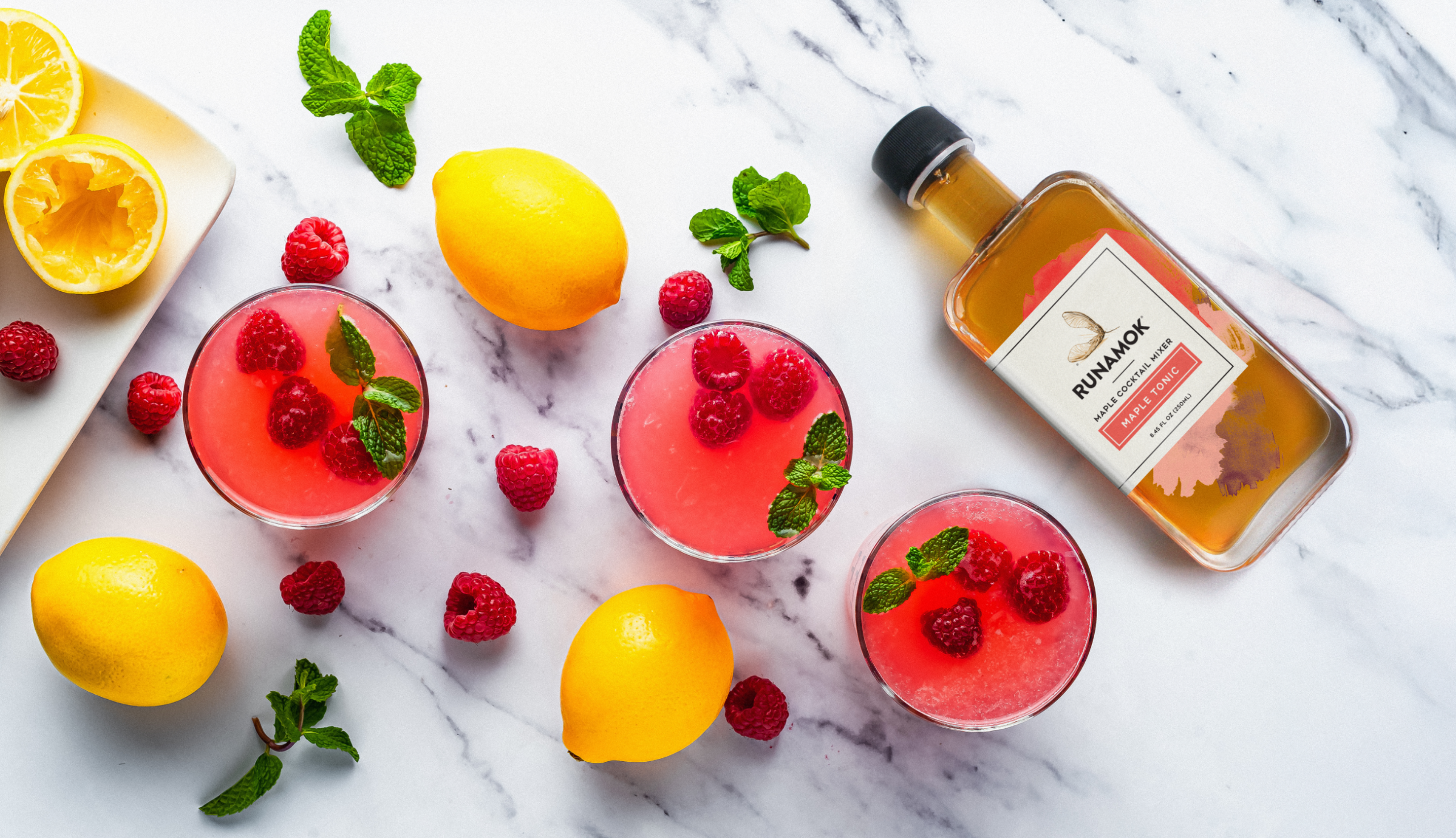
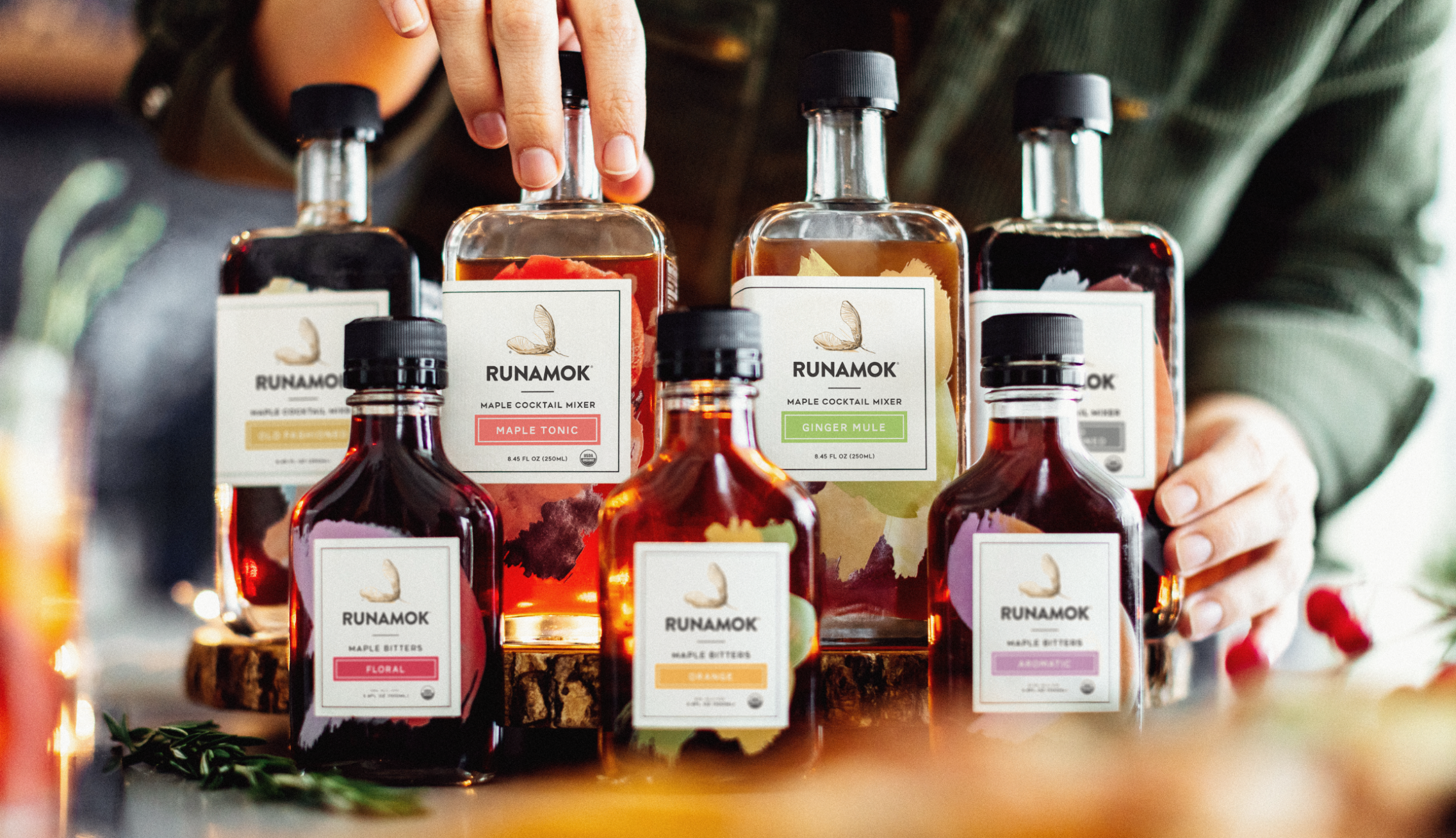
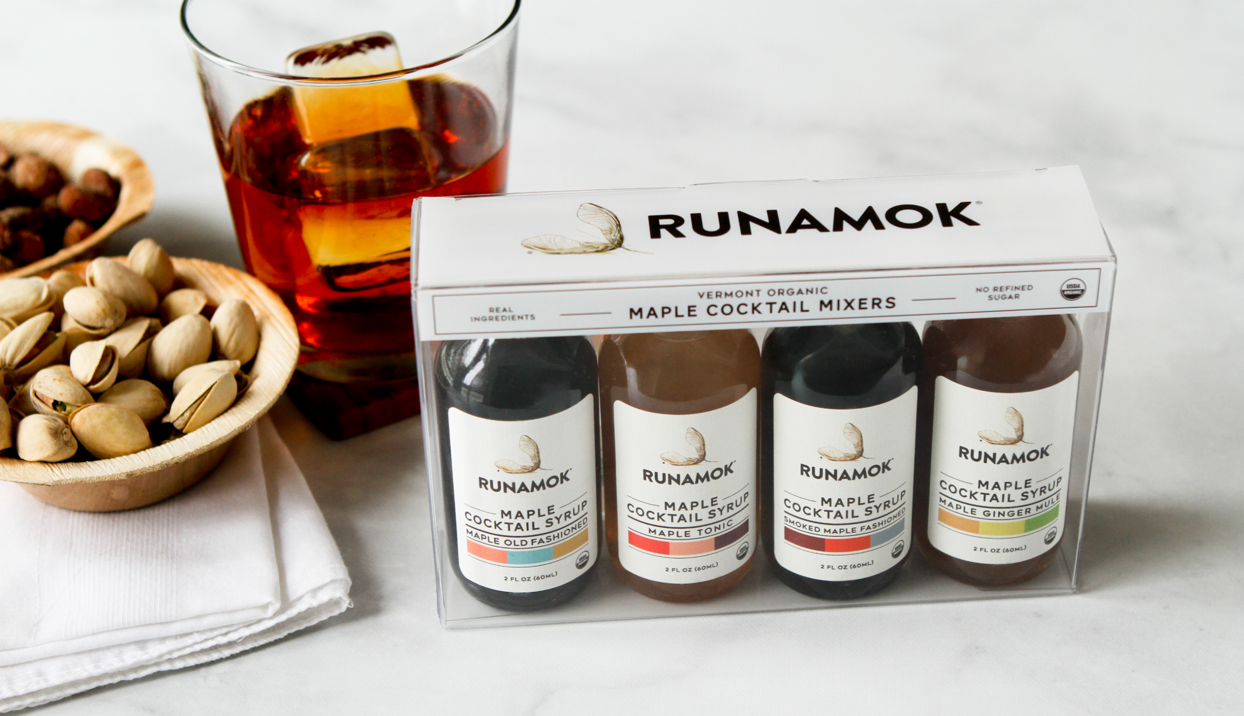
Runamok’s line of maple-based cocktail mixers and bitters provides an easy way to craft some of your favorite cocktails at home. In true Runamok fashion, the cocktail mixers and bitters are made with real herbs and spices infused in pure maple syrup – no refined sugars, no additives.
Runamok’s high-level ingredient focus led to the creative inspiration for the mixers and bitters label designs. Each product is identified by its unique set of ingredient colors that represent the mixologist’s blending process of flavors and colors. The product line is a fun and delicious addition to the Runamok family of maple magic.
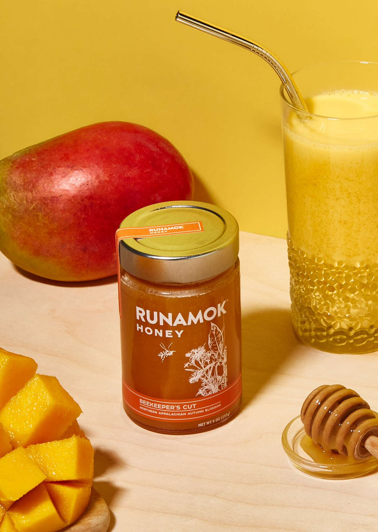
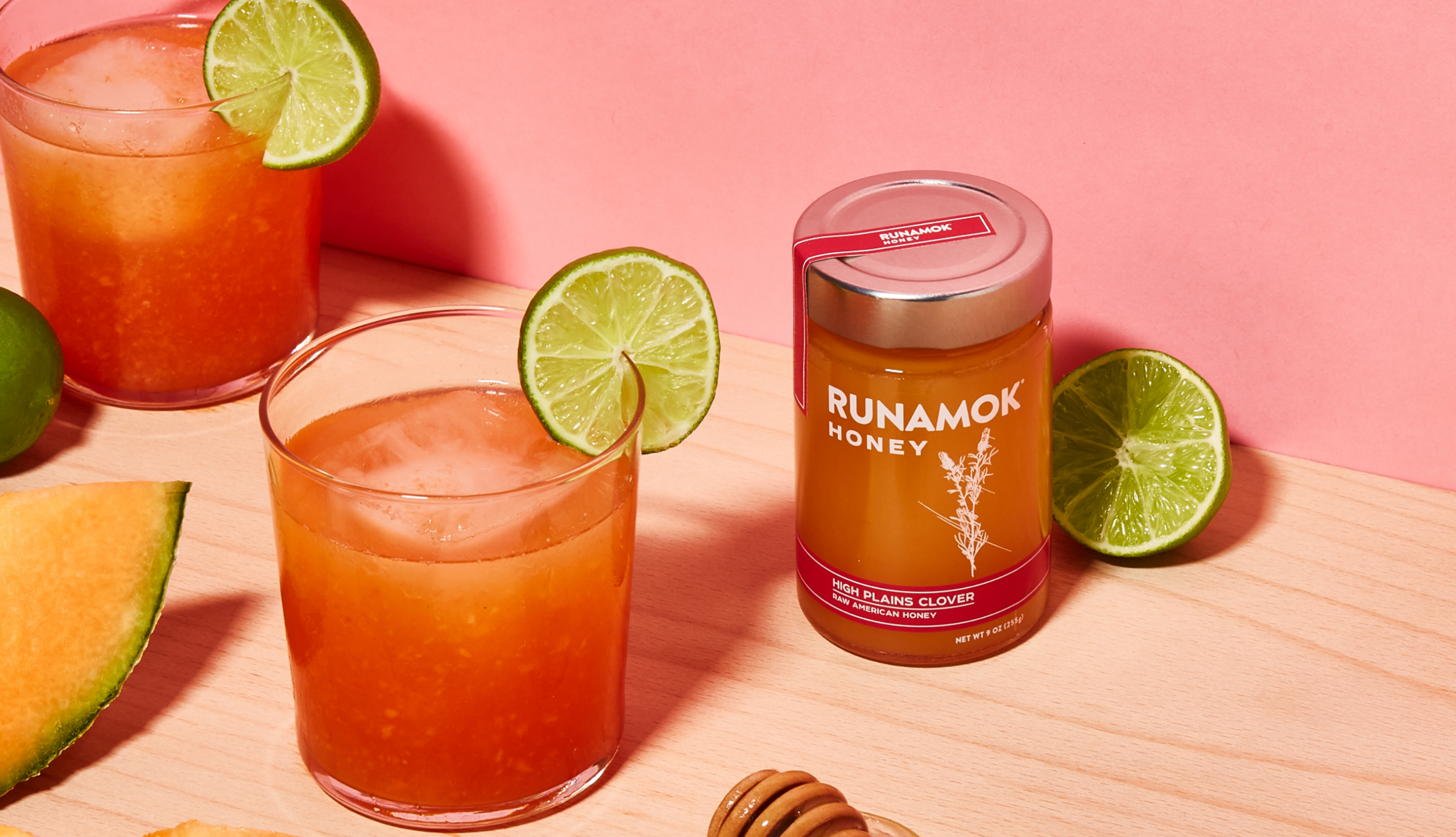
Raw & Infused Honey
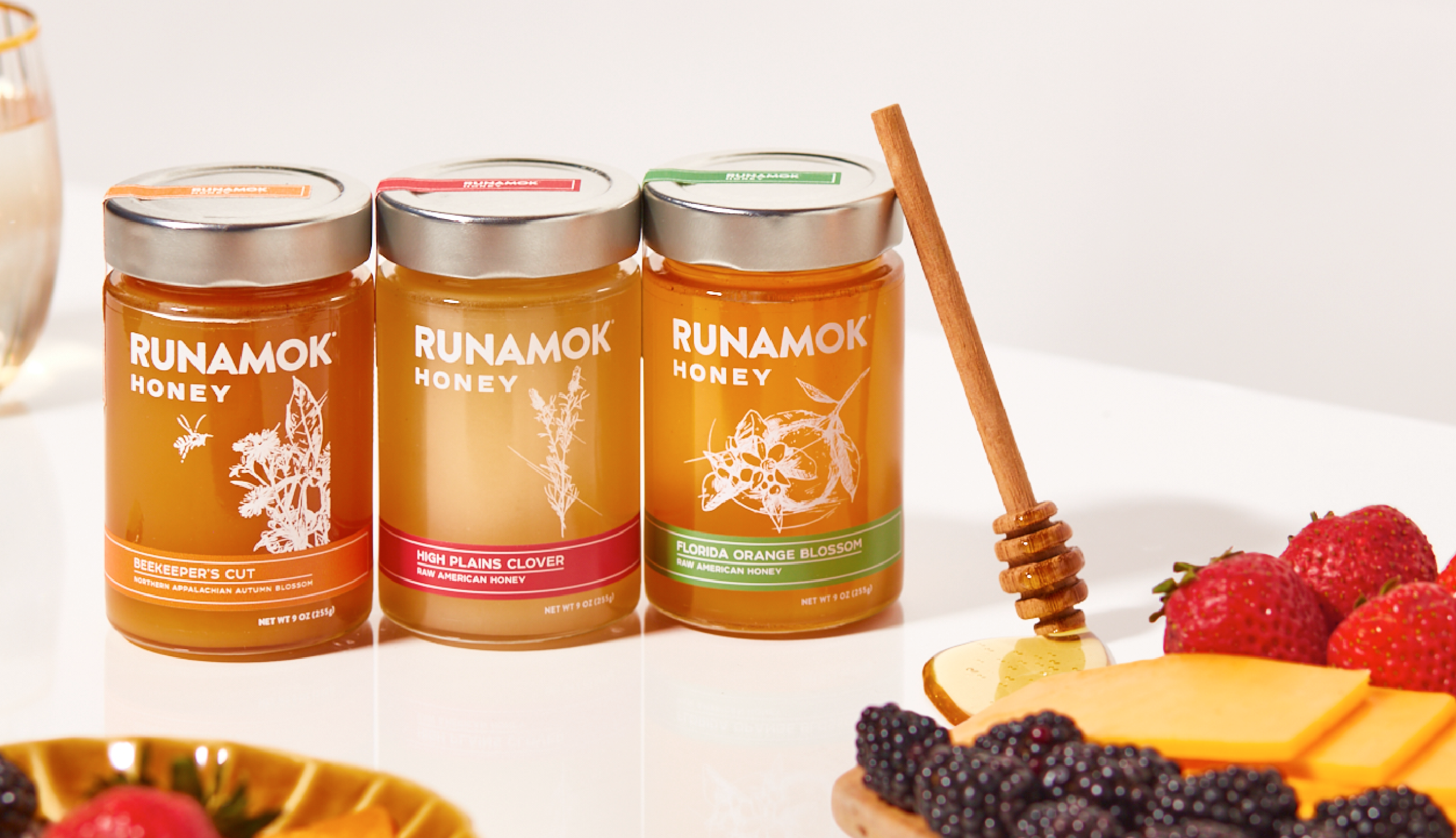
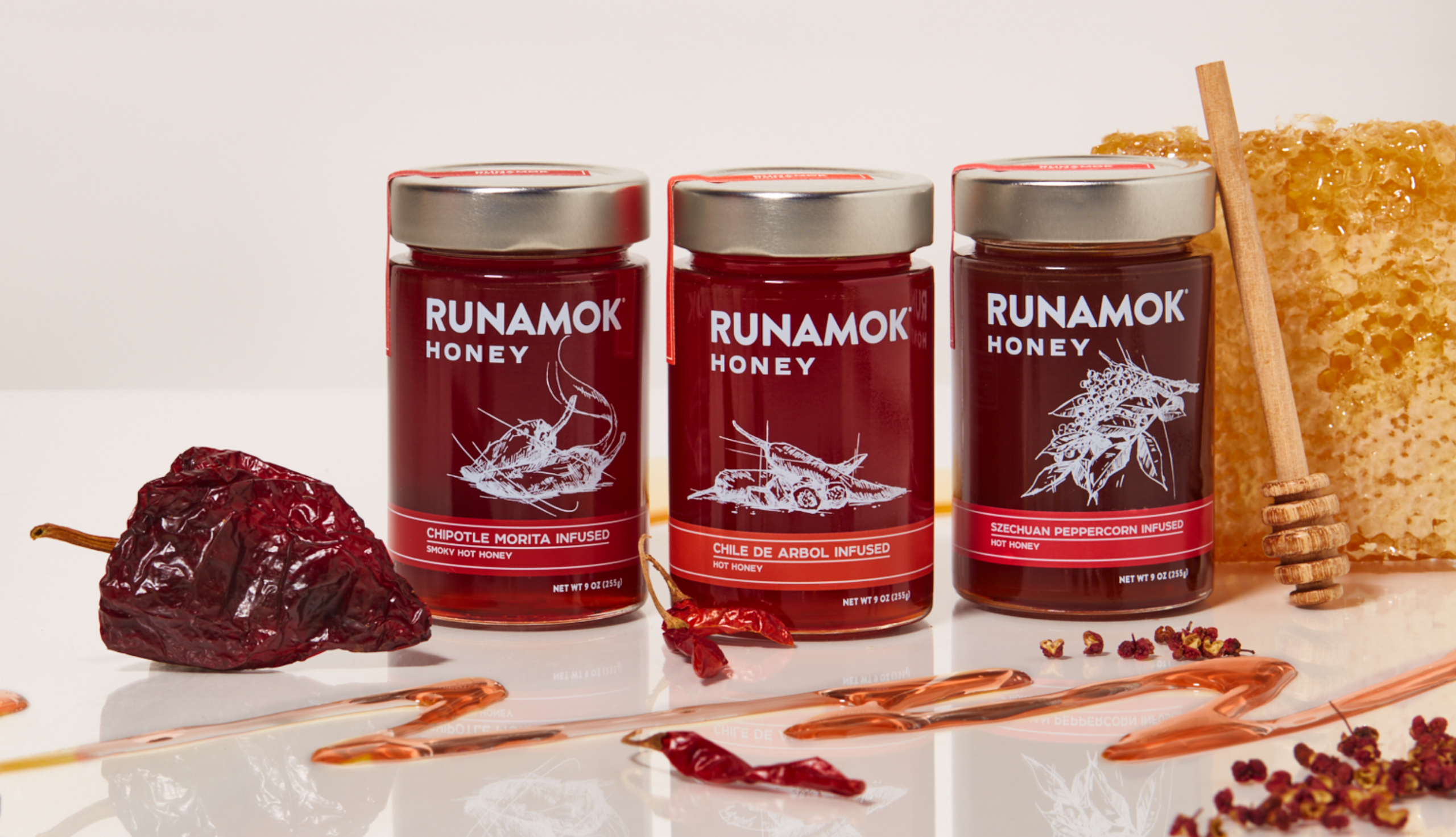
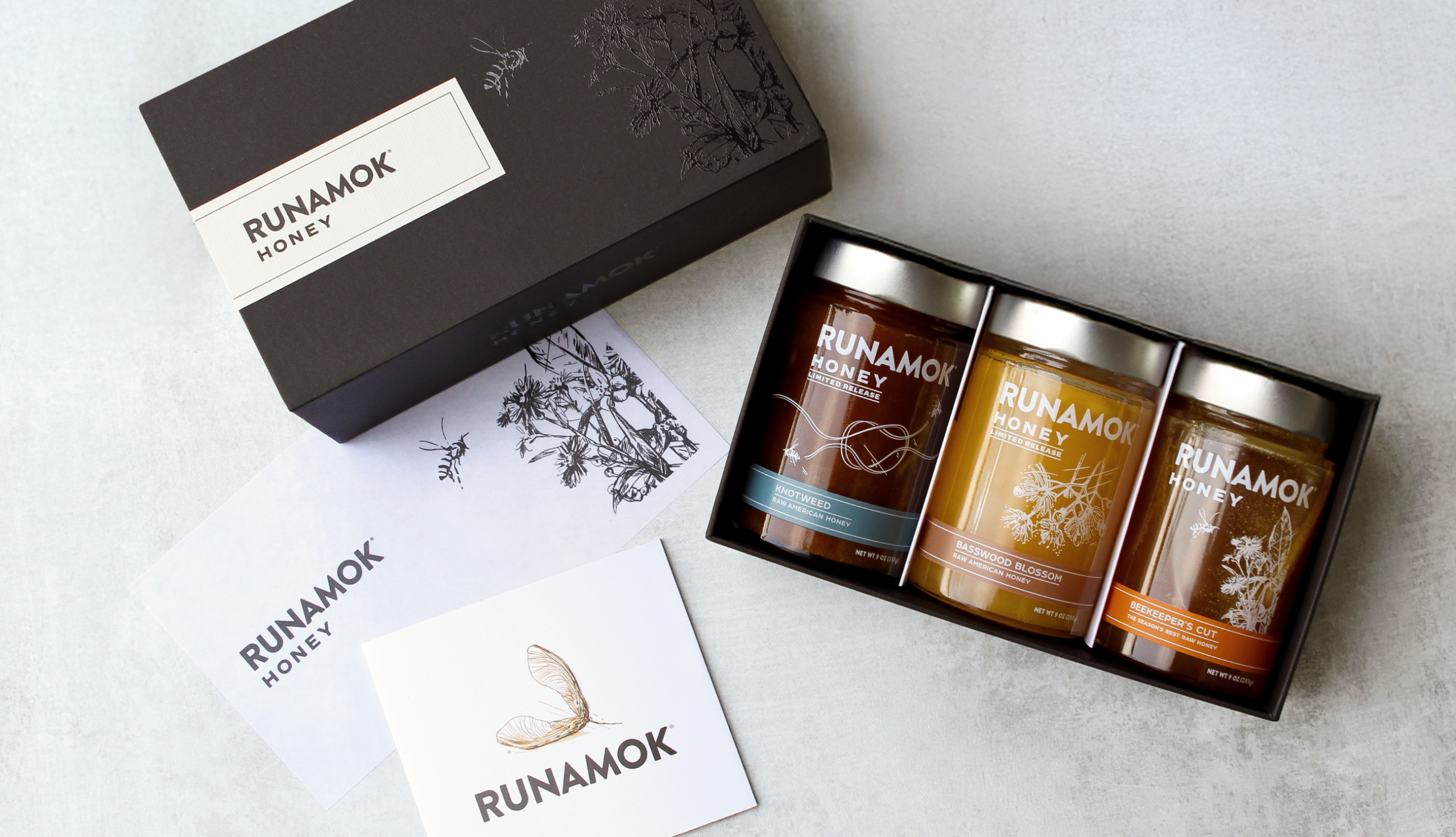
To complement the exceptional qualities of maple, we helped Runamok carefully design a new product line of honey with premium labels and thoughtfully crafted packaging that reflects their passion for quality, innovation, and culinary exploration.
Every detail, from the jars to the artistic labels, was developed to highlight the unique character of each honey variety. The result is a product line that is as beautiful as it is flavorful.
Branching Out
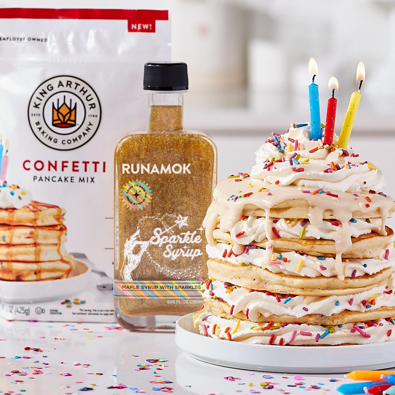
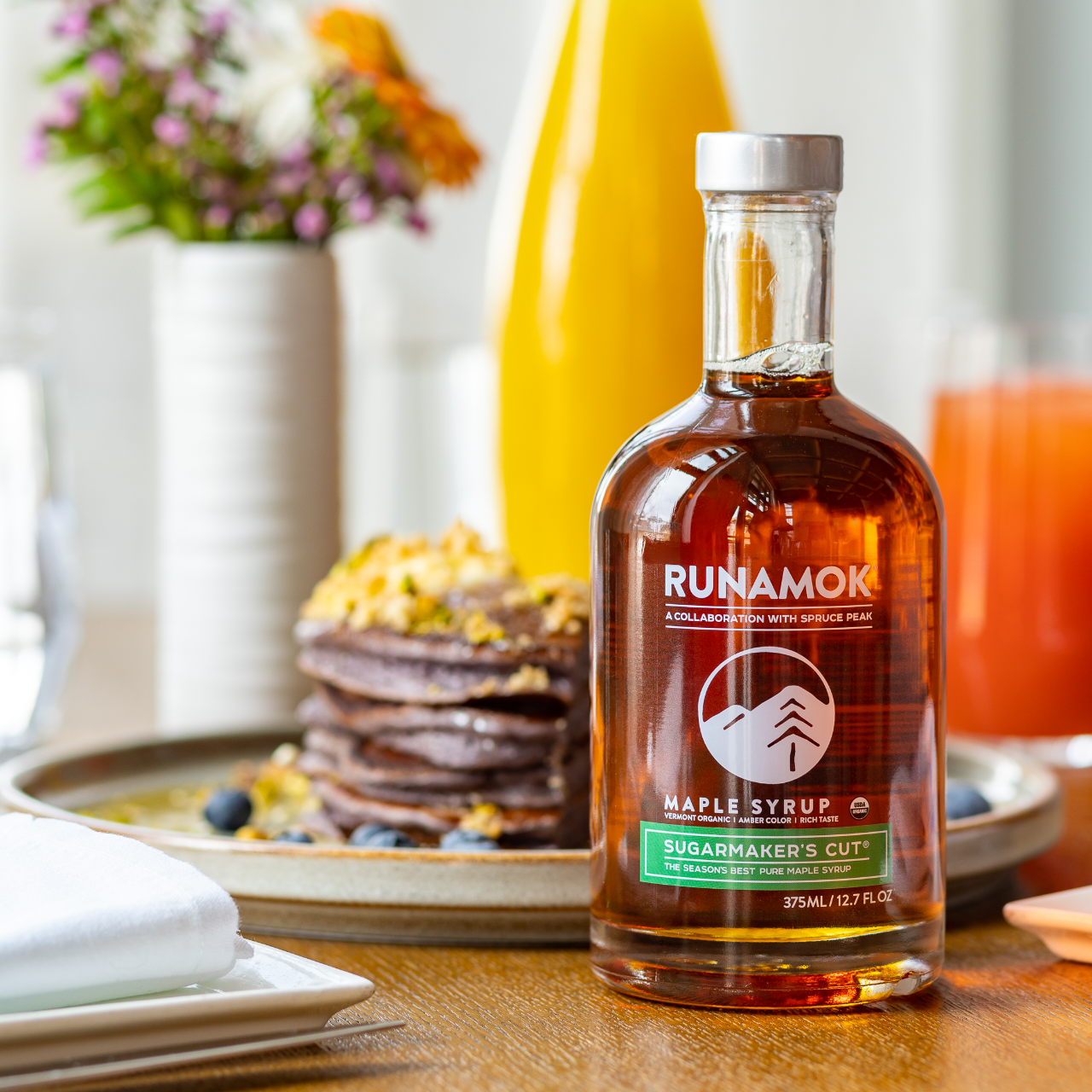
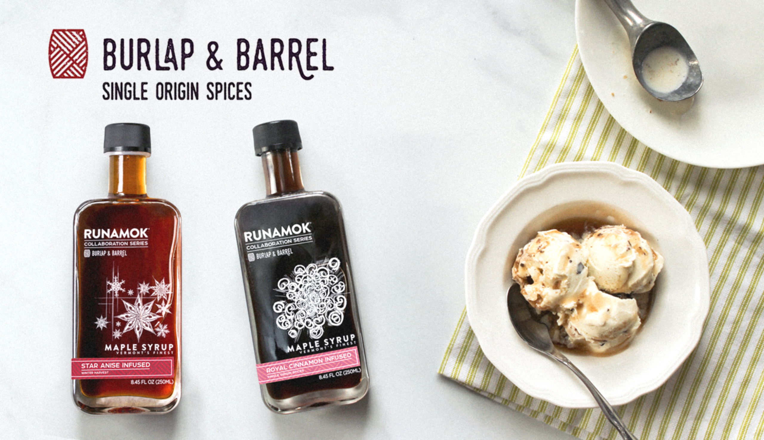
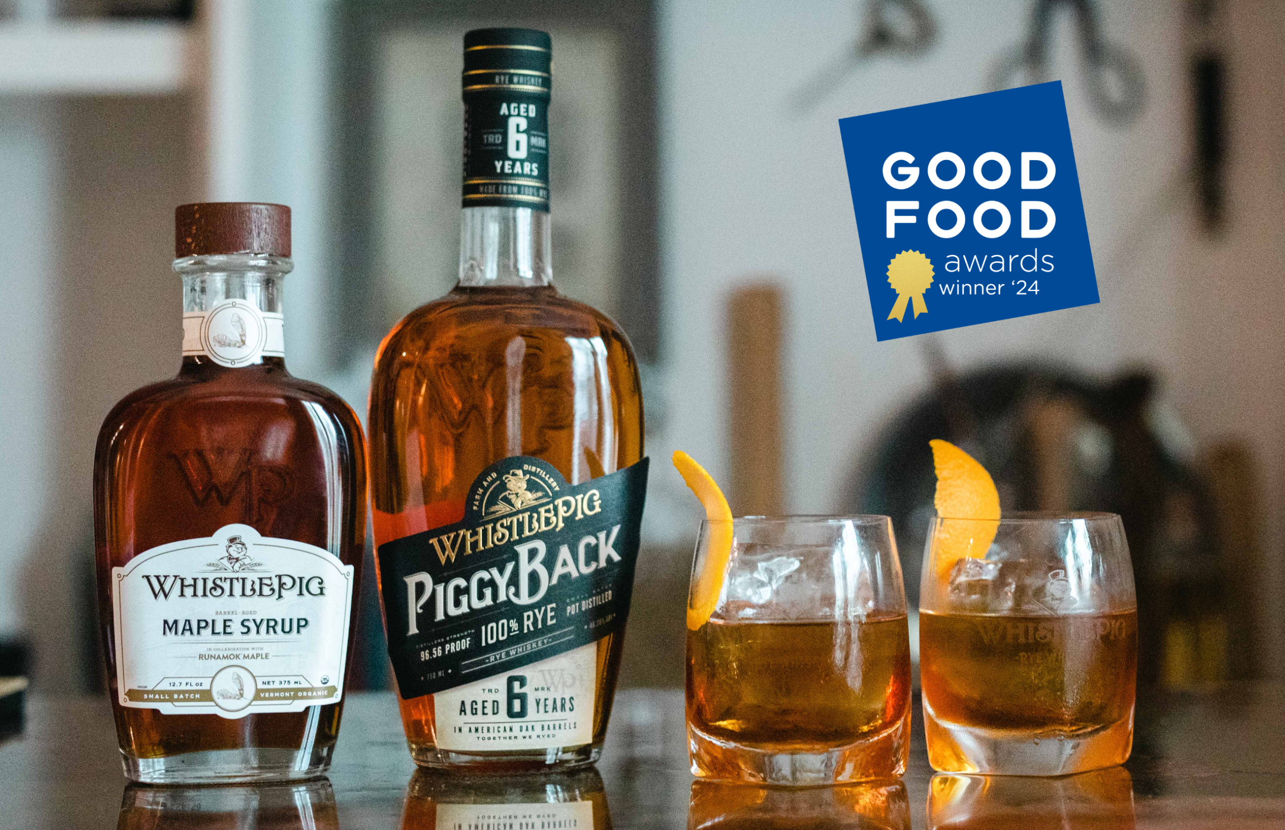
Key ingredients are just as essential as key partners. The Runamok brand naturally lends itself to collaboration from the tap to the table. Each product launch is as delicious as it is unique – featuring fun product partnerships with King Arthur Baking and Spruce Peak and high-end ingredient collaborations with Burlap & Barrel and WhistlePig Whiskey.
Packaging & Retail Displays
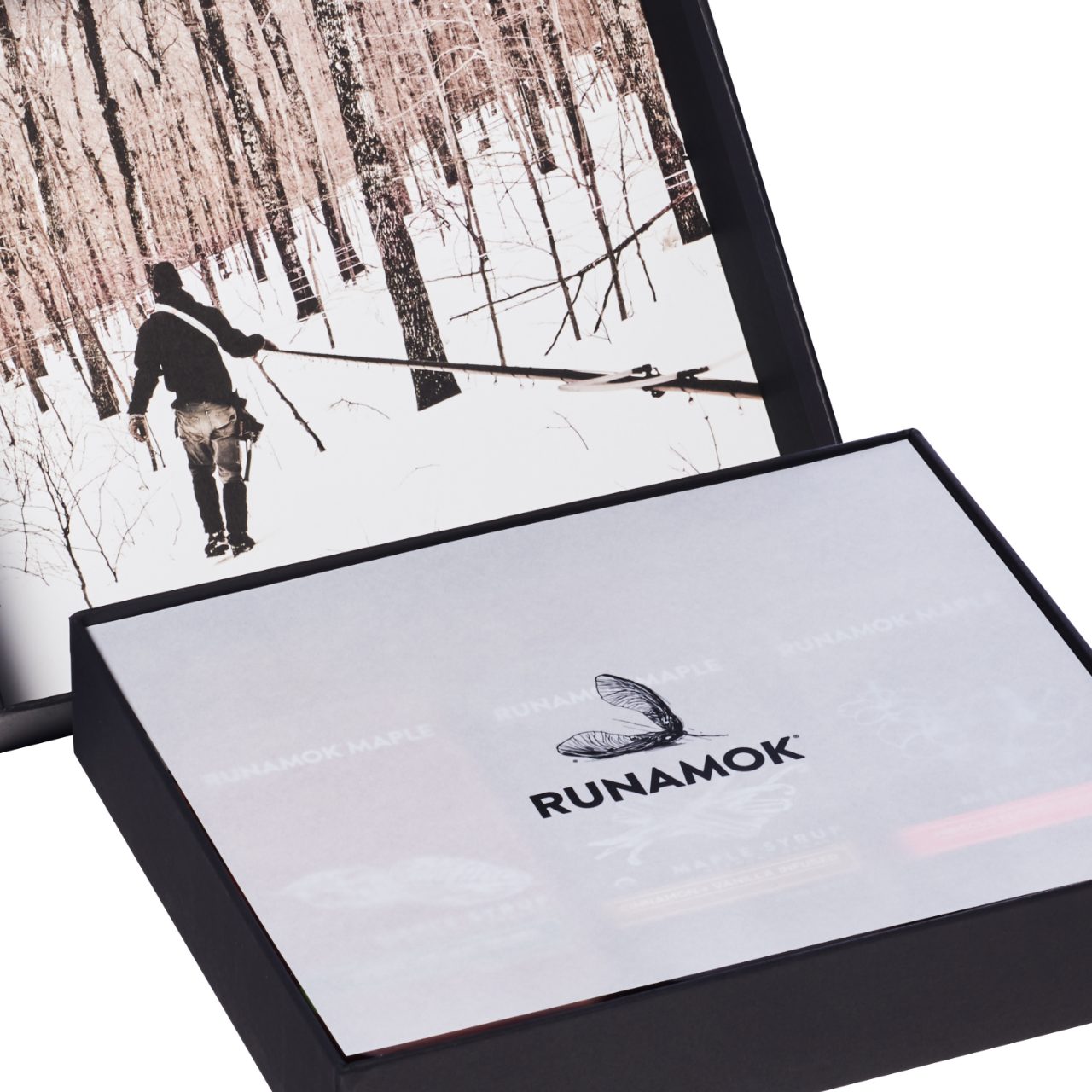
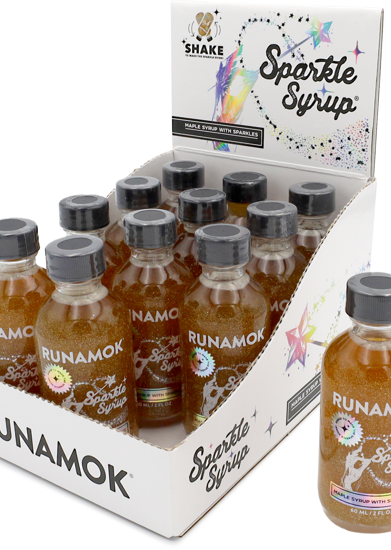
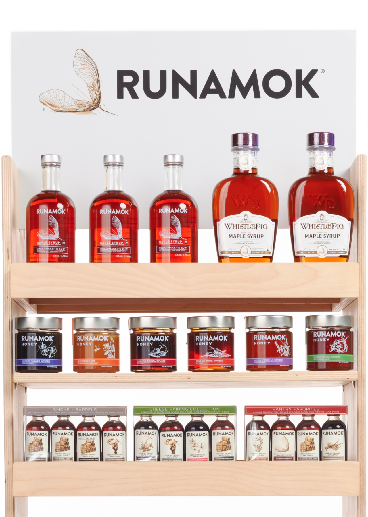
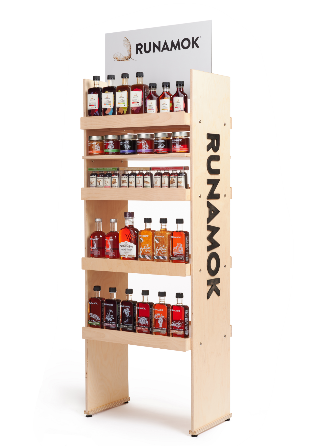
Runamok’s packaging demands a high standard for both fit and function, with a need to deliver a high-end aesthetic while meeting requirements for durability and sustainability.
Given the fragility and weight of each product, it’s crucial that the packaging can reduce the possibility of breakage while delivering a premium experience for each customer. Maintaining Runamok’s sustainability goals means that materials are sustainably sourced and recyclable.