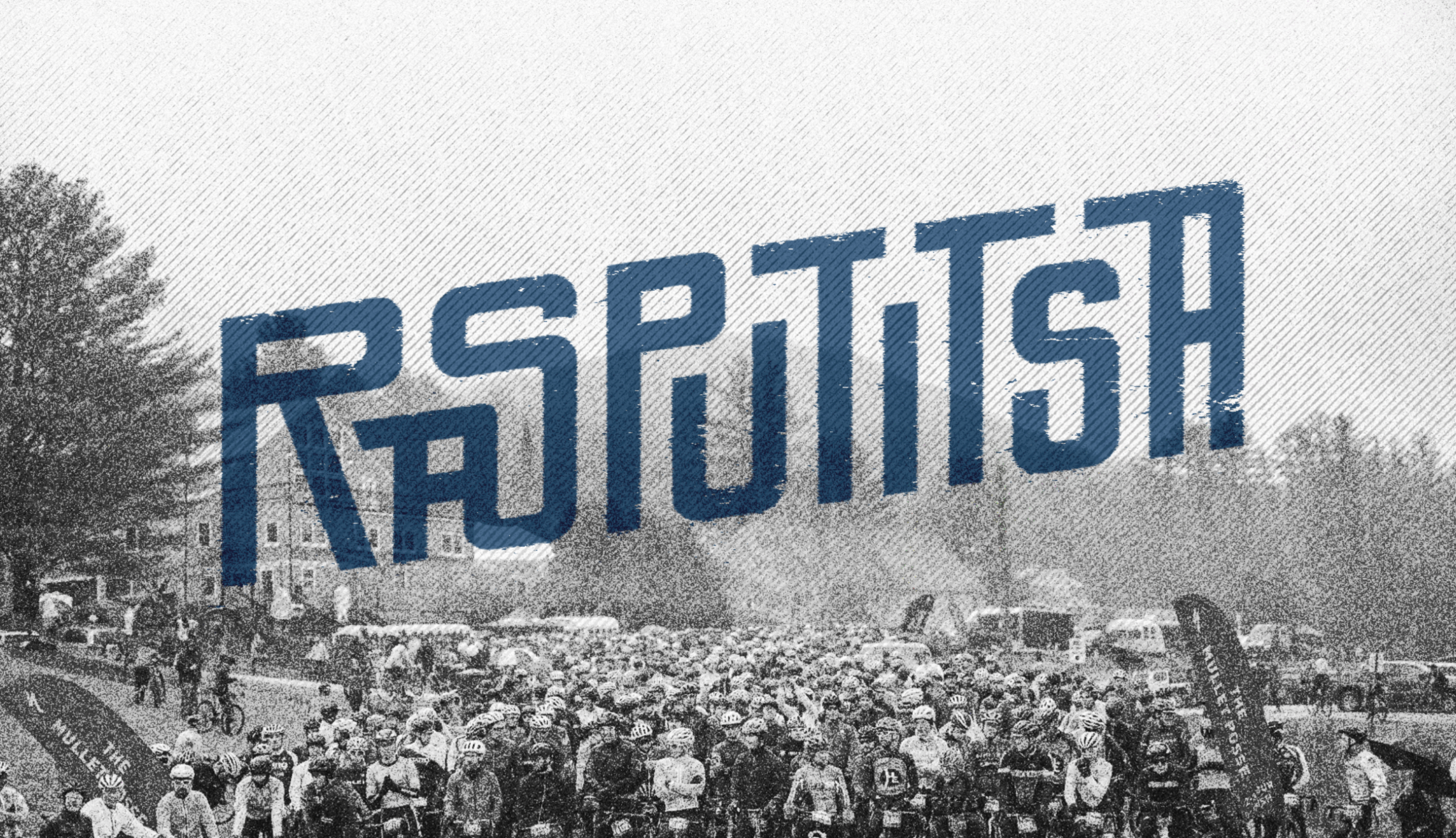
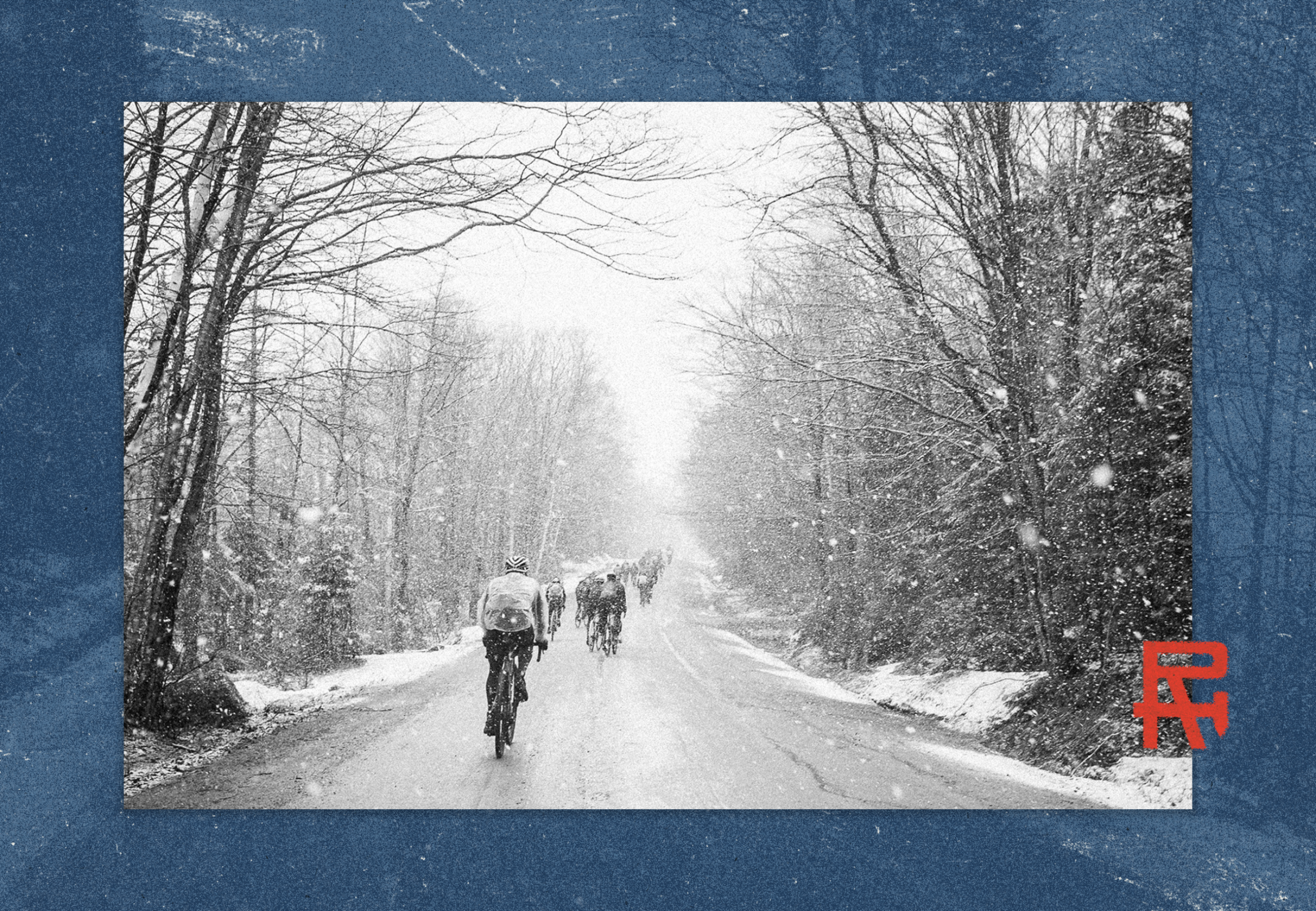
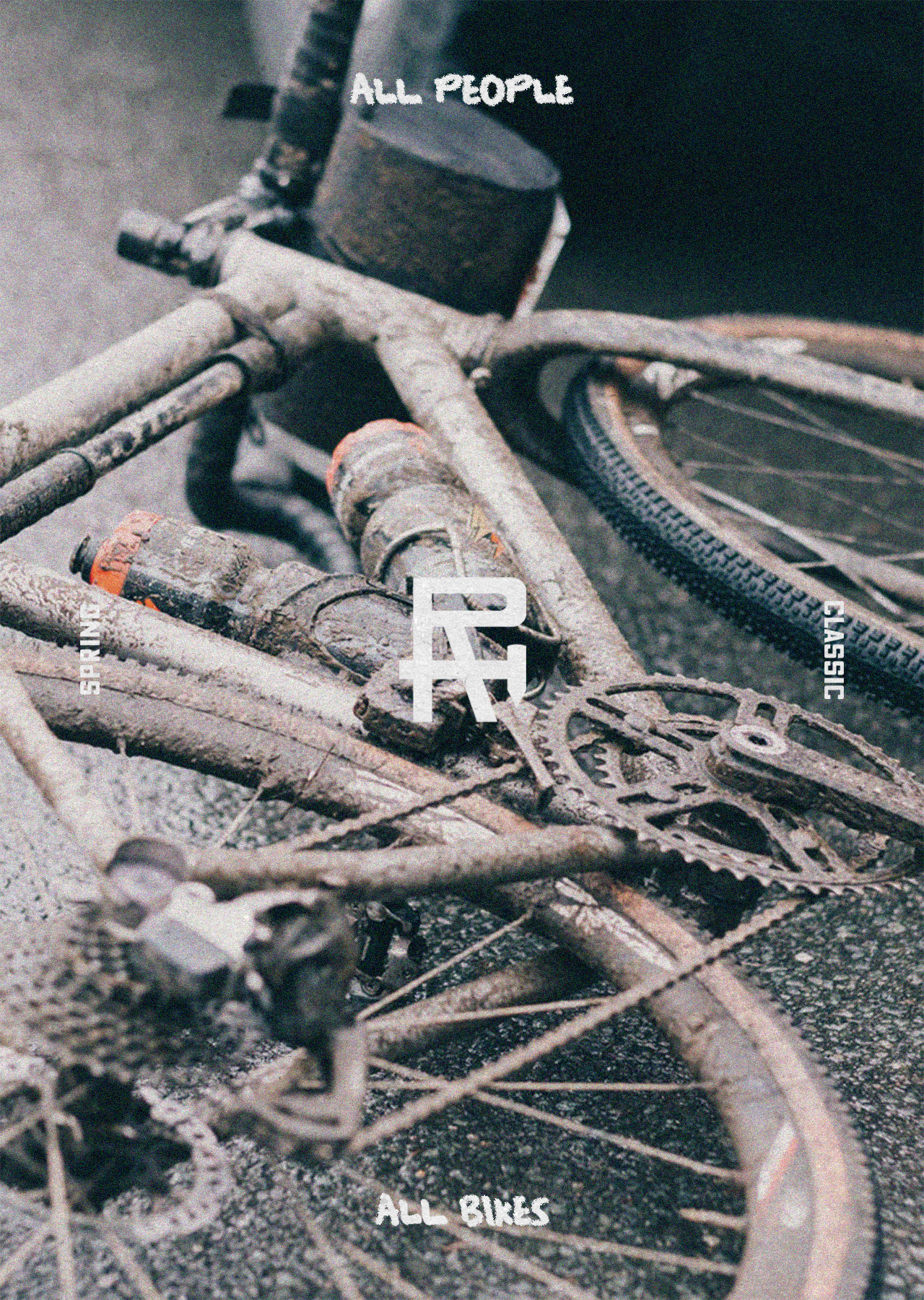
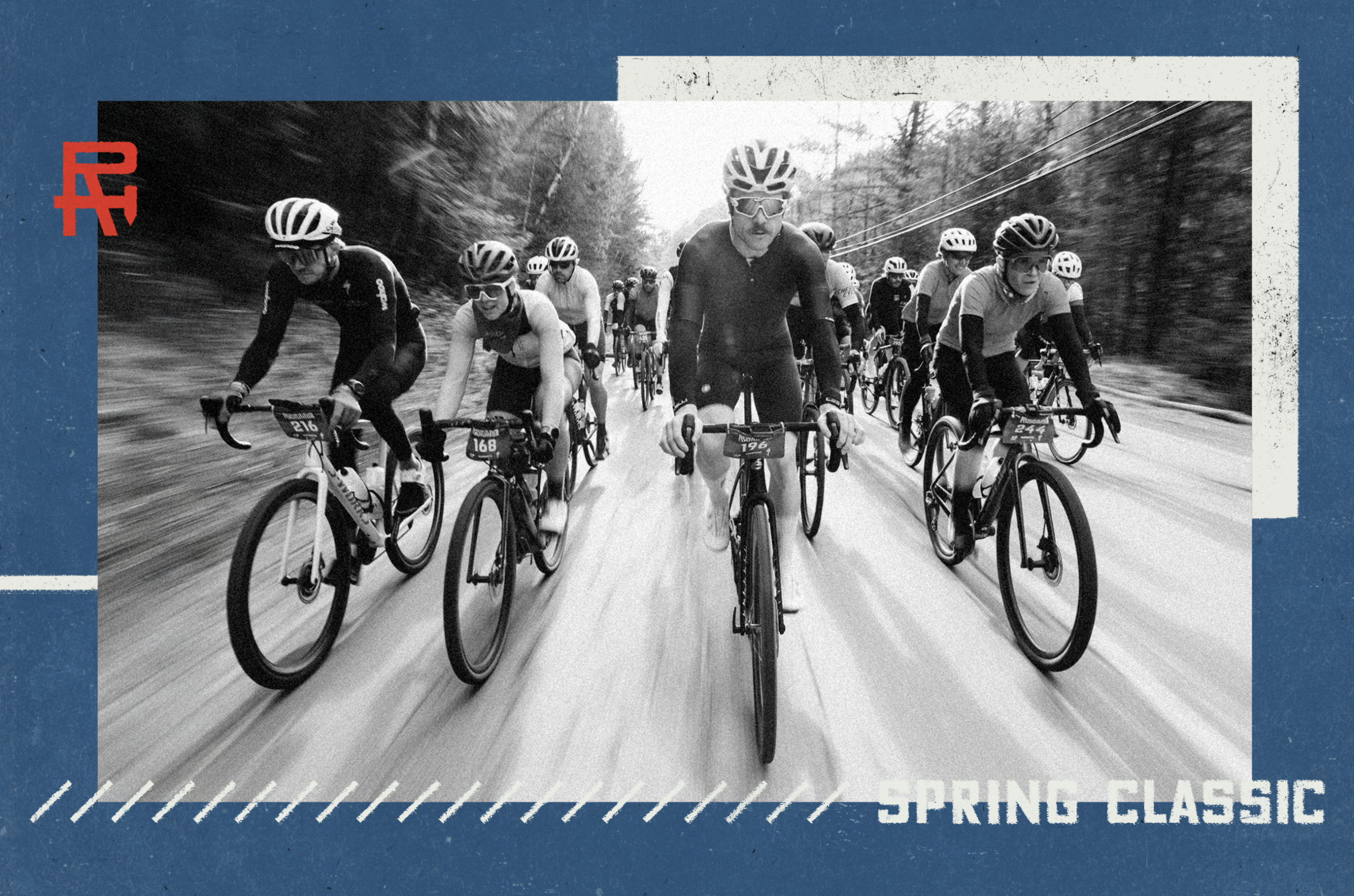
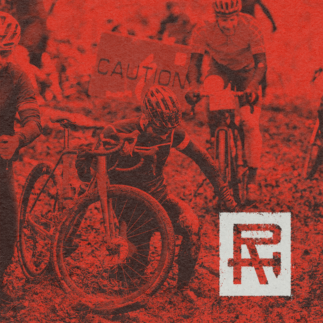
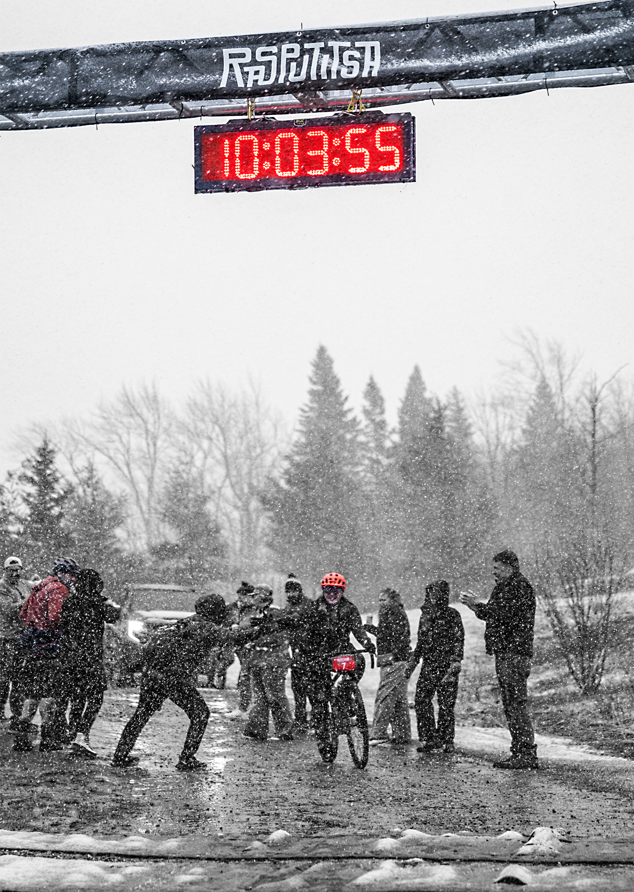
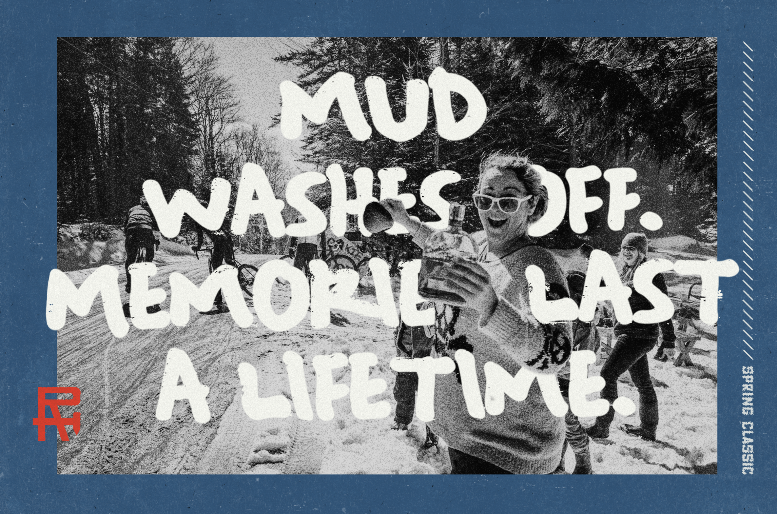
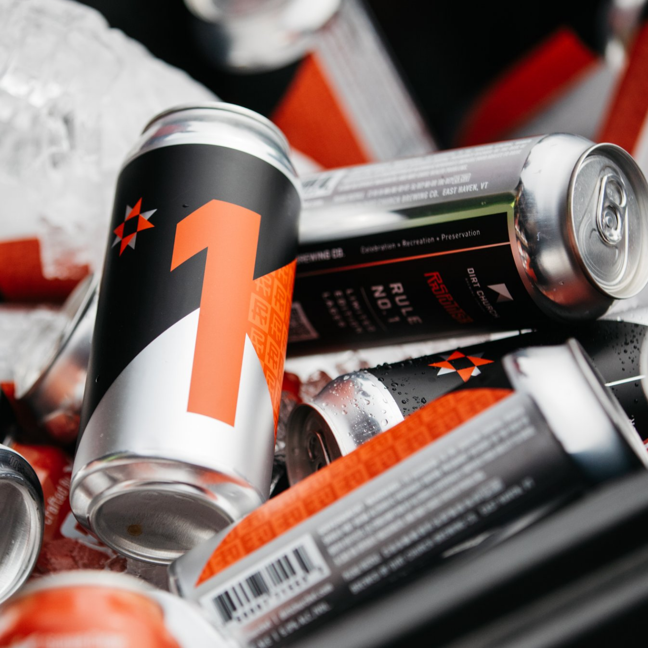
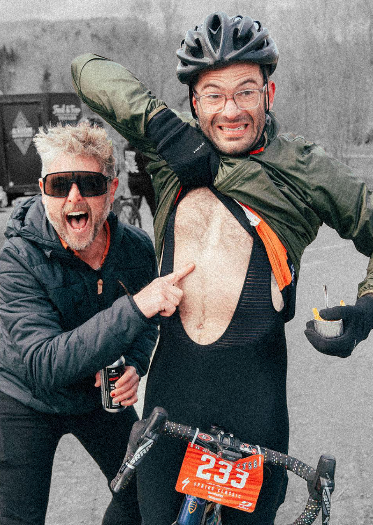
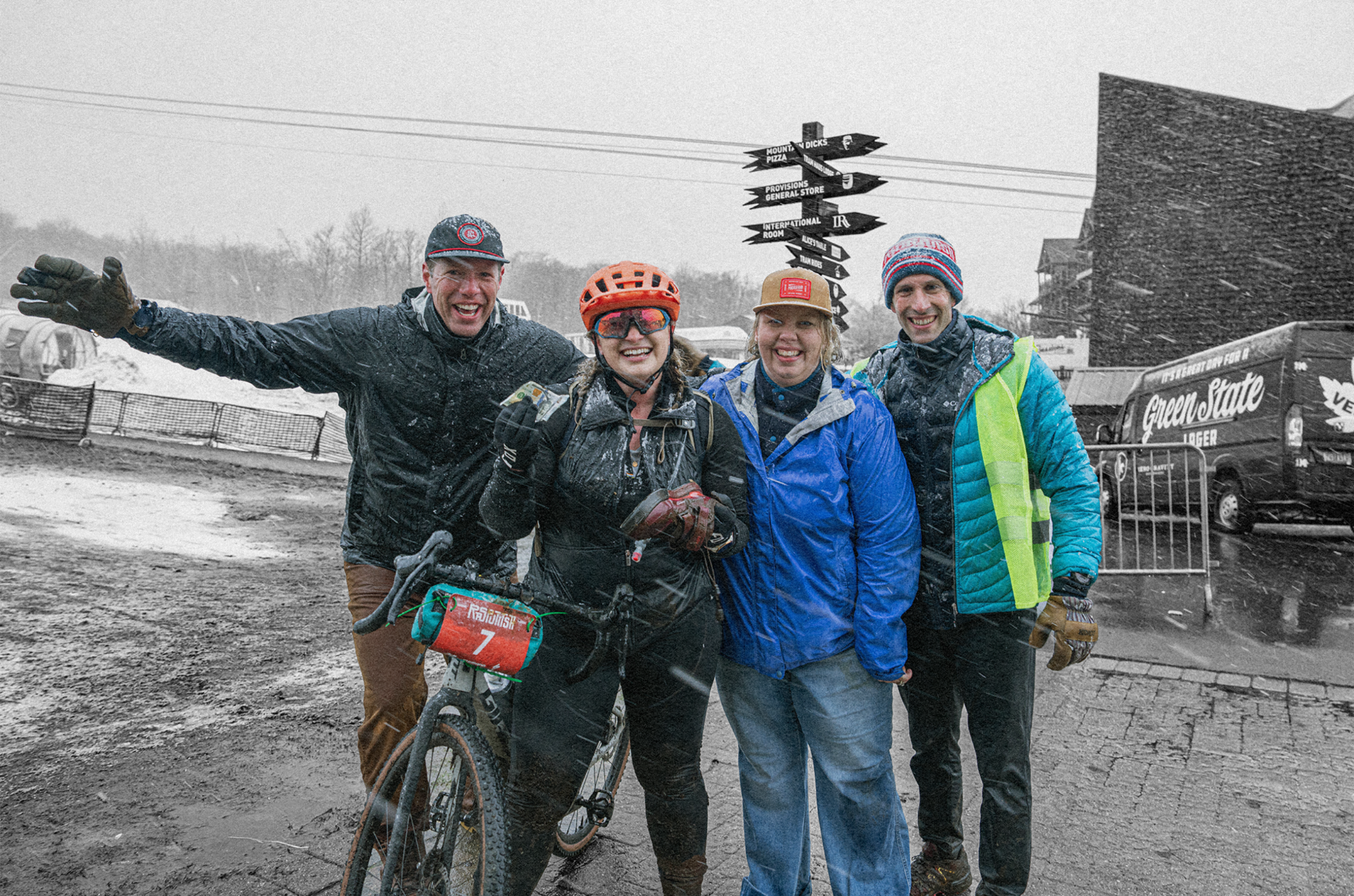
Rasputitsa, meaning “mud season” occurs during the spring thaw when Vermont roads become impassable from knee-deep mud. The annual Spring Classic gravel cycling event is an ever-changing 100-kilometer challenge. A mix of Vermont dirt, gravel, mud, snow, rain, sun, sufferfest slog through some of the best “roads” you’ll find anywhere. It’s a disconnect and retreat from everyday events. A spiritual journey of preparation, experience, and collectiveness.
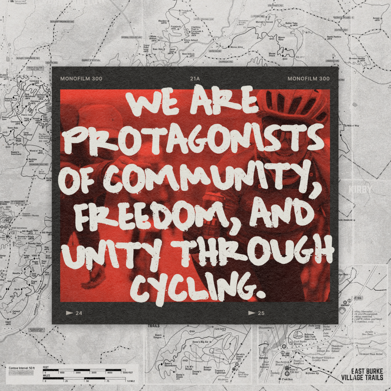
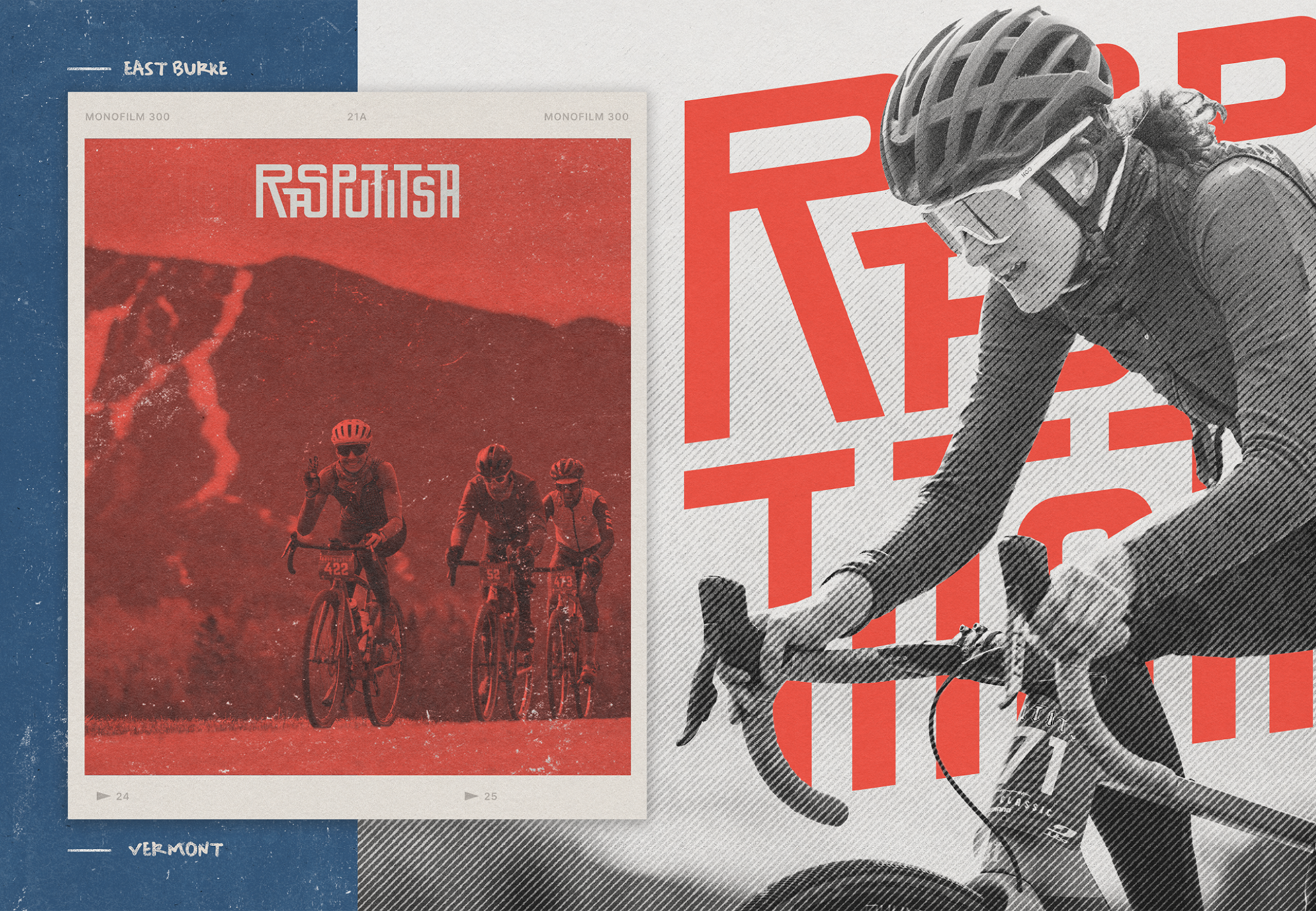
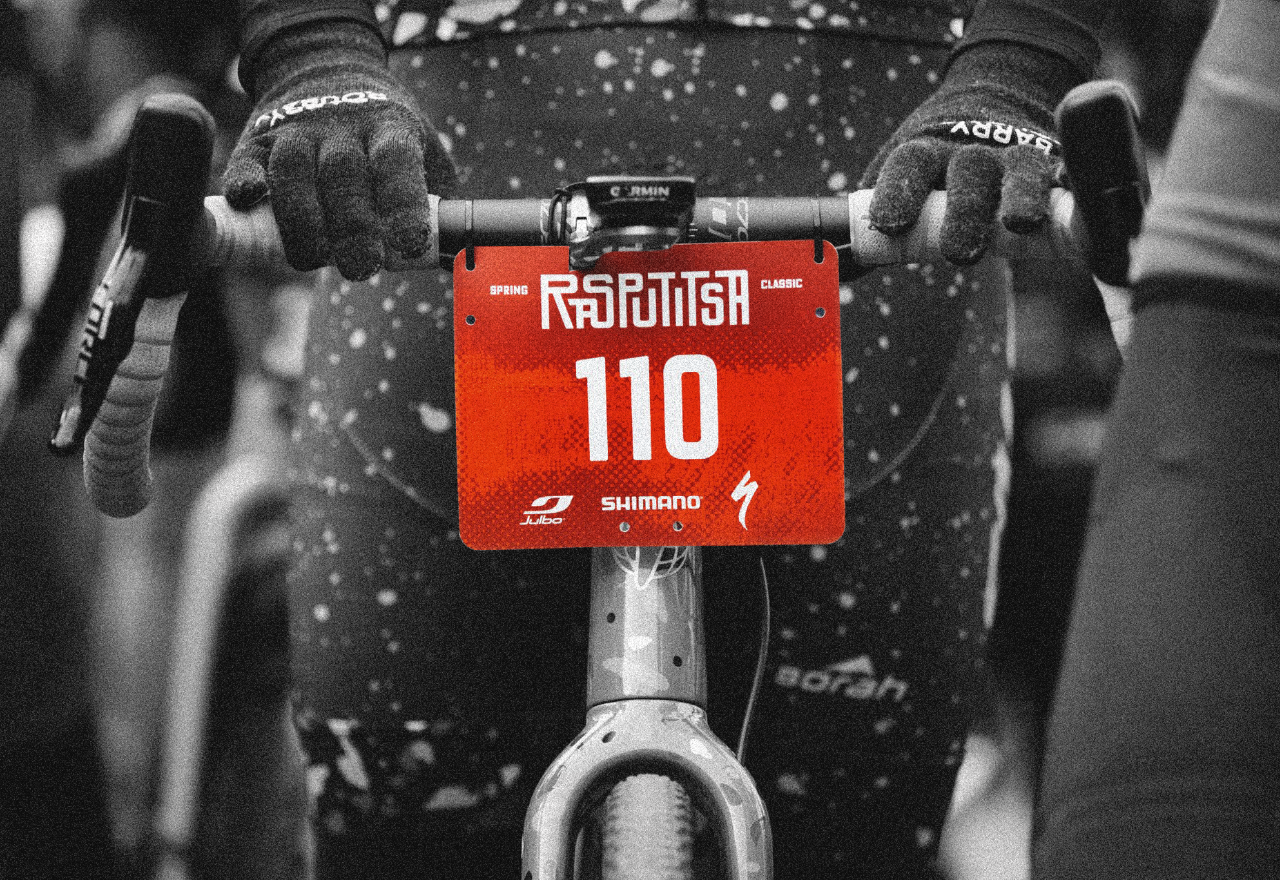
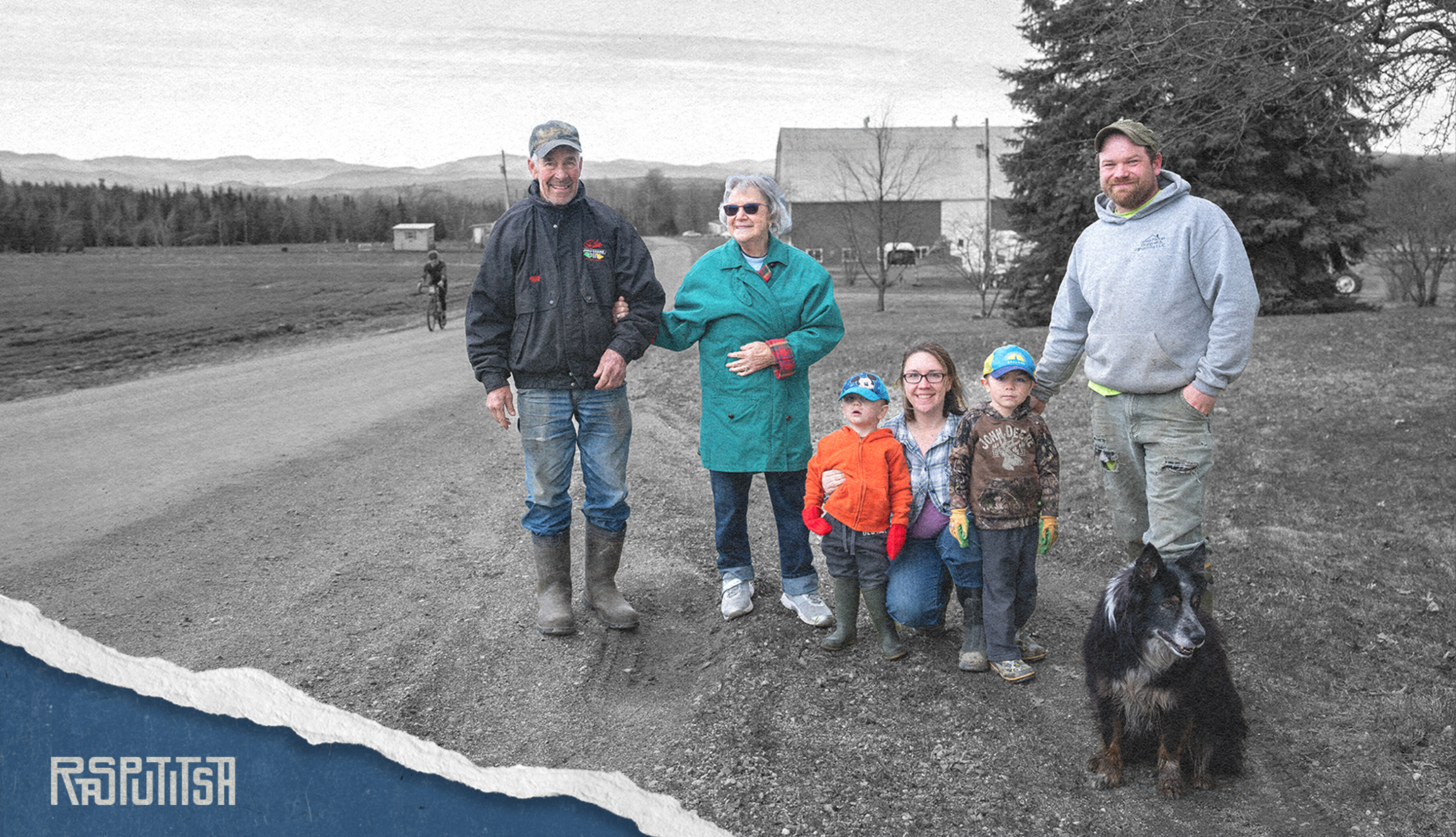
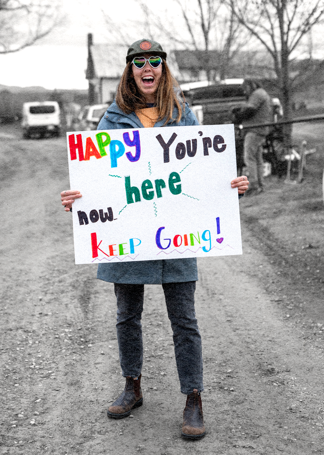
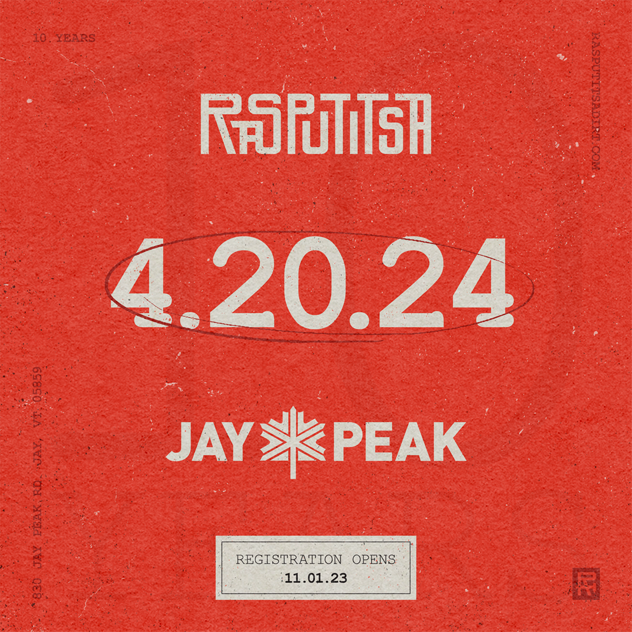
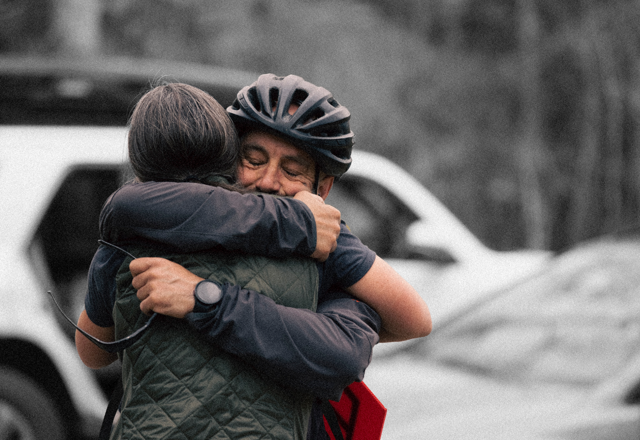
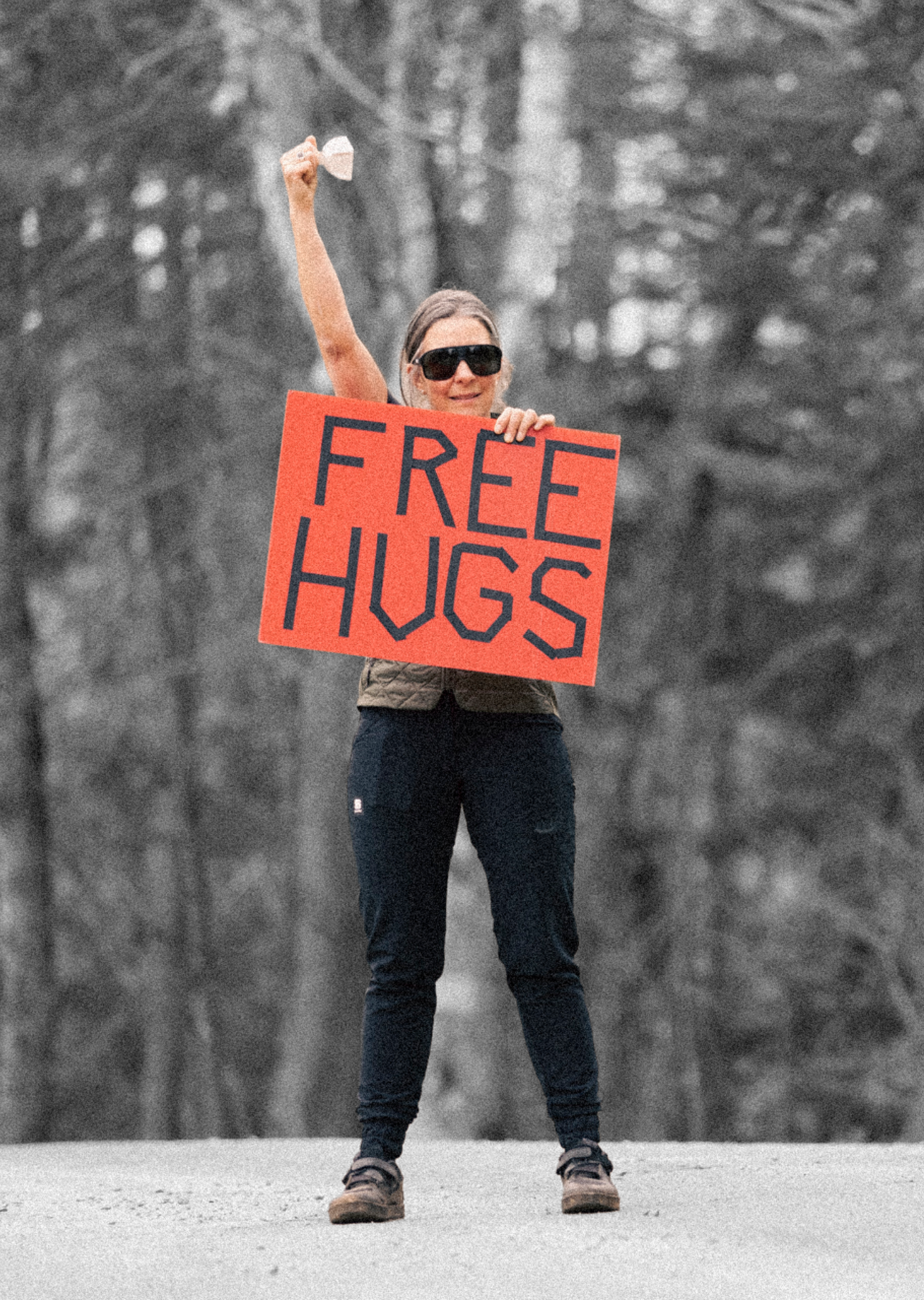
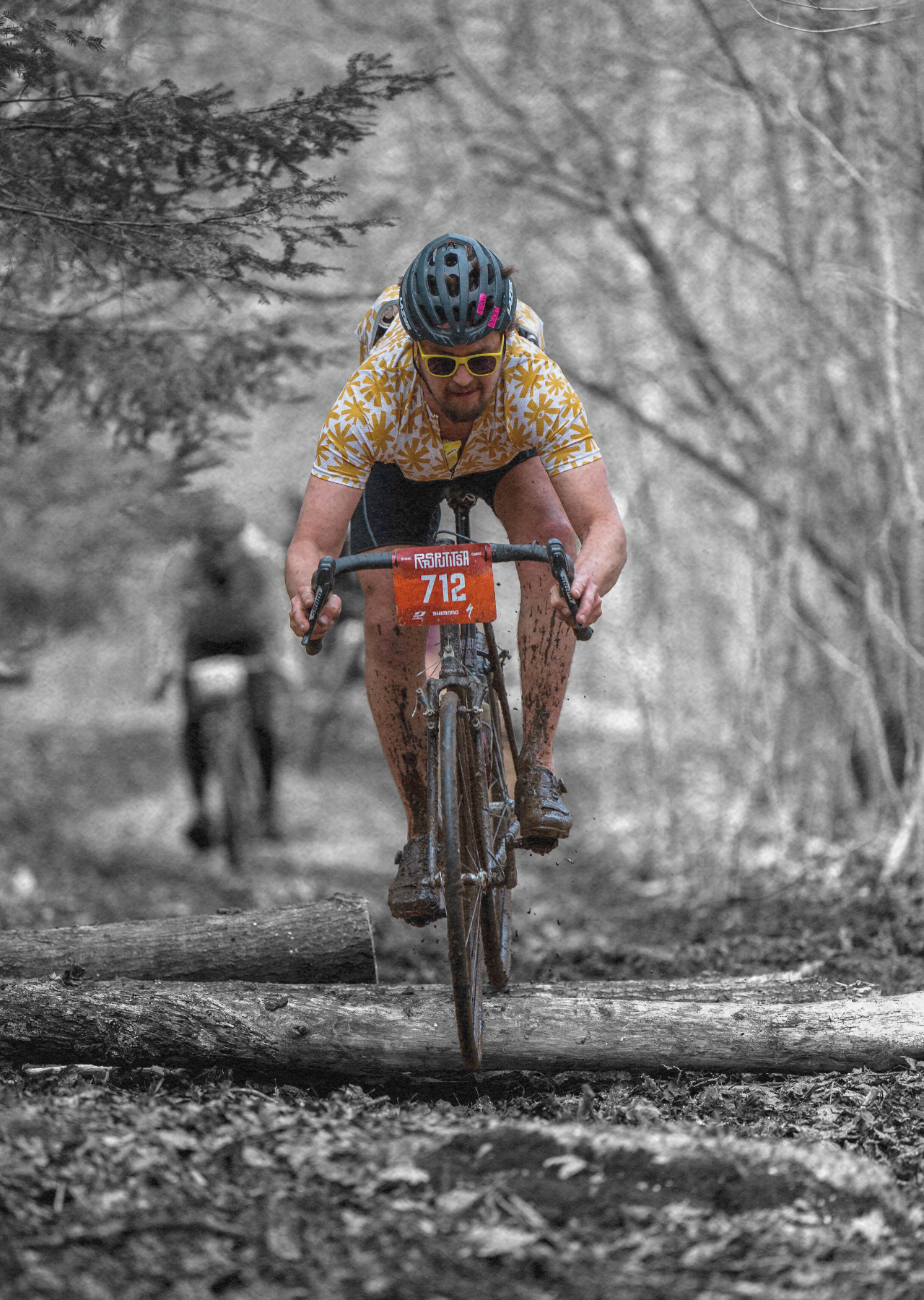
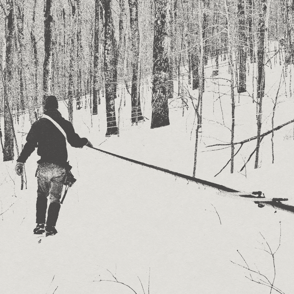
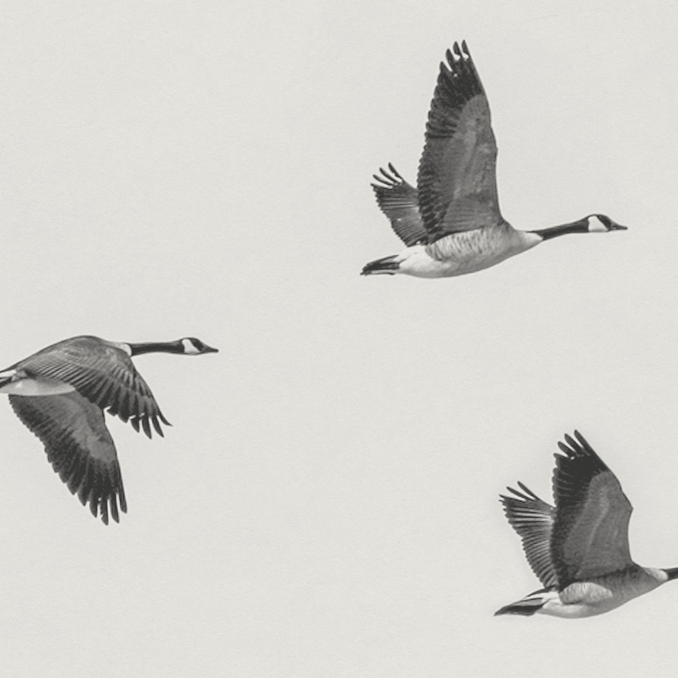
Collaborating and partnering with Heidi Myers and Anthony Moccia, we worked to bring their brand forward to embody community, freedom, and unity. Translating this vision into a bold, story-driven identity. A rich palette of red, blue, black, and white boldly grounds the brand in authenticity, while handwritten details add a personal, expressive touch. A combination of treated black-and-white photography, desaturated imagery, and layered texture introduces movement, grit, and raw energy—reflecting the event’s dynamic spirit. The result is an identity that feels lived-in, full of texture, and deeply connected to the community it represents.
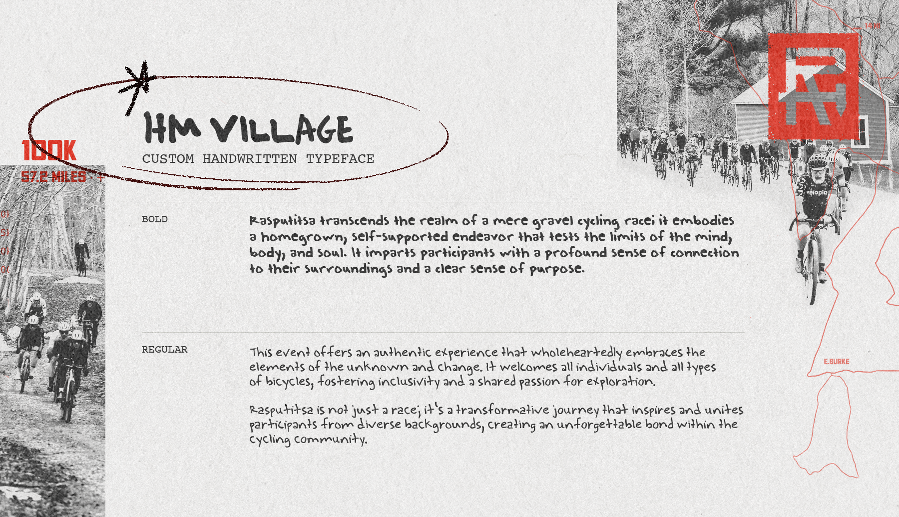
Custom Typeface
Diagnosed with young-onset Parkinson’s disease in 2015, co-founder Heidi Myers has found redemption and motivation in cycling. Though writing has become a challenge for her, we captured Heidi’s unwavering strength and spirit by creating a custom typeface from her handwriting. A time capsule.
“Rasputitsa to me represents determination. With young-onset Parkinson’s disease, determination is part of my day as much as breakfast is. It’s adapting to changes and looking at obstacles through a different perspective. Handwriting has been one of the hardships for me. I am unable to write legibly without incredible effort and mindset.
It’s been a privilege through the creative process to create a typeface that represents our brand, my determination, and preserves my handwriting as it further deteriorates. Remember that through our toughest times come our greatest moments of character.”
– Heidi Myers
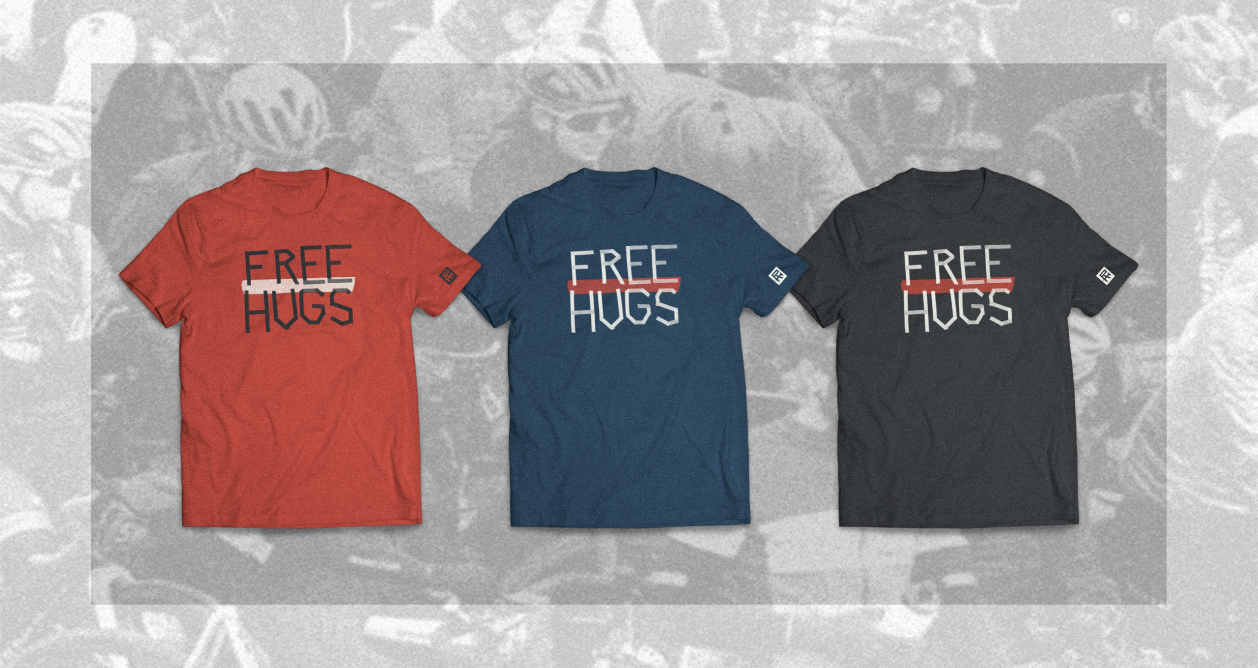
Rasputitsa Swag
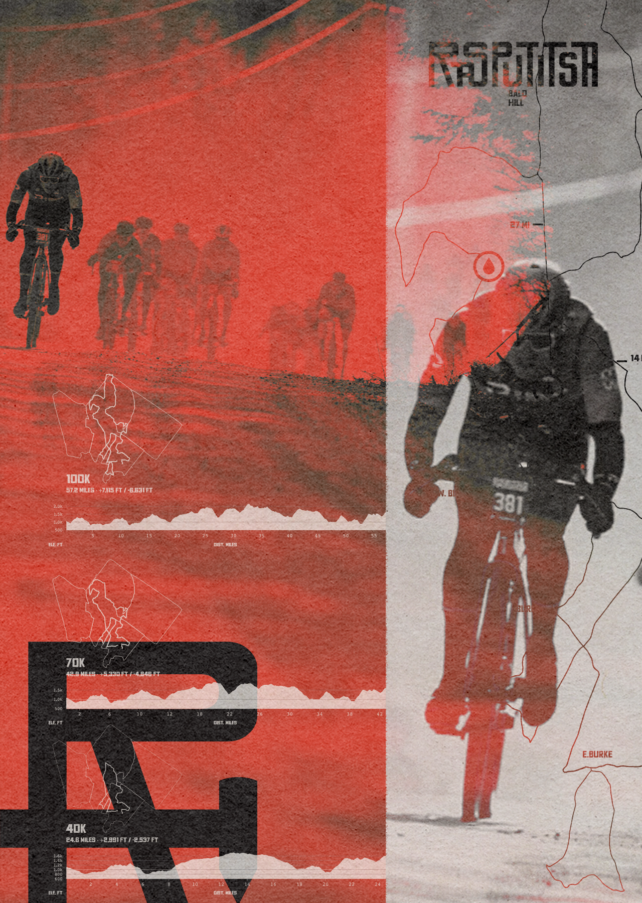
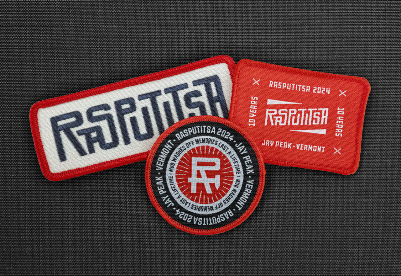
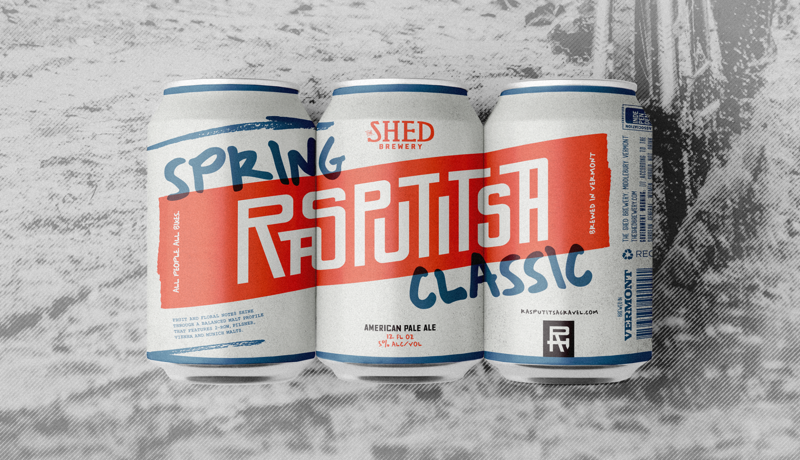
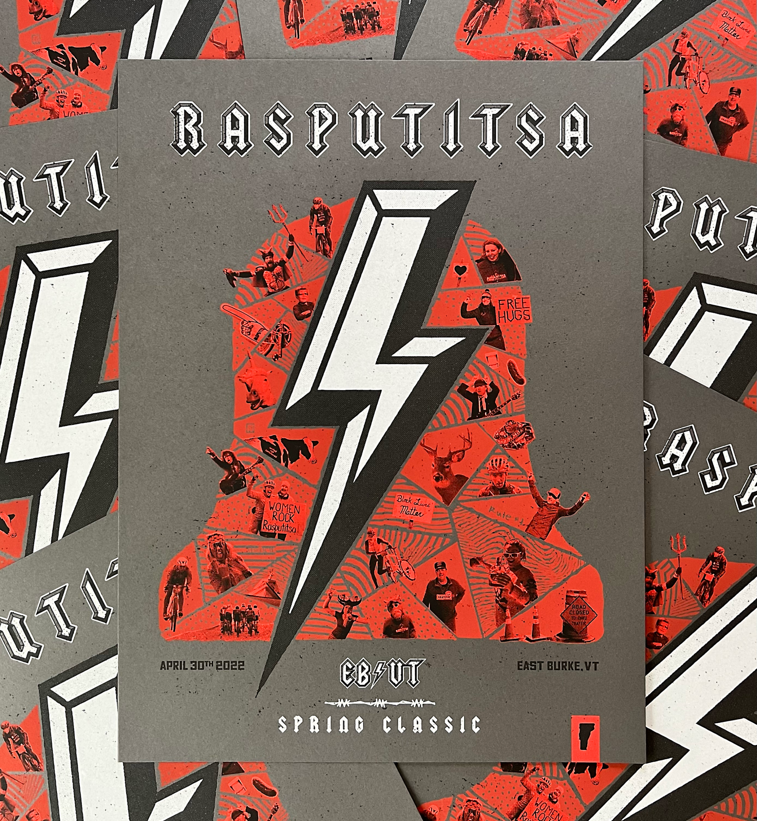
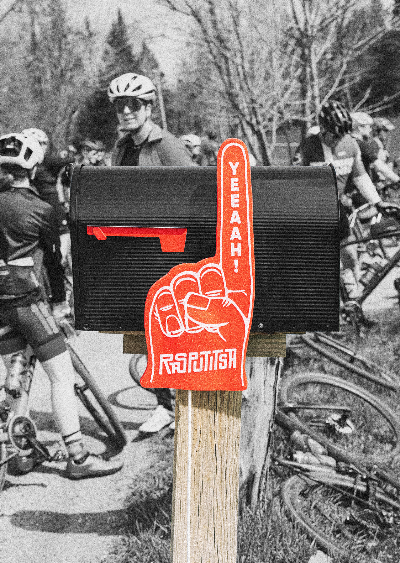
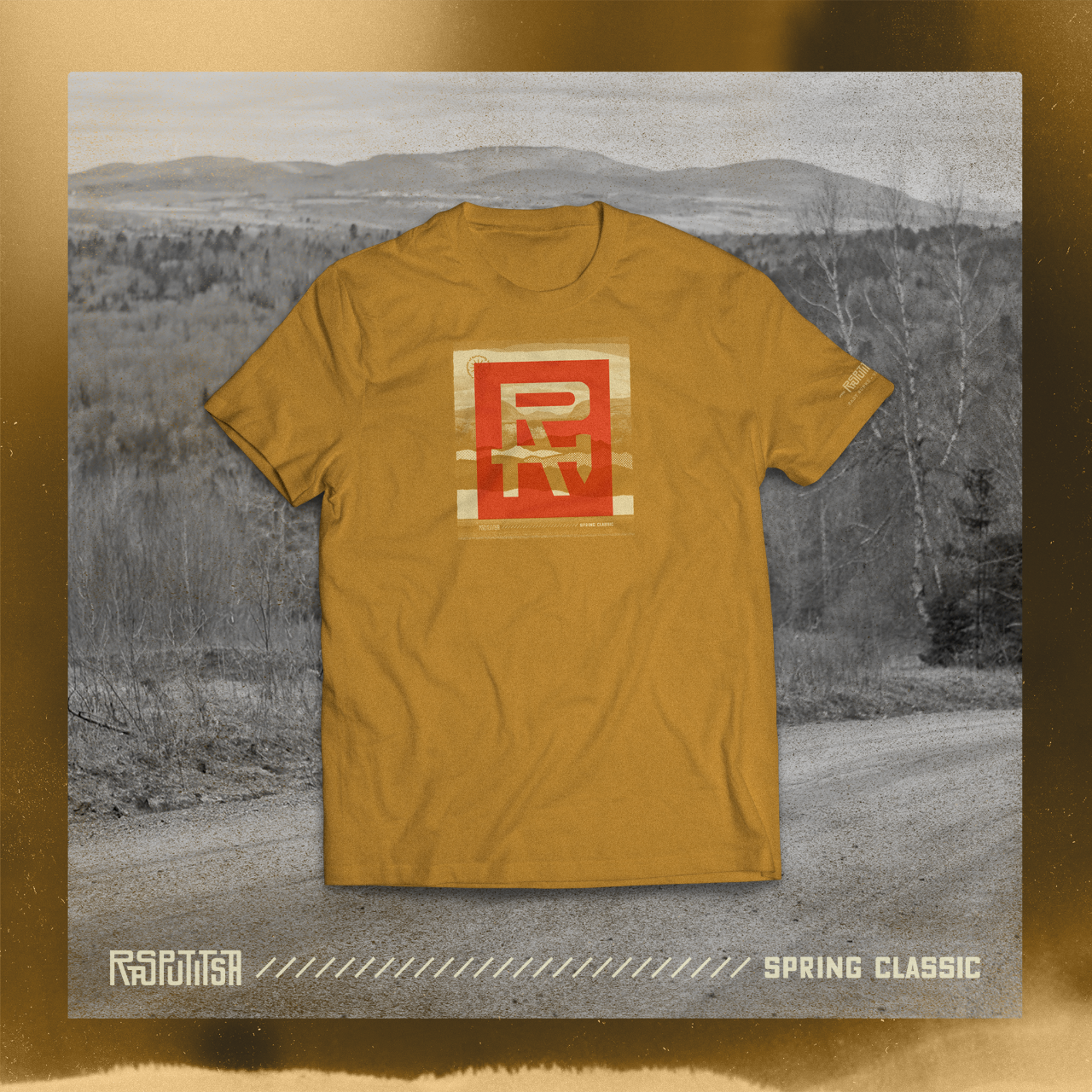
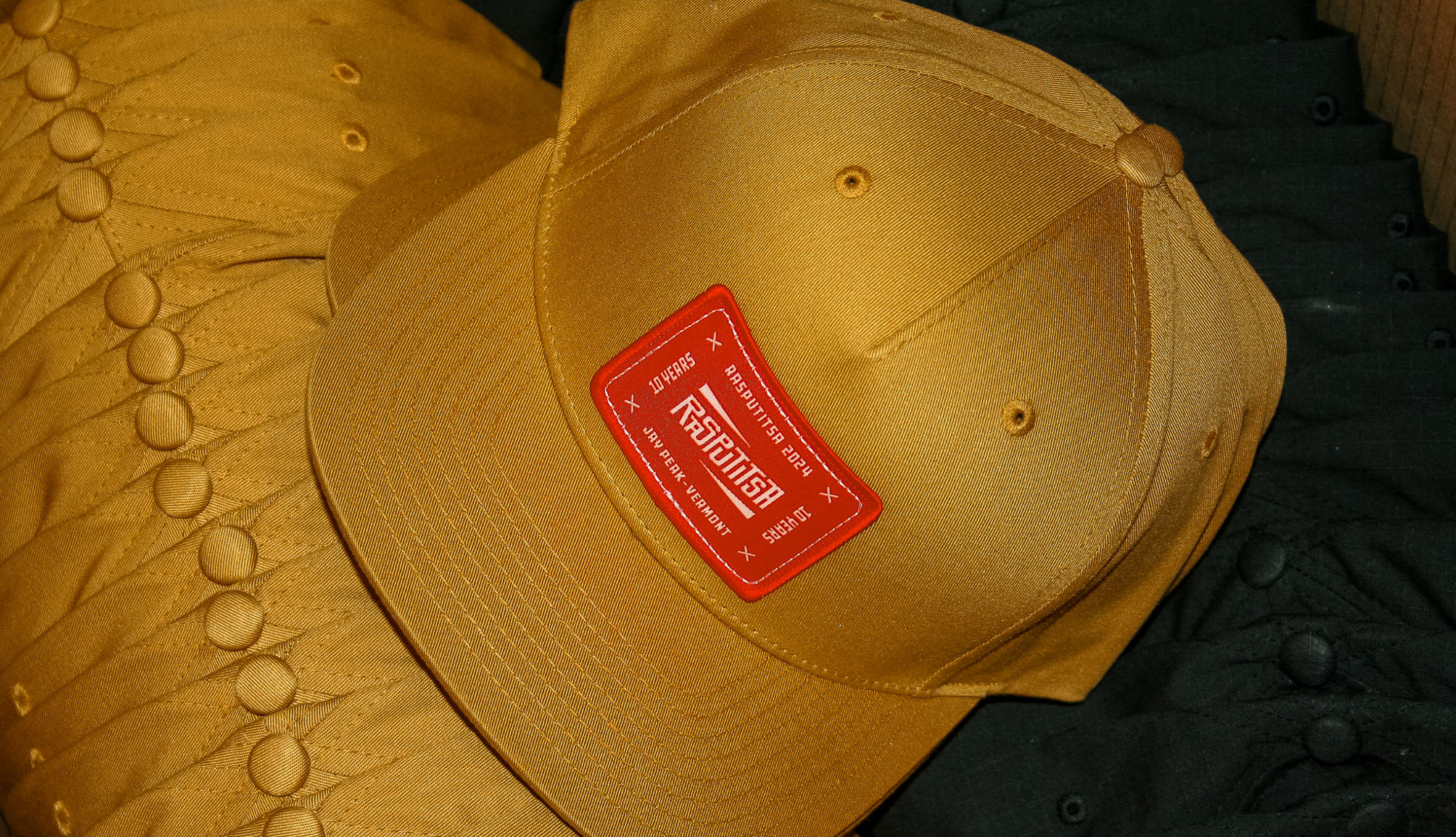
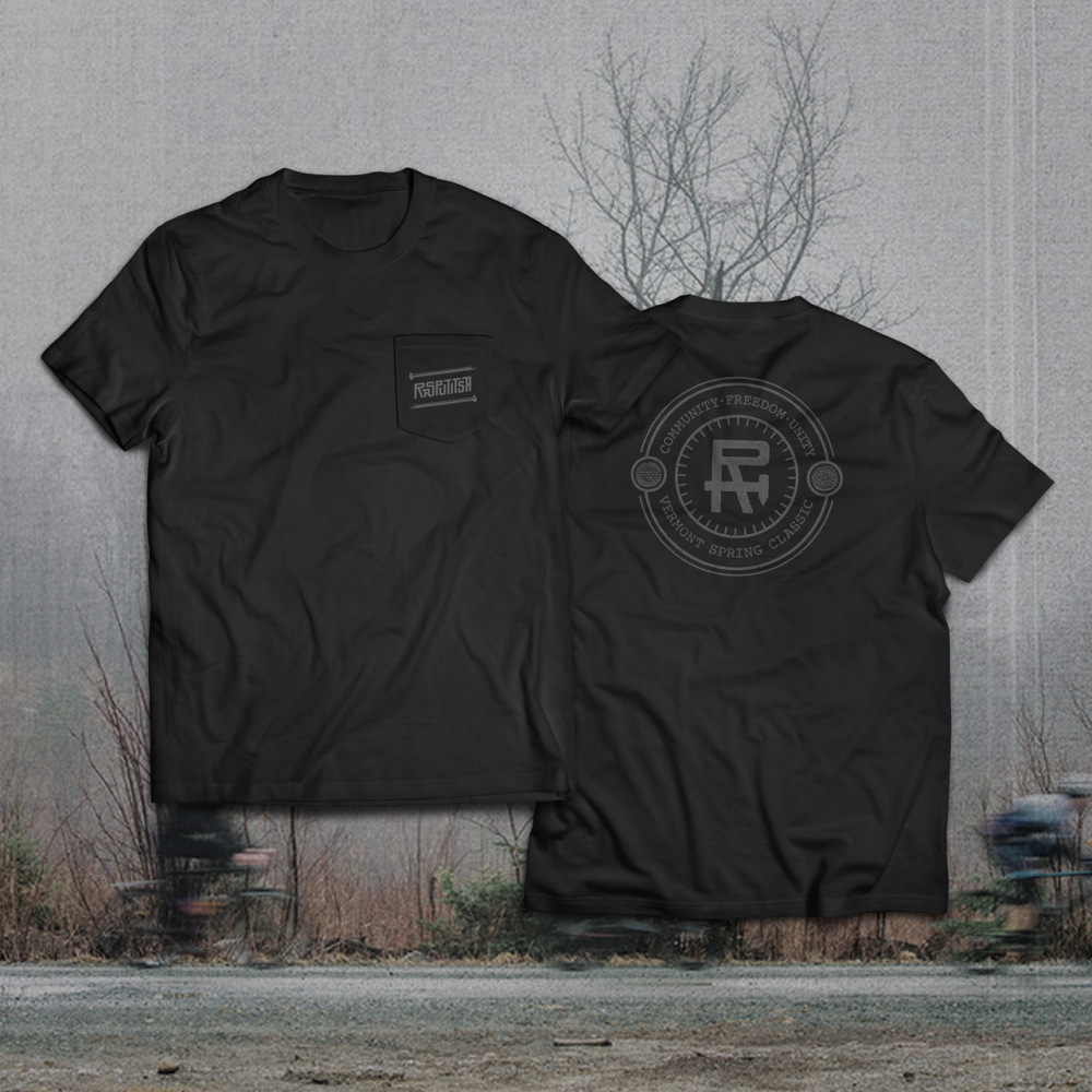
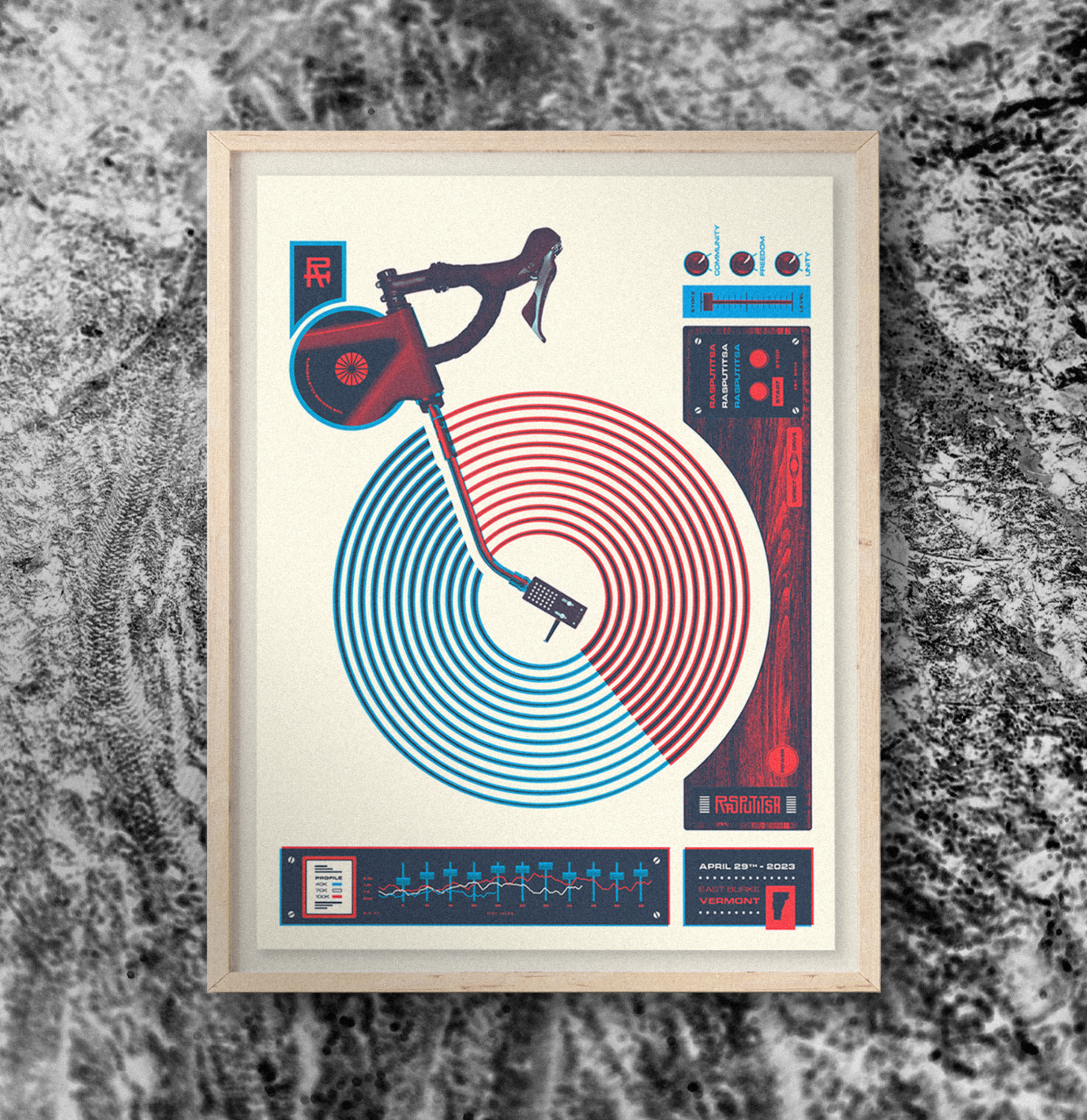
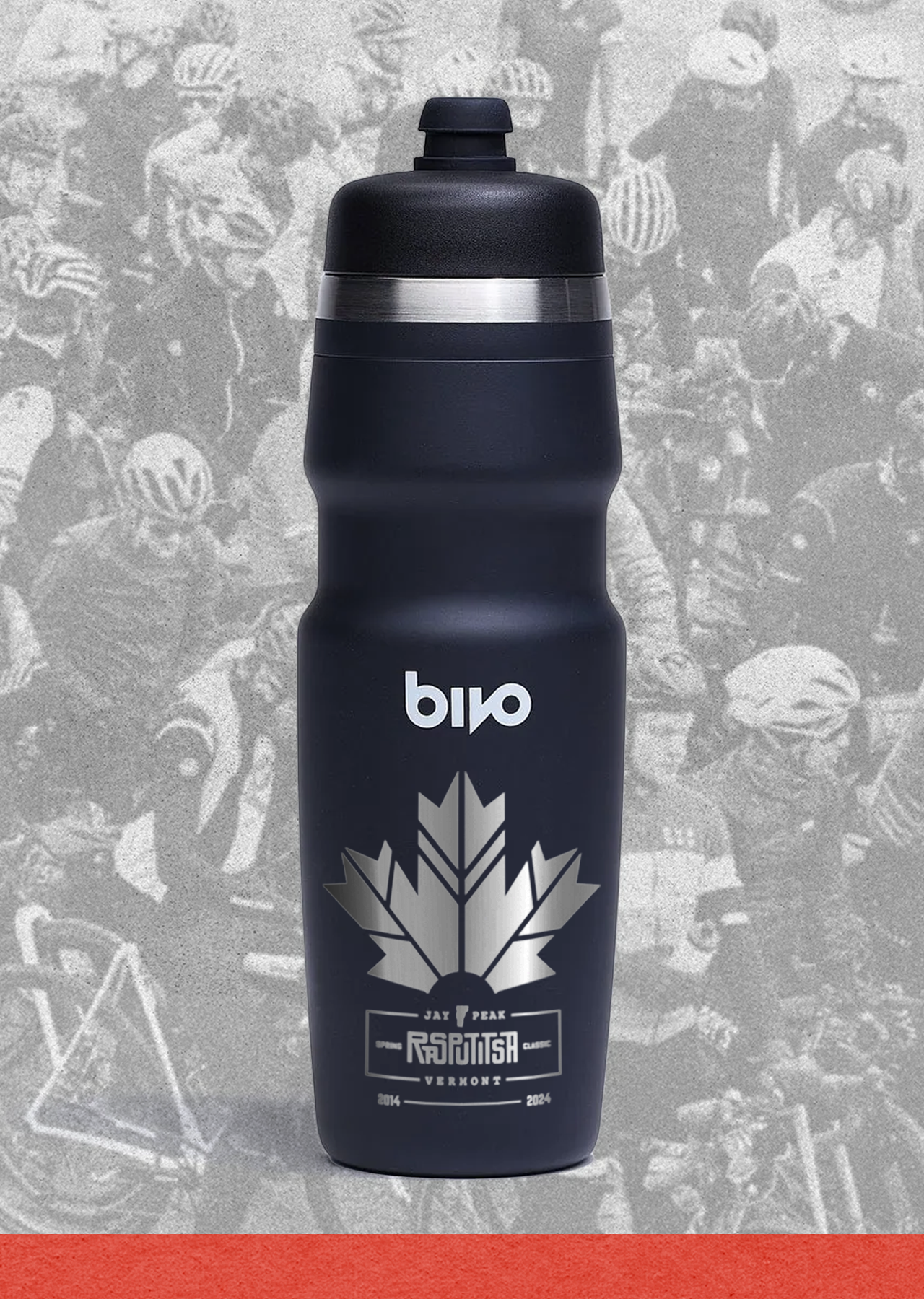
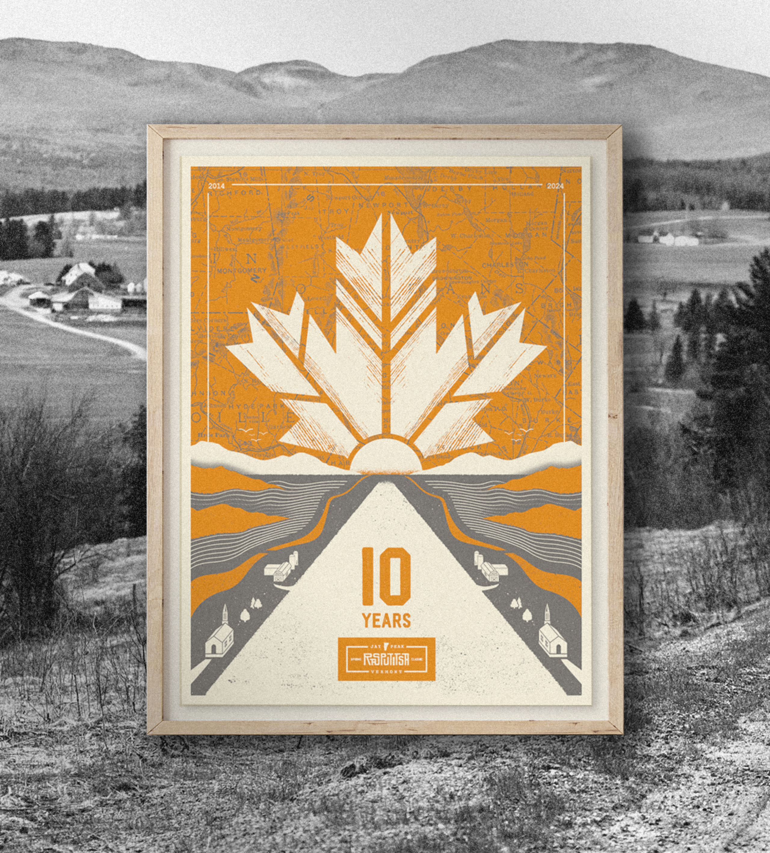
Each year we craft designs that seamlessly blend brand storytelling with adapted themes. Textured graphics, bold typography, and a palette of rich, earthy tones mirror the grit and authenticity of the race itself.
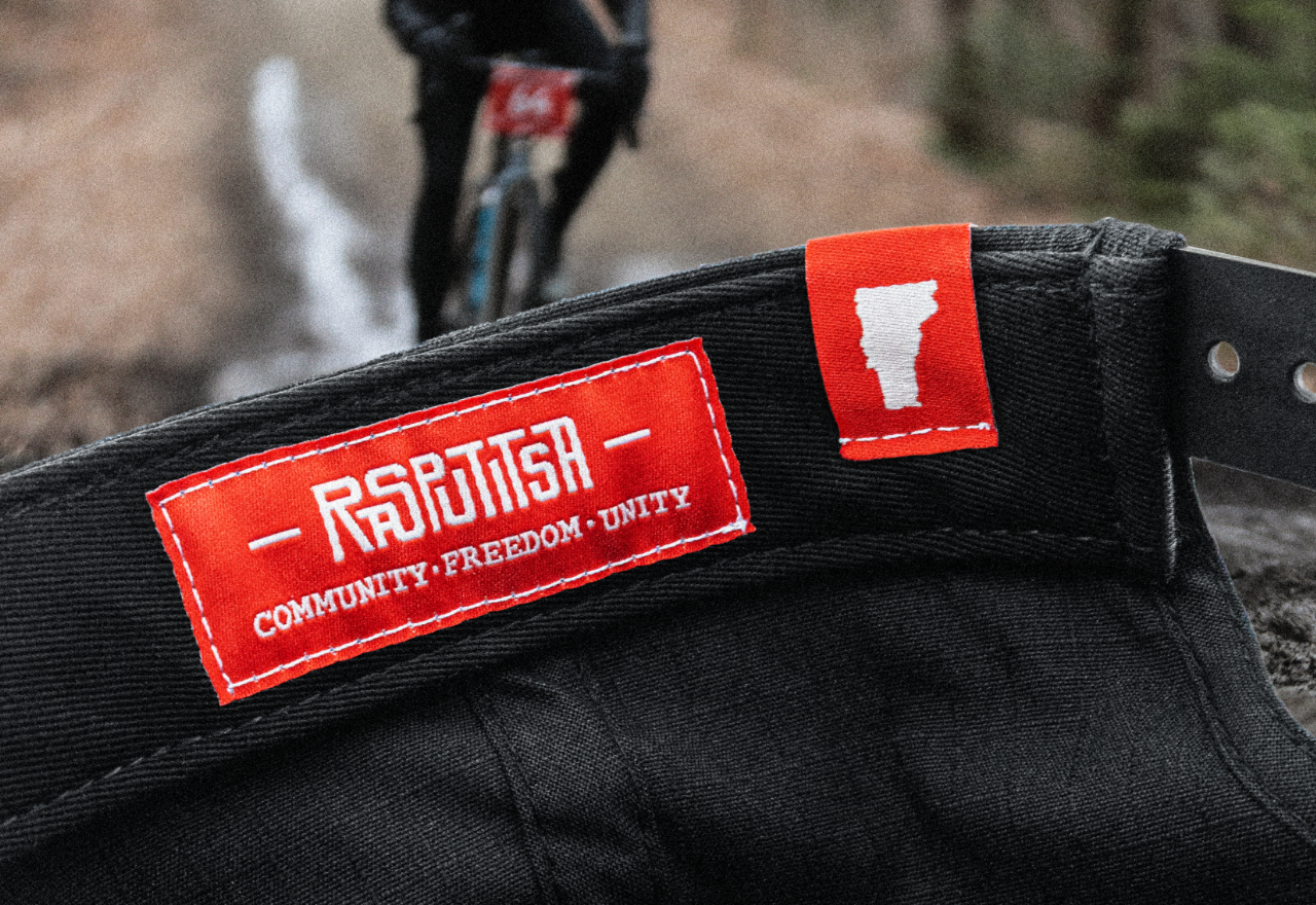
From premium tees and caps, to thoughtfully designed posters and accessories, each piece serves as a tangible extension of the brand—something participants can wear, use, hang, and carry as a badge of their experience. Rasputitsa swag doesn’t just represent the event but becomes part of each rider’s journey.
Select Photography:
Meg McMahon, Jenny Goyne, Matt Kiedaisch, Jared Herman, Brett Protasiewicz, JP Clifford, Luke Enright, Joe Faraoni, TBD NYC, chris mcintosh, JOSHUA STRONG, Jeff Price